Starting With Momo and Okarun: The Complete Guide to a Handmade Dandadan Ita Board
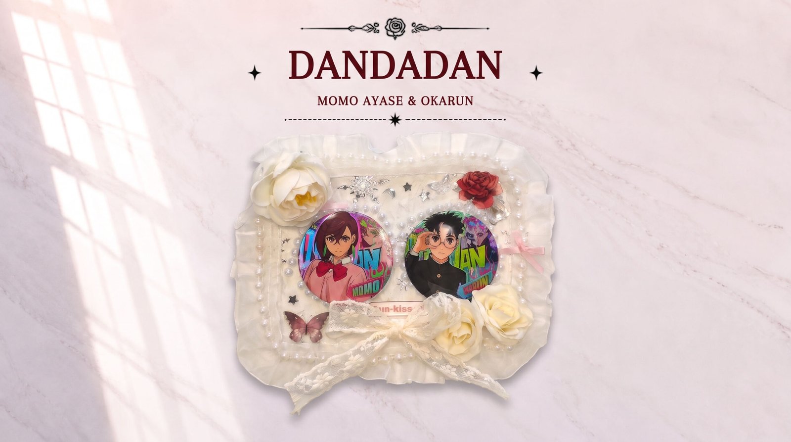
Table of Contents
Hi everyone! Today we want to share something fun with you: our newest team member decided to try making a handmade Dandadan Momo × Okarun-themed Ita Board, and recorded the whole process — from picking the characters, to planning it out, to the finished piece. After watching it back, we felt that rather than just dropping a tutorial video, we also wanted to clearly explain why we designed it this way — because that thinking is worth sharing too, after all, Ita Bags are about technique being secondary — what you’re trying to say through the board is what really matters.
Around the same time, we’ve also been browsing the Reddit community and came across two really interesting Dandadan-themed Ita Bags. Their styles are completely different, but each one clearly reflects the player’s own ideas. We wanted to bring these three things together in one piece: a design philosophy, a complete tutorial, and a breakdown of two real players’ finished bags — hopefully giving you, if you’re still stuck on how to design your own Ita Bag, a few practical ideas you can actually use.
A Deep Dive Into Real Players’ Dandadan-Themed Ita Bags
Based on the Dandadan-themed Ita Bags we saw in the community, we got a sense of how differently players express this theme. Community creations tend to reflect the most authentic use cases and merch-collecting preferences, and these two cases are especially representative.
Case 1: Gentle Layering in a Black Satin Ita Bag
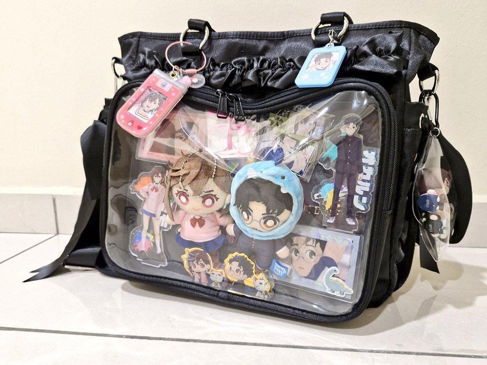
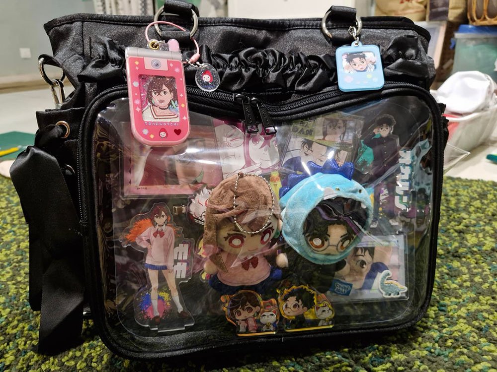
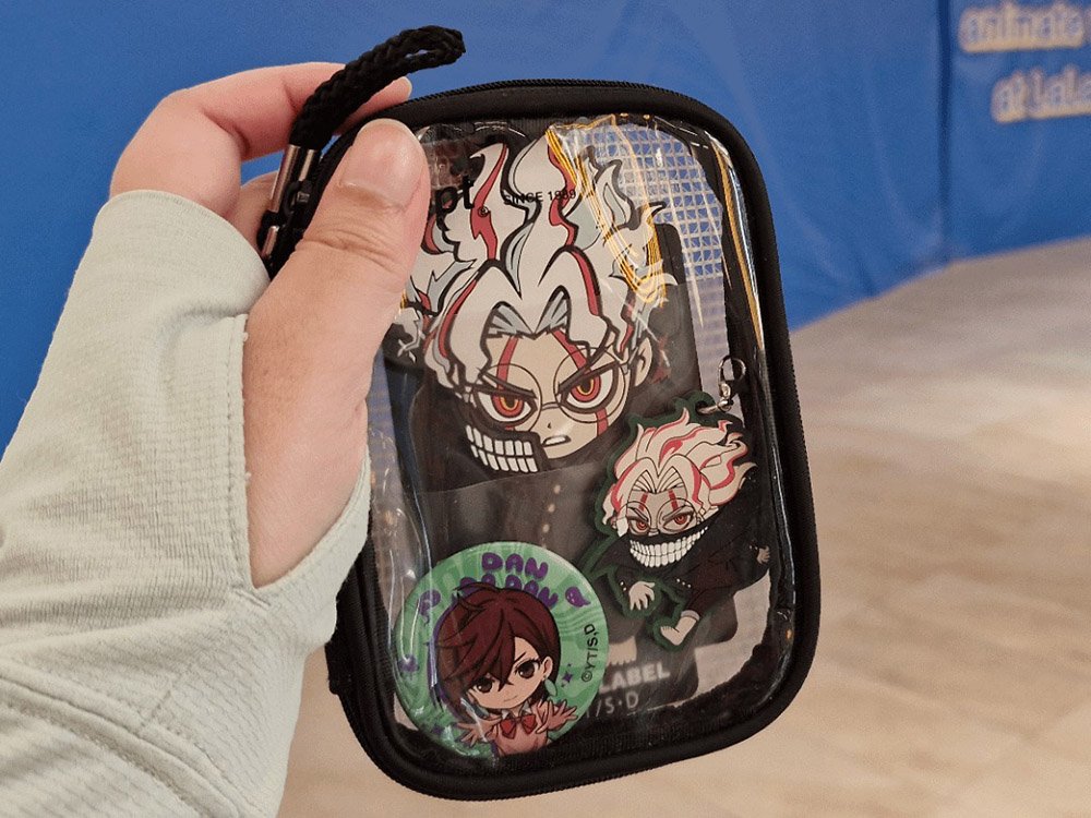
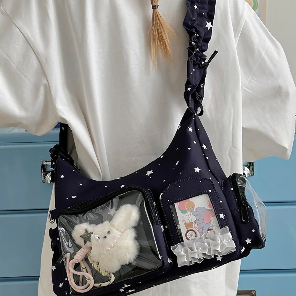
This player put together a really cozy Ita Bag set. Instead of a traditional array of metal badges, they built it around an official plushie doll as the absolute centerpiece. The bag itself is a very classic Black Satin Ita Bag with a large front display window, a ruffled lace trim along the top edge, double shoulder straps, and metal D-rings, and they even paired it with a matching mini bag in the same theme.
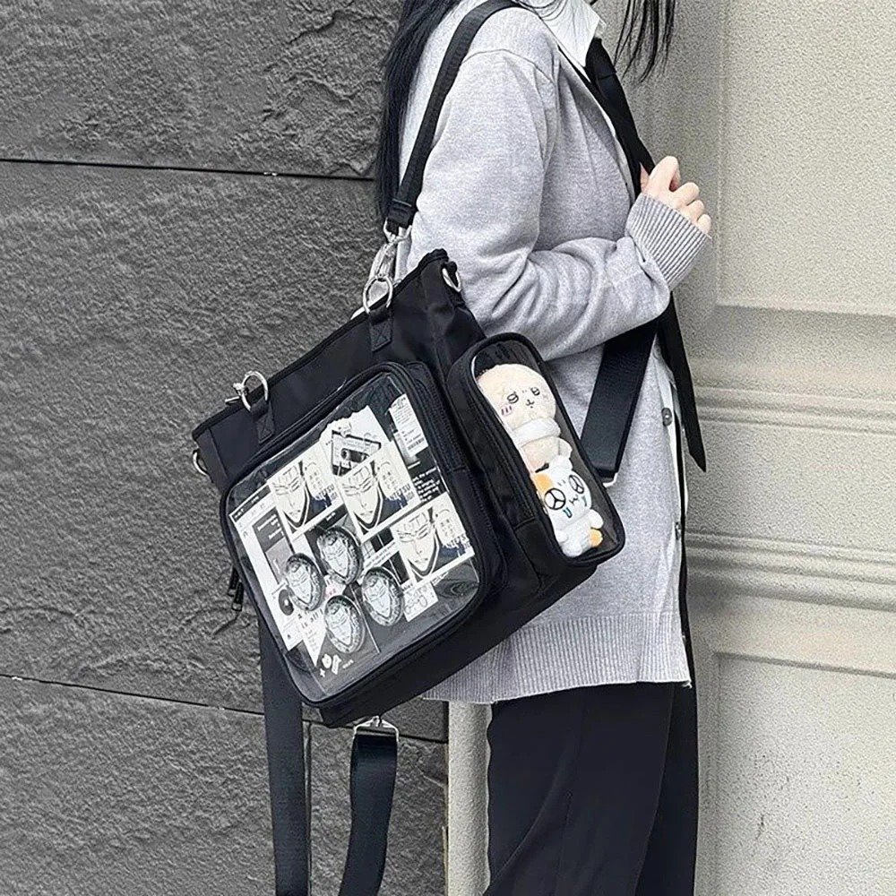
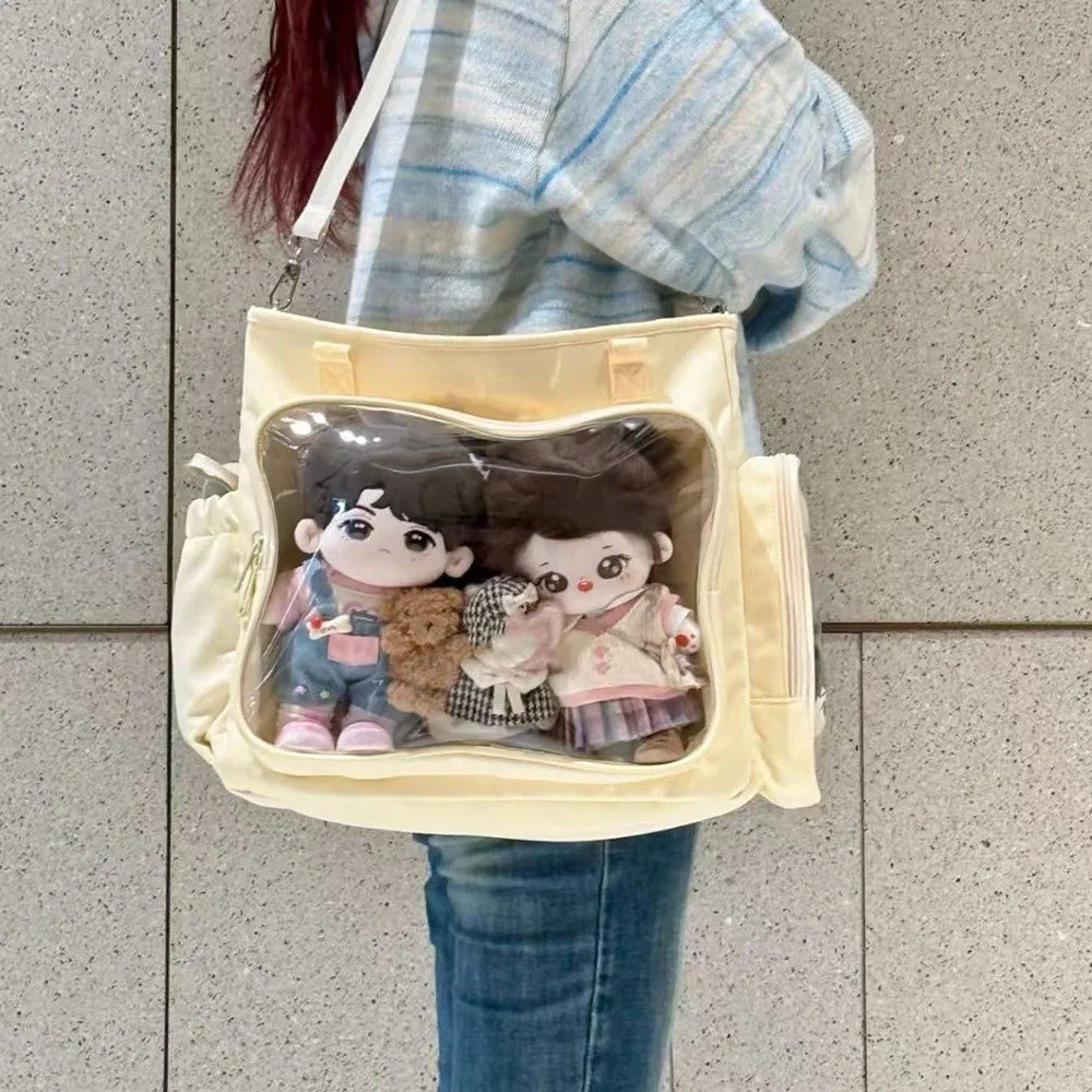
The layout inside the window follows a classic four-layer stacking approach: a bottom card as a photo-style base layer that adds color depth to the background; a large acrylic standee to enrich the visuals; a large, main-focus official plushie doll that breaks up the flatness of the standee while highlighting the theme; and a row of chibi-style mini standees lined up in a row that echo the theme and add a group-photo feel, used as accents.
On the outside, three different types of charms are hung, along with black satin ribbon streamers on both sides of the bag. The overall approach leans into layering — the more, the better — which is the exact opposite of our earlier Ita Board design that was built around negative space, but it works just as well, as long as your stacking is ordered and layered rather than randomly crammed together — fullness itself can be a style too.
Case 2: A Strange Battlefield Inside a Silver PU Ita Bag
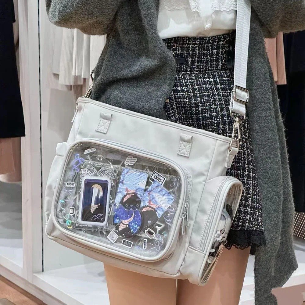
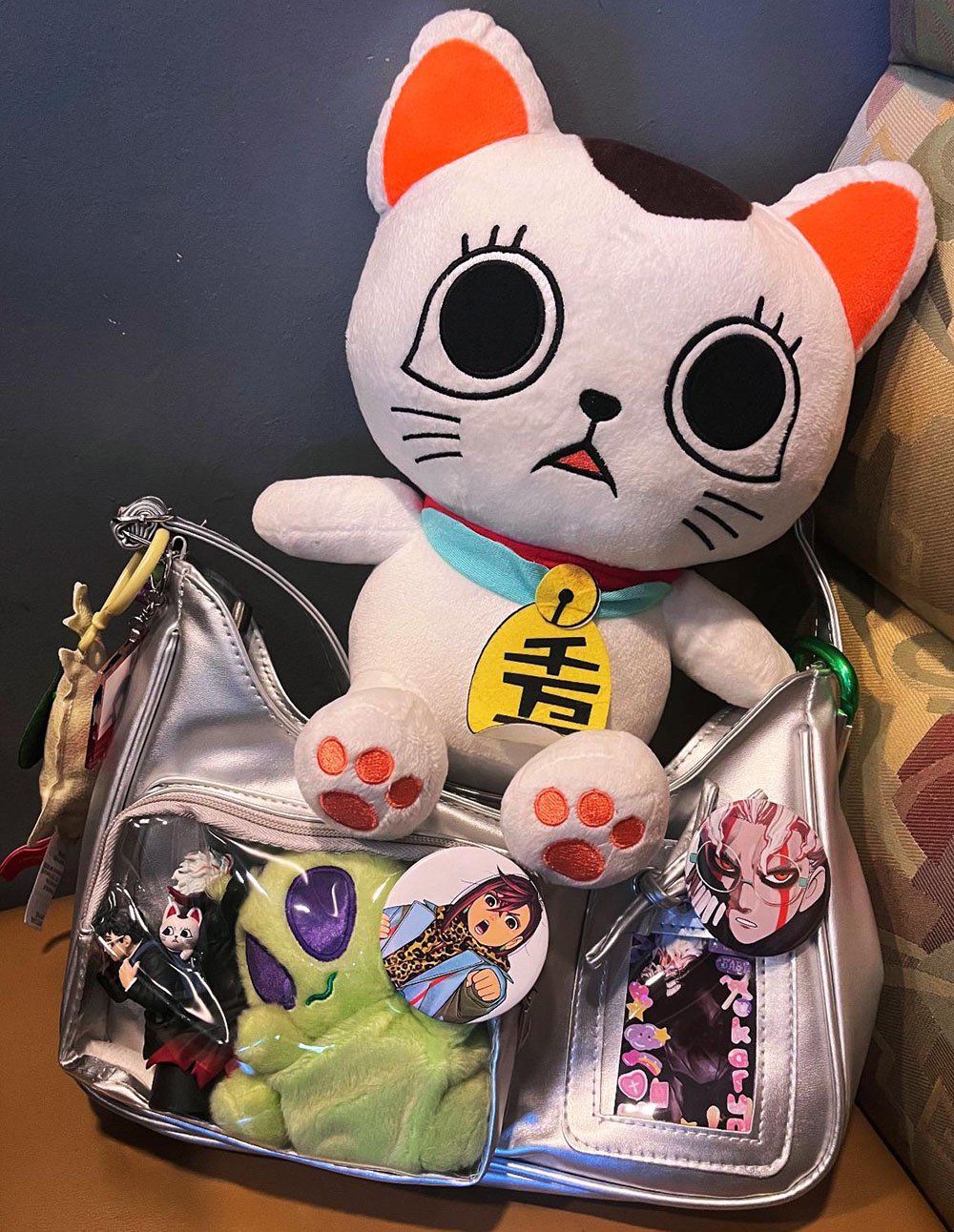
This player presents a really clever, visually striking approach. The bag they used is a Silver PU Ita Bag with an avant-garde, tech-forward, metallic feel that fits perfectly with Dandadan’s blend of the supernatural and alien sci-fi tone.
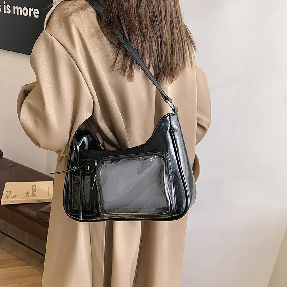
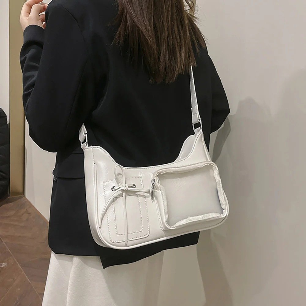
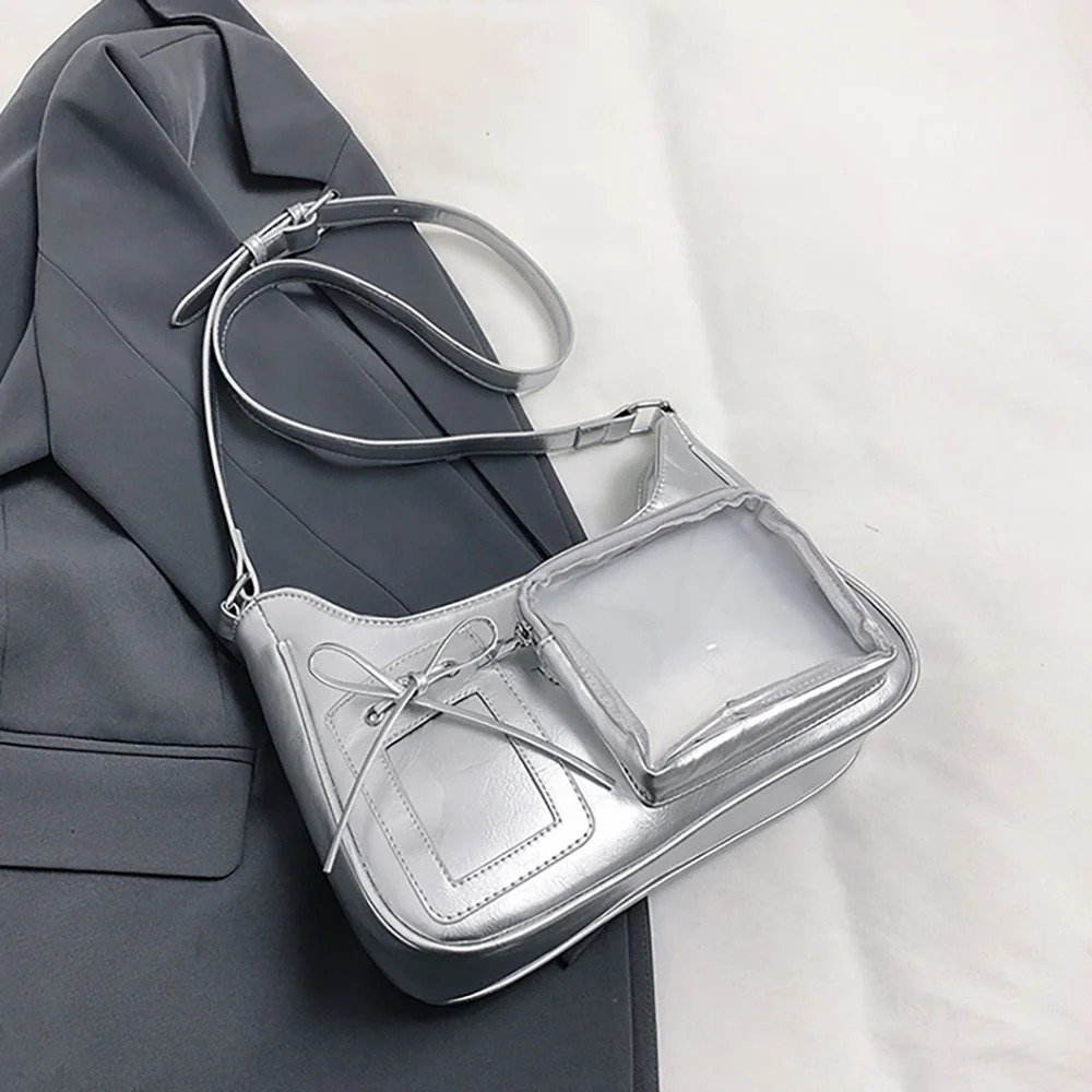
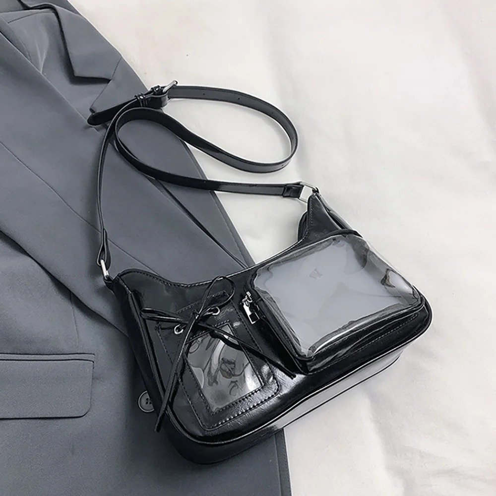
The window design is fairly simple: inside the large main window, an Okarun figure and an alien plush toy are cleverly combined, using 3D merch to build a strange, richly layered battle scene; in a separate translucent card window on the right, the creator precisely placed image merch of Okarun’s transformed form, creating a striking contrast between the two forms. On the outside of the bag, a Momo badge is hung, which not only creates a striking visual break in color and material but also naturally echoes the bond between the two leads.
What These Two Cases Taught Us
Looking at these two real cases side by side, you can see two completely different design logics. This difference in approach doesn’t have an absolute right or wrong — but what they share is that behind every finished piece, whether it looks packed full or minimal, there’s a self-consistent design logic, not just a random pile of things. That’s actually the main point we want to get across in this piece. Figuring out which direction your own Ita Bag should take before you start is a lot more efficient than agonizing over it as you go.
About Our Ita Board
Before we get into the tutorial itself, here’s a creation note our team member wrote before making this board — this passage actually shaped every material and technique choice that came after.
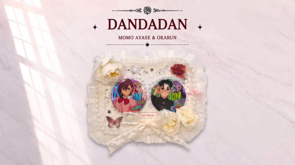
This Ita Board was inspired by Dandadan’s Momo and Okarun. Rather than simply spotlighting the characters, what I really wanted to capture was the sense of relationship between the two of them — one bold, one shy; one brave, one gentle. Two completely different people who, through fighting side by side again and again, gradually became important to each other. So when designing the board, I deliberately chose softer materials — white lace, pearls, and flowers as the base decoration, to give the whole thing a light, romantic feel. Their badges are placed in the most important spot, not to cram the board as full as possible, but because I wanted every decoration to serve the characters.
Hidden in that passage is a design premise that a lot of beginners overlook: figure out what emotion the board should express first, then work backward to the materials and color palette — not the other way around, stockpiling a bunch of pretty decorations first and then trying to figure out how to use them all up.
From start to finish, this board doesn’t use any flashy or over-the-top elements — everything about it is simple. But it’s precisely because of that simplicity that the two badges placed dead center truly become the visual focal point, rather than getting lost among the decorations around them. This is actually the first design principle we most want to share with you: how restrained your decoration should be depends on the character mood you’re trying to express, not on whether it looks good on its own or whether it looks full enough — those two standards shouldn’t be treated as the whole goal.
Full Tutorial: Momo × Okarun Ita Board
With the concept out of the way, let’s get into it. Below is the complete process for this board, from scratch to finished piece, broken down into a few main steps in the same order as the video.
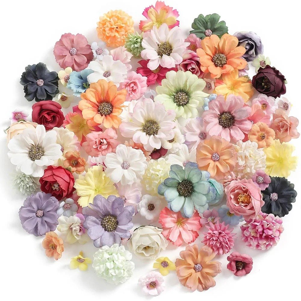
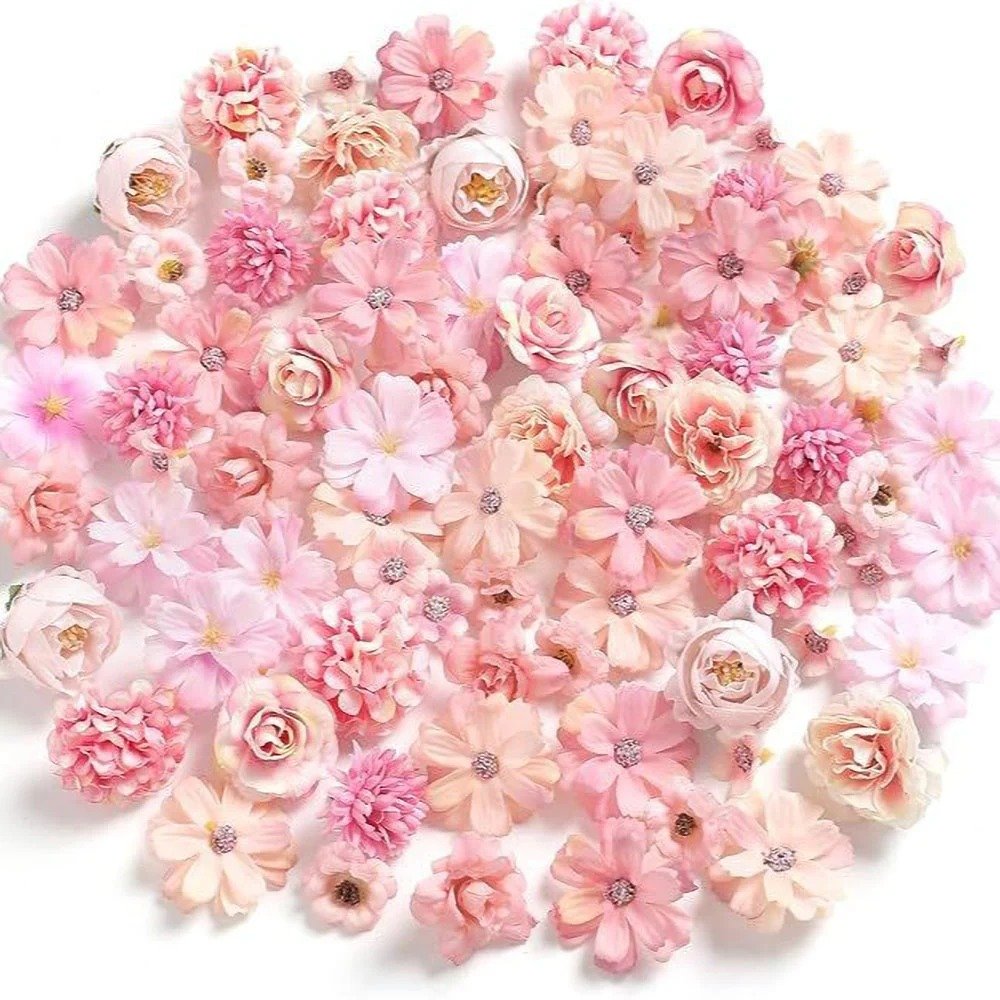
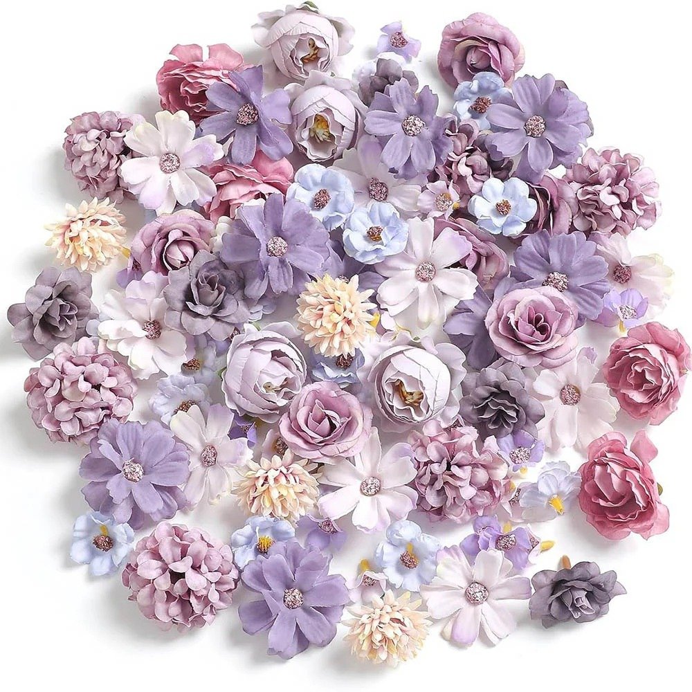
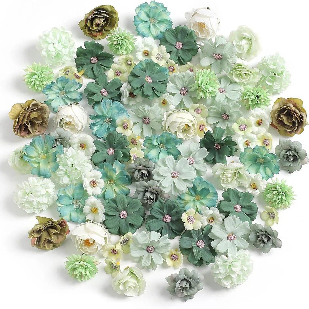
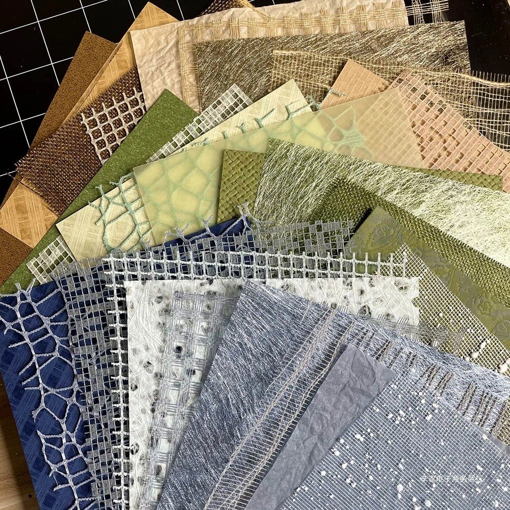
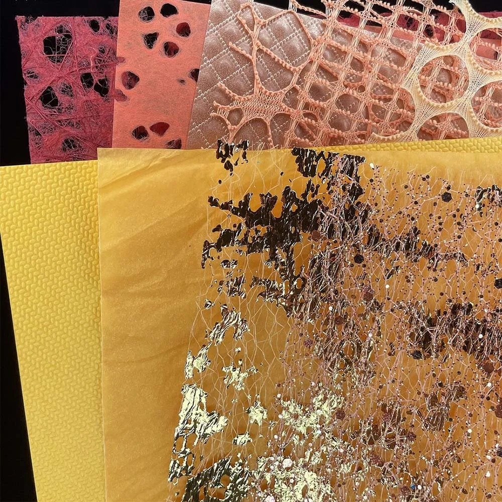
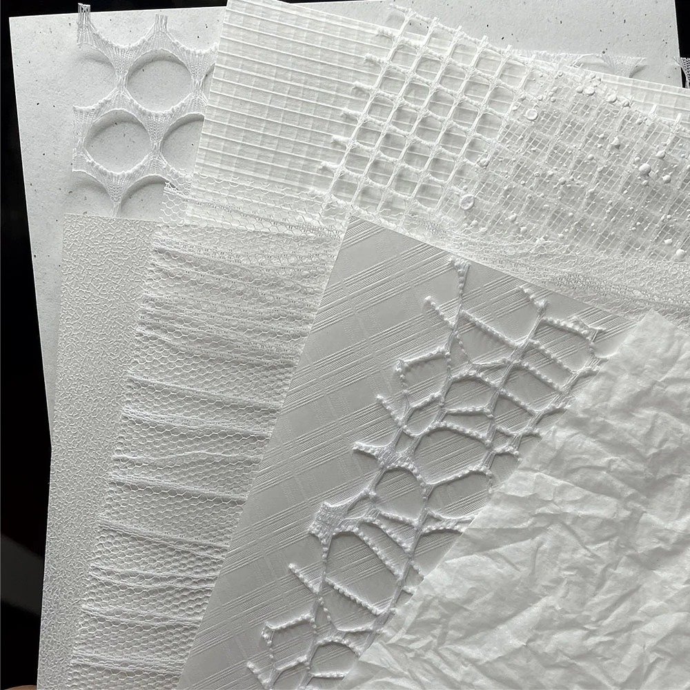
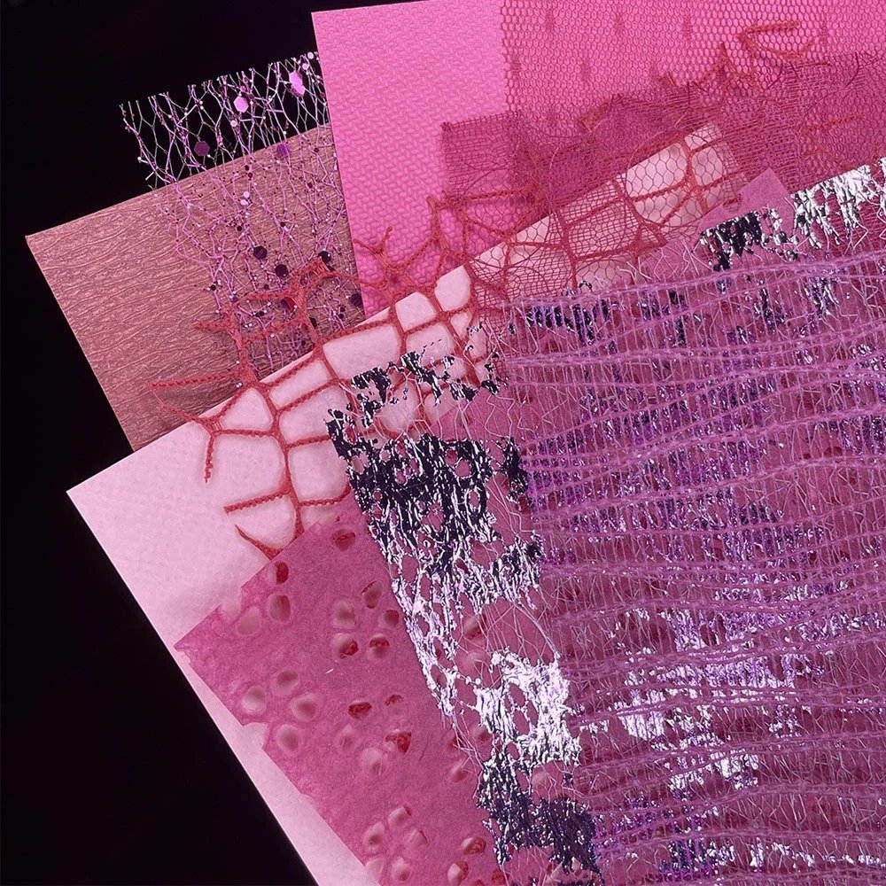
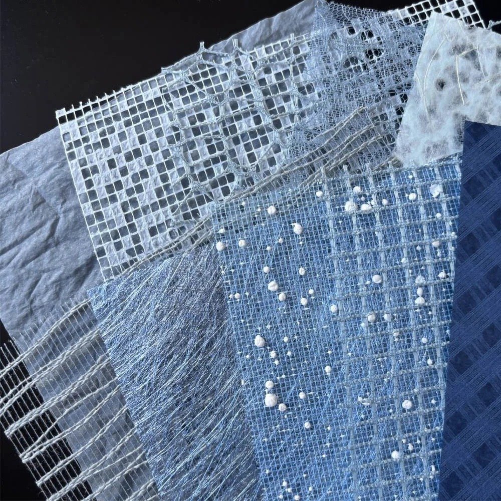
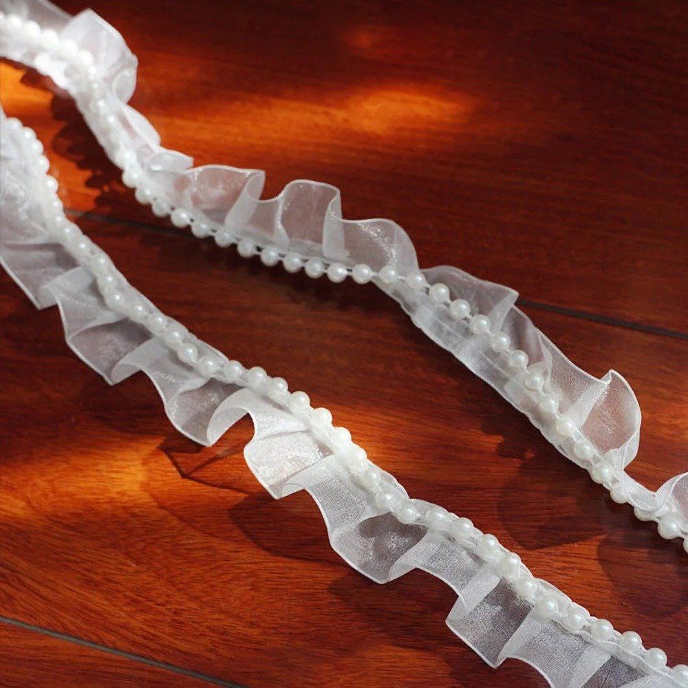
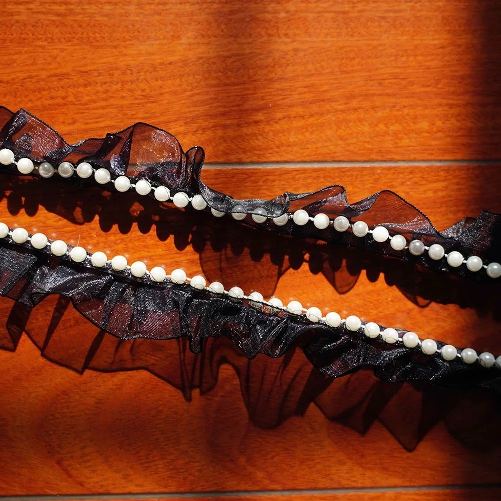
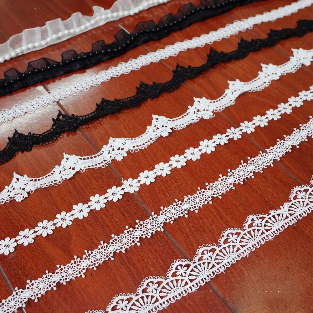
Materials: clear base board, traceless double-sided tape, scissors, tweezers, white lace texture background paper, snowflake-pattern clear sheet, white lace ruffle pearl trim, off-white silk flowers, round badges ×2, pearl decorative stickers, decorative stickers, floral lace-edged off-white ribbon.
Step 1: Laying the Background Paper and Trimming the Edges
Start with the clear base board — stick a ring of traceless double-sided tape around its outer frame. Take the white lace texture background paper you’ve prepared and smooth it onto the base board as the first background layer, then lay a snowflake-pattern clear sheet over it as the second layer. Press your scissors right against the edge of the base board and cleanly trim away the excess paper. Next, apply another ring of double-sided tape around the front edges of the background paper to prepare for attaching the lace later.
Step 2: Sewing the Pearl Lace Edge Trim
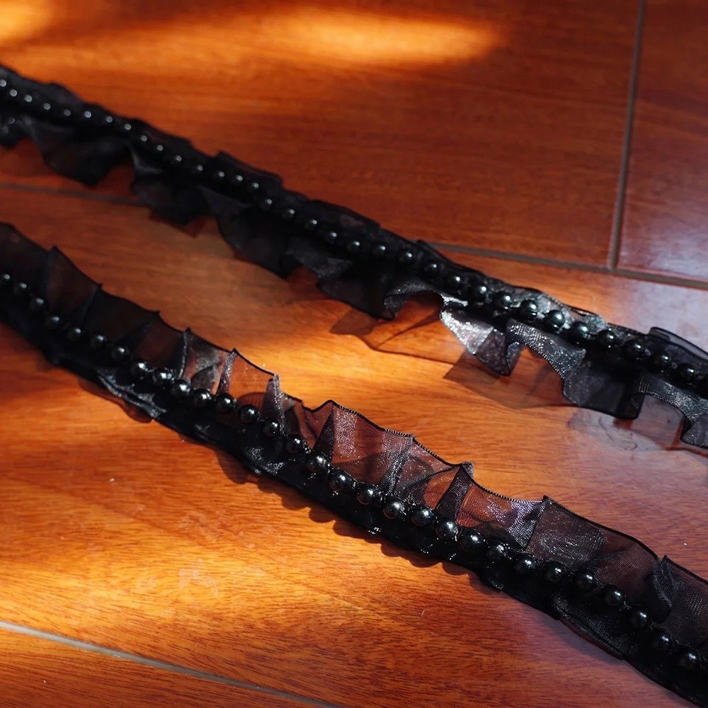
Take out the White Lace Ruffle Pearl Trim and press it down all the way around the double-sided tape on the edges of the base board. At the corners, fold and press it along the lace’s natural pleats so it forms a full, soft, cute frilly border that completely hides the hard edge of the rigid base board.
Step 3: Positioning the Core Badges
Apply double-sided tape to the back of the Momo and Okarun badges and fix them side by side, right in the center of the base board. Keeping the two badges horizontally aligned visually reinforces the sense of the two of them fighting side by side.
Step 4: Diagonal Layout of Pearls and Silk Flowers
Using tweezers, take out the pearl decorative stickers and arrange them in an arched border around the outside of the badges. Trim away the green leaves and raised connectors from the bottom of two off-white silk flowers, apply a dot of glue to the back of each, and fix them in the top-left and bottom-right corners of the board to create a diagonal visual balance. Then apply the various decorative stickers to the remaining blank areas to finish the decoration.
Step 5: The Bow — Placement and Finishing
How to make the bow: face your palm toward yourself and spread your thumb and index finger into a V-shape to act as a frame; take the lace ribbon and leave a tail of suitable length at the front end, then wrap the long end of the ribbon crosswise between your thumb and index finger. Next, thread the remaining tail of the ribbon through the gap between your two fingers, loop it around the crossing point once, and pull it tight to lock the center knot. Finally, gently slide the finished bow off your fingers and adjust the symmetry of the two loops. Once the bow is done, do one last overall check to make sure nothing is loose and everything is symmetrical — and your Ita Board is complete.
Wrap-Up
From a creation note, to an actual finished board, to two real, very different-looking cases from the community — what we’re really trying to say is the same thing throughout: an Ita Board was never a contest of piling on decorative materials. It’s a concrete expression of how you understand the characters you love. Whether you want to use lace and pearls like we did to express a tender, heart-fluttering sense of relationship, or go the way those community players did, expressing something more internal, as long as the logic holds together, it’s a good Ita Board.
If you happen to have finished a new piece recently, feel free to leave a comment and chat with us about it — we’d also love to see what kind of little world the characters look like through your eyes.
FAQ
What should you think through before making a pin display board?
You should first get clear on the emotion or character relationship you want the board to express, and then choose materials and color schemes based on that direction — rather than stockpiling a bunch of pretty decorative items first and figuring out how to cram them in afterward.
Is it better to have more decoration on a pin display board?
Not necessarily. Using two real players’ cases as examples, both a densely layered style and a minimal, spacious style can work — what matters is whether the decoration serves the character vibe you’re trying to express, rather than simply chasing “does it look good” or “is it full enough.”
If you want a pin display board to reflect the relationship between two characters, what’s a concrete approach?
Use color and material choices to build the overall mood, then use side-by-side placement and alignment of the core merch to reinforce the sense of connection between the two — keeping the decoration centered on the relationship rather than just piling up character elements.
Besides following tutorials, are there other ways to find design references?
You can look at real players’ finished-product breakdowns in the community, and observe how different people, based on their own understanding of a character, create ita bags and pin boards that look completely different in style but are still internally consistent. The point isn’t to copy a particular style, but to learn the mindset of making the design serve what you personally want to express.