Atsushi Nakajima's Black-and-White World: A Handmade Journal and Case Study Breakdown
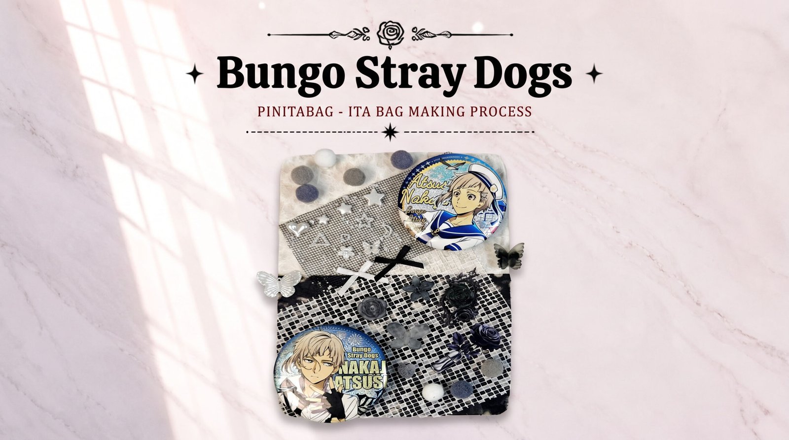
Table of Contents
Why Bungo Stray Dogs, Why Atsushi Nakajima?
We actually spent quite a while deciding on this topic. Bungo Stray Dogs has always been a popular IP in the ita bag community — the official art direction is strong, the merch quality is high, and each character carries its own extreme aesthetic label: Ryunosuke Akutagawa’s dark Japanese-style elegance, Fyodor D’s gothic grace, and Atsushi Nakajima’s boyish charm paired with the lonely wildness of the beast under the moon — almost every character can carry a distinct visual style on its own.
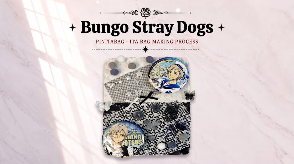
We chose Atsushi Nakajima for this demo ita board because his character design already carries a beauty that’s contradictory yet unified: by day he’s an awkward, self-doubting ordinary teenager, and under the moon he transforms into an all-devouring giant tiger. We wanted to echo that contrast with the most restrained black-white-grey palette, skipping flashy clashing colors and instead telling the story through fabric texture, layered sequin sheen, and a black-and-white pixel-check pattern. That’s also the core idea we want this tutorial to get across: an ita board doesn’t have to be busy to be memorable — a restrained palette can leave just as strong an impression.
Tutorial: Atsushi Nakajima Beast-Under-the-Moon Themed Ita Board
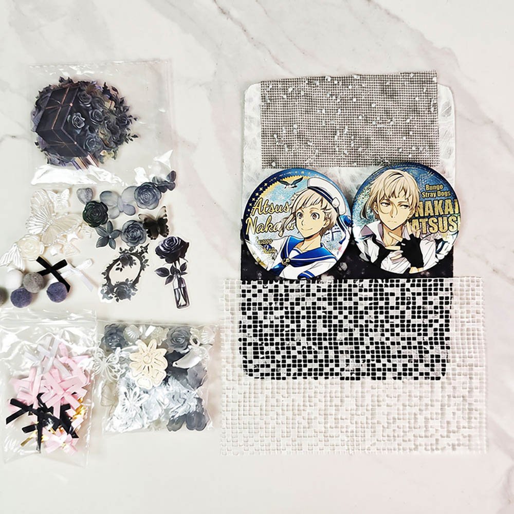
Tools and Materials
Base board: clear PVC base board
Background fabric: 2 pieces of black-and-white feather mesh fabric in different textures, plus 2 pieces of cutout mesh fabric.
Decorative accessories
Grey, white, and purple pom-poms.
Black-and-white ribbon bows.
3D butterfly appliqués.
3D decorations and rose stickers.
Core merch: 2 Atsushi Nakajima character metal badges.
Tools: craft tweezers, dot glue, residue-free double-sided tape.
Step-by-Step Instructions
Step 1: Piece Together the Diagonal Background Mesh
Start by laying the background on the clear PVC base board: attach the black and white feather mesh fabric stacked top and bottom, then piece the 2 pieces of cutout mesh fabric onto the base at a diagonal angle. This layered piecing breaks up the flatness of a single-color backing while echoing the black-and-white imagery of Atsushi Nakajima’s white tiger form, and it adds geometric depth for the pieces placed on top later.
Step 2: Accent the Corner with Pom-Poms
Glue a few pom-poms onto the upper-left corner of the ita board. The purple echoes the purple gradient in Atsushi Nakajima’s eyes, while the fuzzy texture captures the cute, furry feel of the little tiger under the moon.
Step 3: Attach the Two-Tone Bow and 3D Butterfly
At the seam where the black and white feather fabric meet, attach a black and a white ribbon bow, adding detail to the color transition between them. At the same time, glue a silvery-white 3D cutout butterfly to the left edge to create a lively visual extension.
Step 4: Arrange the Core Badges Diagonally
Fix the two Atsushi Nakajima badges to the upper-right and lower-left corners of the ita board so they echo each other diagonally. This leaves the center and lower-right area open as a display space for decorations, keeping the visual weight from feeling too crowded.
Step 5: Add Sparkling Stars, a Moon, and Black Roses
Glue sparkling star-and-moon decorations onto the empty spaces around the badges. Next, use tweezers to place small black roses in the black mesh fabric area at the lower right, adding a refined gothic touch.
Step 6: Final Accents and Balance
Fill in the remaining empty spaces with 3D flowers and other decorative details, and finish arranging the pom-poms diagonally. The overall result has an indescribable sense of harmony — the symmetry of the badges, the symmetry of the decorations — it’s just about perfect!
Case Study Breakdown: Two Players’ BSD Ita Bags in Action
After finishing our own ita board, we wanted to turn our attention to the community as well — after all, Bungo Stray Dogs has so many fans, with styles all over the map, which makes it a great IP for comparing different approaches side by side. This time we picked two especially representative cases from the community.
Case 1: Ryunosuke Akutagawa Ita Bag
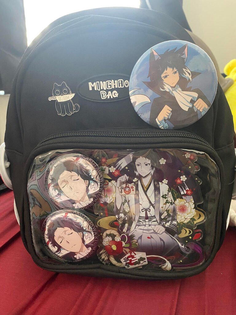
The maker of this bag admits they might redo it someday, but still wanted to share it — and that honesty is exactly what makes the community feel so real and so charming. The clear display window uses a large-illustration-plus-two-badges composition: at the center is a large illustration of Ryunosuke Akutagawa in a white kimono surrounded by red spider lilies, serving as the absolute visual focal point, while the left side stacks two cool-toned badges of the character with his eyes closed, creating a light-dark contrast.
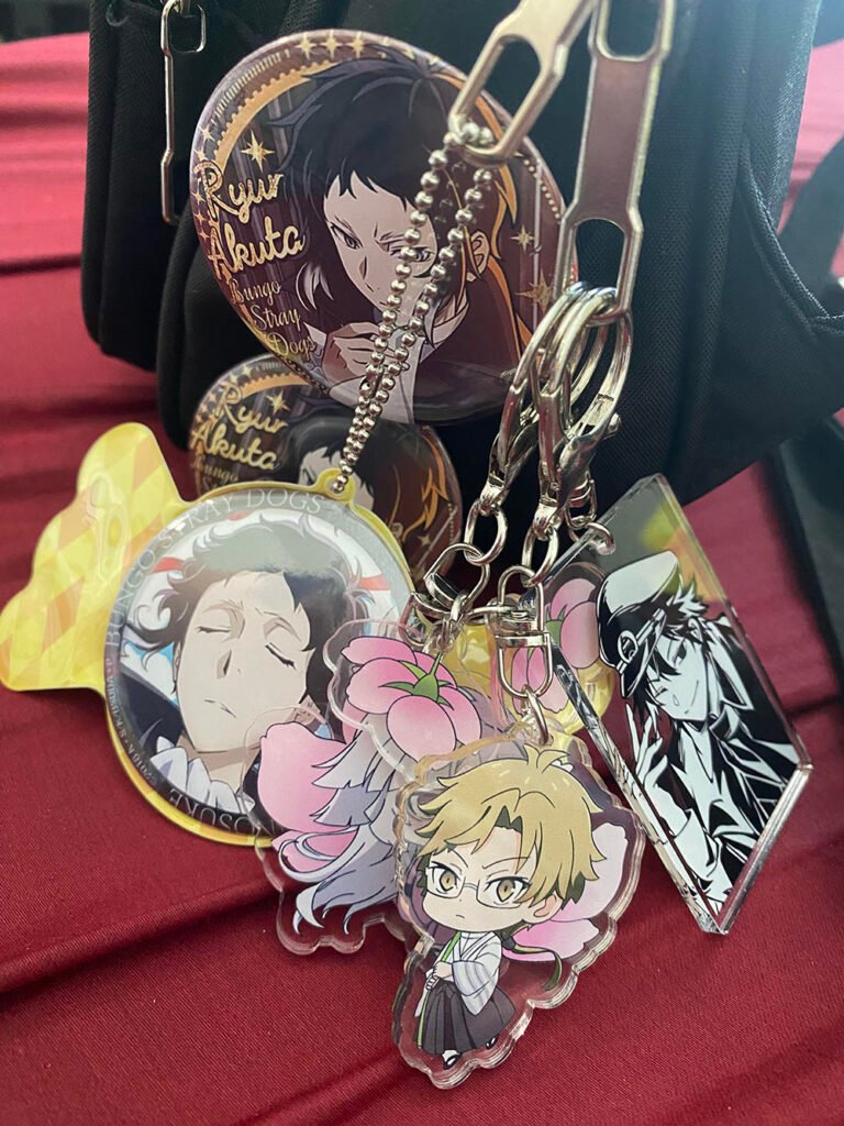
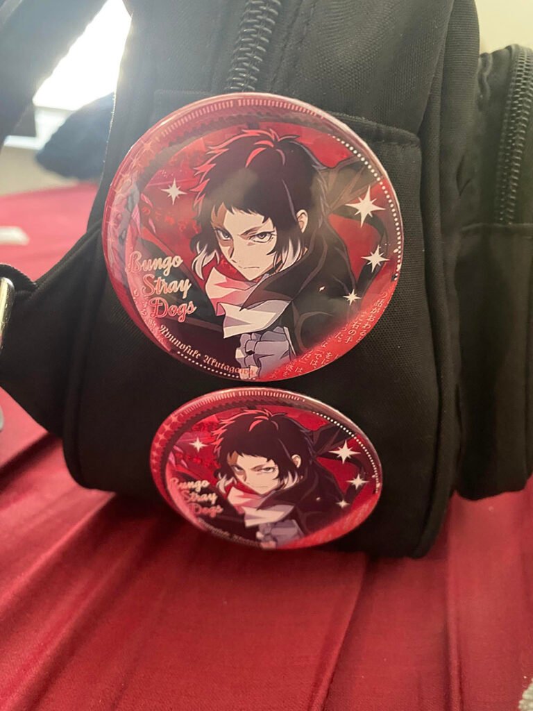
The outside of the window goes all out: red circular badges, chibi acrylic charms, and black-and-white silhouette charms are layered onto the zipper pull, and a large badge of his Rashomon ability awakening is even used for extra impact. This dual-narrative approach — telling the story of the character on the inside of the window and the story of his ability on the outside — is a layout idea well worth borrowing.
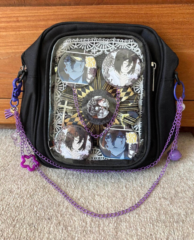
Case 2: Fyodor D Ita Bag
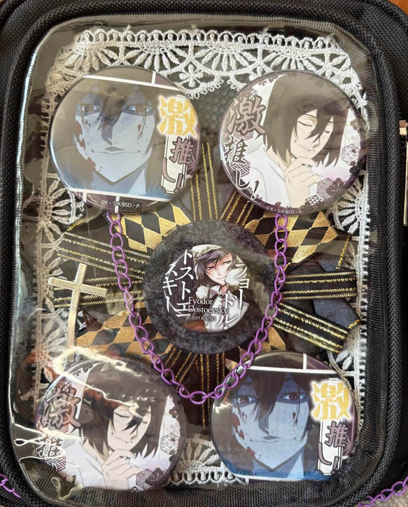
By contrast, the second case takes the completely opposite route. The maker says this is their very first ita bag, and they deliberately chose a low-effort, low-cost approach to practice with — that honesty is just as valuable. Inside the window is the most classic four-corners-plus-center five-point symmetrical composition: four badges of the same character in different filter tones sit in the four corners, the background is a single piece of black-and-gold diamond-lattice lace fabric, and around the purple chain at the center badge adds dimension, while the outside of the window is accented with just two purple beaded chains and charms.
This minimalist symmetrical approach is almost the golden formula for beginner ita bags — it doesn’t need complex stacking techniques, and symmetry plus a unified color tone alone can produce a very polished result, making it a great reference for anyone just starting out with ita bag making.
About the Materials: What We Quietly Stocked in Our Shop
If you’d like to try the same beast-under-the-moon look from this tutorial, or recreate a detail from one of the community cases, a lot of the materials are actually already in our shop: the classic clear ita board base comes in several color options; feather fabric and cutout mesh fabric are also things that show up again and again in our own handmade work, and they’re pre-cut and ready to use. If you want to try that chain-accent look, we also have a few accessory packs with thin chains and star charms, which are great for a beginner’s first try at chain aesthetics. As for the various decorations an ita board needs, we’ve got it all — feel free to take a look.
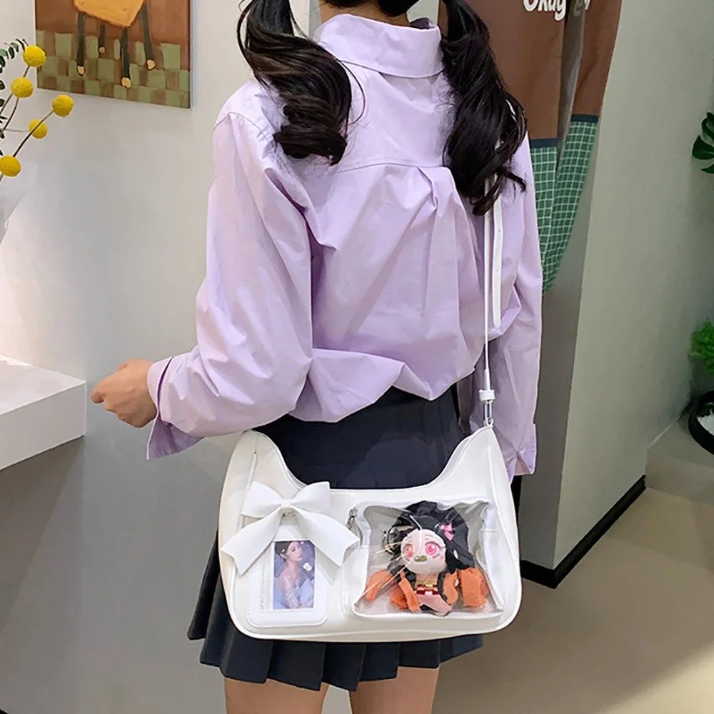
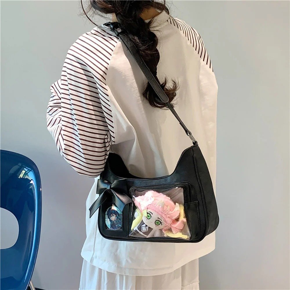
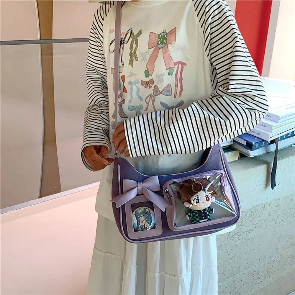
From making our own ita board to looking through the very different styles of two players in the community, our biggest takeaway is this: an ita board is never about right or wrong. As long as it carries your love for the character, it’s the right piece of work. We’d also love for everyone to share with us the themed ita boards you’ve made — who knows, you might be the star of our next case study.
FAQ
Why choose Bungo Stray Dogs’ Atsushi Nakajima as the demo character?
Because Atsushi Nakajima’s character design has built-in contrast — an awkward, self-doubting ordinary teenager by day, and a lonely, wild giant tiger under the moon. This contradictory-yet-unified beauty is a perfect fit for a restrained black-white-grey palette, and the tutorial also wants to get across the idea that an ita board doesn’t need flashy clashing colors to stand out — a clean palette can be just as memorable.
How should the background fabric be pieced together to look good?
Start with black and white feather mesh fabric stacked top and bottom as the base, then piece 2 pieces of cutout mesh fabric onto the base at a diagonal angle. This diagonal piecing breaks up the flatness of a single-color backing, echoes the imagery of the black-and-white tiger, and adds geometric depth for whatever is placed on top afterward.
How should badges and decorations be arranged so it doesn’t look cluttered?
You can fix the two core badges to the upper-right and lower-left corners so they echo each other diagonally, leaving the center and lower-right area open as a display space and keeping the visual weight from feeling too crowded. After that, use various elements in the empty spaces and corners to add accents and balance, keeping an overall sense of symmetry.
How do the two BSD ita bag cases differ in style?
Ryunosuke Akutagawa’s uses a large-illustration-plus-two-badges narrative layout, with the inside of the window telling the character’s own story and the outside using lots of charms and ability-awakening badges to tell the story of his power — a bold, full style. Fyodor D’s, on the other hand, is a beginner-friendly four-corners-plus-center five-point symmetrical composition that wins through unified tone and symmetry, with low effort and low cost, making it a great reference for players just starting out.
Get Inspired on Instagram
Looking for inspiration for your next ita bag? Follow us on Instagram for more ita bag decoration ideas, styling inspiration, and creative ways to showcase your favorite pins, charms, and collectibles. We regularly share different styling ideas to help you discover new ways to decorate and personalize your ita bag.