Animal Crossing Ita Bag Panel Layout Ideas
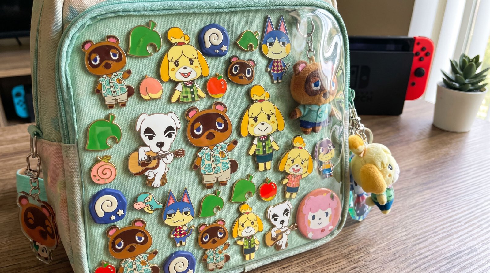
Table of Contents
For Animal Crossing players, building an island isn’t just a construction journey in a digital world — it’s also an extension of personal aesthetics. Bringing that love for your island and its animal villagers into the real world by making an Animal Crossing-themed ita bag has become a favorite way for many players to show off their creativity.
Unlike the highly saturated, character-driven layouts typical of anime-themed ita bags, an Animal Crossing-themed ita bag needs to balance a lived-in feel, a sense of nature, and a fresh, breezy atmosphere. How do you express your love for a particular villager within the limited space of the display window, while still capturing the relaxed, cozy visual feel of a deserted island? This article walks you through Animal Crossing-themed ita bag layout thinking across three dimensions: design logic, real-case breakdowns, and choosing the right bag and insert.
I. Three Core Design Principles for Animal Crossing Ita Bag Layouts
To avoid a layout that feels empty or cluttered, you first need a clear compositional logic. Animal Crossing’s visual style leans toward warmth, softness, and freshness, so keep the following principles in mind when designing your insert panel.
1. Color Coordination
Animal Crossing merch, both official and fan-made, comes in every form — pins, charms, acrylic stands, patches, and more. The first step in layout is settling on a primary color palette: will it be natural island tones like grass green and misty blue, or a single-character palette built around one villager’s signature colors.Locking in 1-2 main colors plus one accent color can instantly establish visual order.
2. Negative Space and Layering
Never pack your insert board so full there’s no breathing room. The essence of Animal Crossing aesthetics lies in a sense of space. Use a three-layer composition of foreground, midground, and background: use a textured or plant-patterned fabric for the background, place your main metal badges or acrylics in the midground, and fill the foreground with faux dried flowers, small leaf appliqués, or little fence ornaments to create a dimensional, miniature island scene.
3. Building a Narrative Scene
A standout ita bag panel often tells a story — Whitney’s campsite under a starry sky, a slice-of-life diary of your island days, or a trophy display from a fishing tournament. Grouping merch by shared theme gives your ita bag a deeper sense of life.
II. In-Depth Analysis of Real Player Builds
To make the theory more practical, we’ve picked three highly representative real-world Animal Crossing ita bag examples, and broken down the layout thinking behind their success.
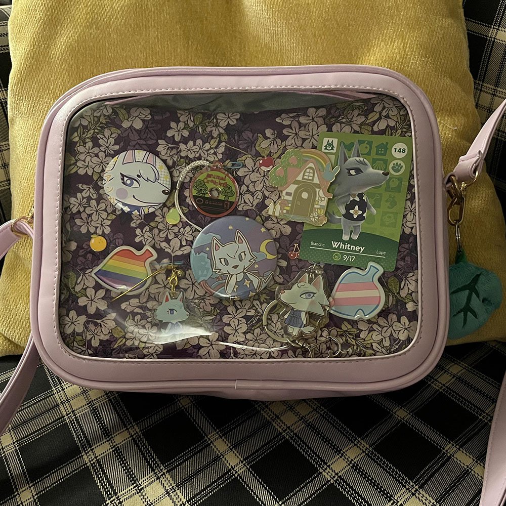
Case One: Extreme Single-Character Focus — a Whitney-Themed Ita Bag
Layout Analysis (Centered Clustering with Negative Space): The creator arranged Whitney merch in a centered cluster, keeping excellent, even spacing between pieces. The whole panel rejects a fully-packed look, leaving moderate breathing room around the edges for a clean, crisp visual effect that perfectly matches Animal Crossing’s fresh, relaxed aesthetic.
Key Insight (Everyday Practicality and Unified Tone): The creator upgraded from an earlier backpack they rarely used to a crossbody bag that better fits their daily habits, balancing display value with everyday outfit practicality. They also strictly locked in Whitney’s signature gray-white and blue-purple tones, so the backing and the merch colors work in close harmony.
Highlight (Elegant Metal Finish Matching the Character): Inside the display window, refined metal enamel pins serve as the main visual focus — clean lines, rich detail, and a distinctly upscale feel that precisely matches Whitney’s cool, elegant character design.
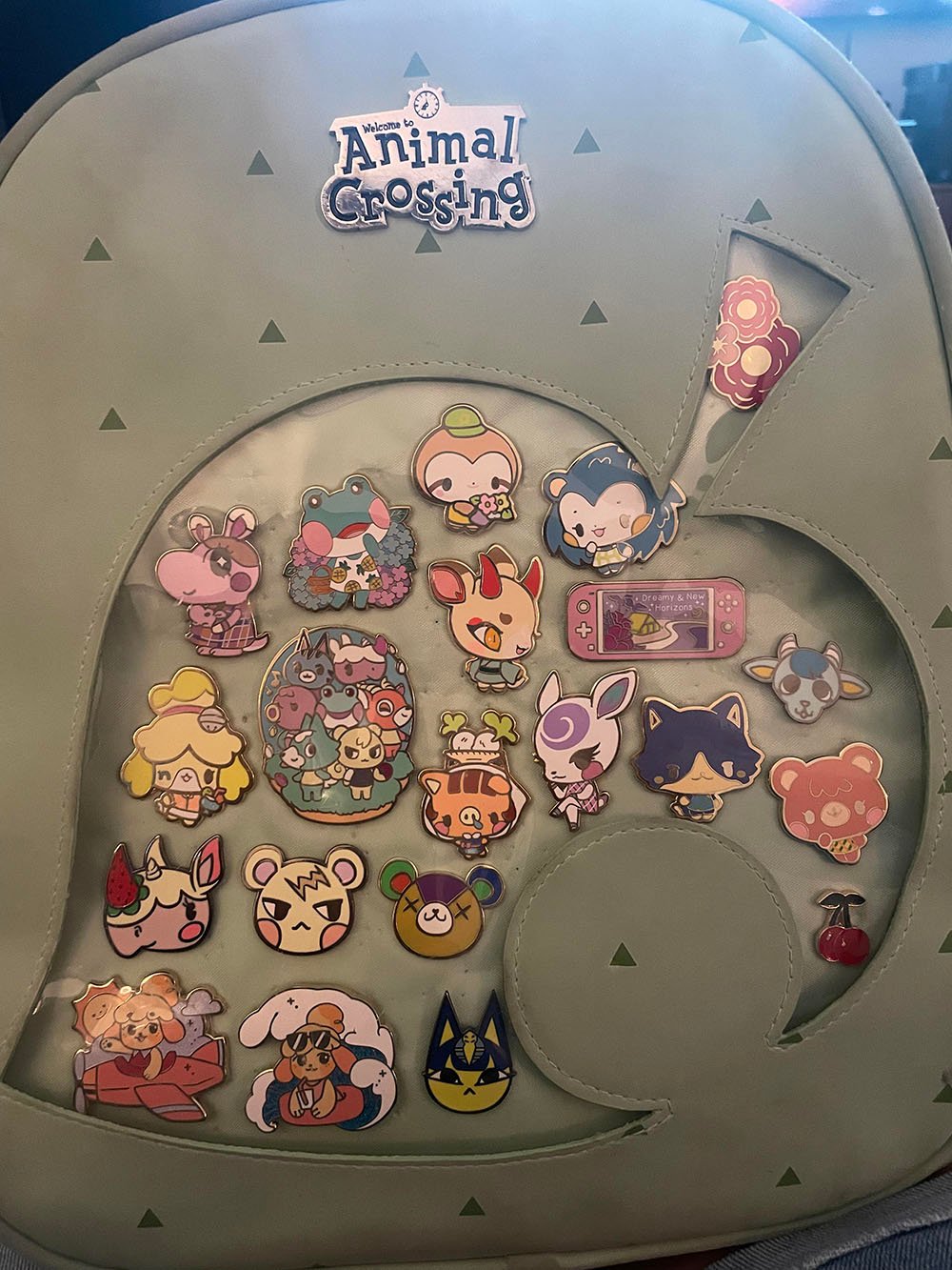
Case Two: Leaf-Shaped Window and a Full Villager Lineup — a Fully-Packed Animal Crossing Badge Bag
Layout Analysis (A Tight Grid That Follows an Irregular Window): The creator worked with the bag’s signature Animal Crossing leaf-shaped cutout window, arranging metal pins in a honeycomb-tight pattern that follows the leaf’s contour. The pieces interlock closely, making full use of the limited, irregularly shaped space.
Key Insight (A Logo Anchor Up Top and Character Mixing): The bag’s topmost point features a metal Welcome to Animal Crossing official logo badge as a visual anchor, while the display window below is filled with a lineup of popular villagers, along with iconic item badges like a Switch console and cherries.
Highlight (Highly Faithful to Official Elements): The bag’s green base color paired with a subtle triangle pattern, plus the leaf-shaped window, naturally form Animal Crossing’s visual signature. Paired with enamel badges of consistent finish, the overall look delivers strong thematic cohesion and richness — a classic, fully-packed collector’s Animal Crossing ita bag.
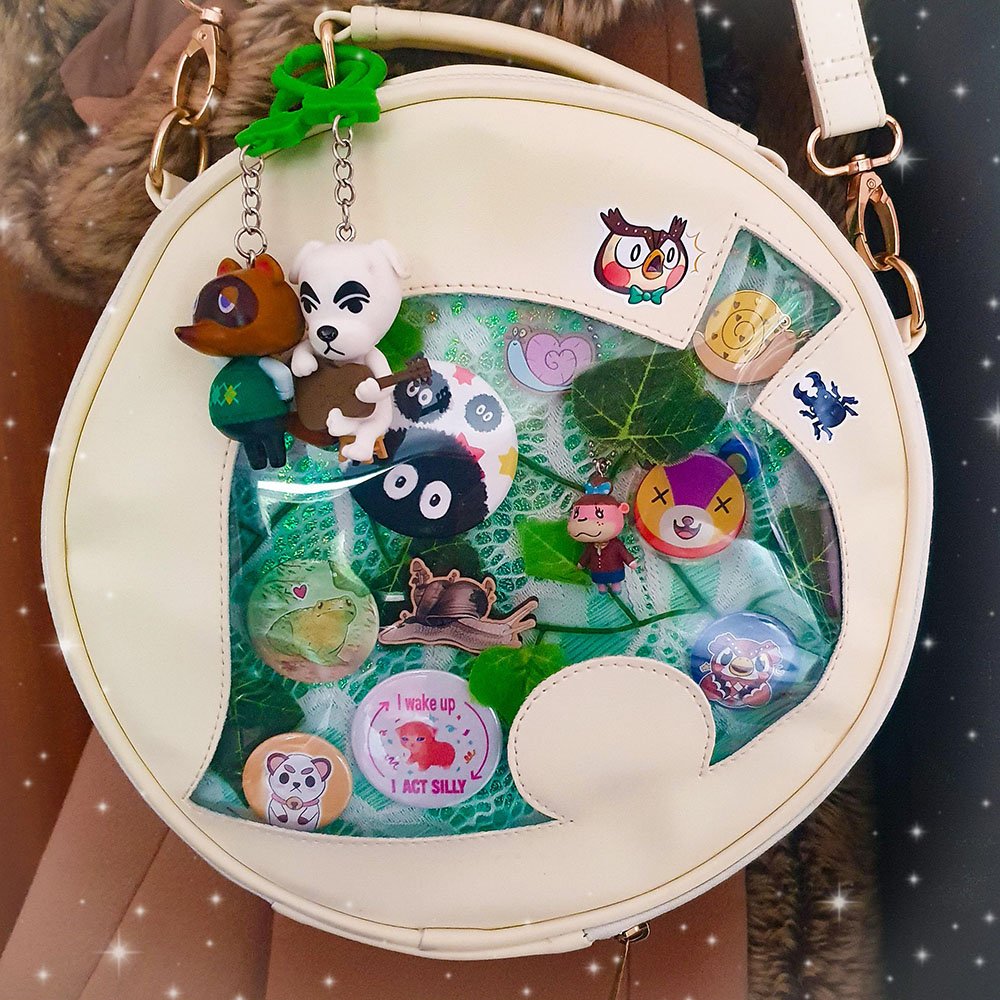
Case Three: Dimensional Ecology and Crossover Fusion — a Forest-Ecology Mixed Ita Bag
Layout Analysis (Dimensional Extension Inside and Out): The creator broke from the usual approach of stuffing everything into the display window, instead hanging 3D Tom Nook and K.K. Slider charm figures from a metal ring at the upper left of the backpack, creating foreground overlap outside the window. Inside the window, a scattered, staggered layout combines snail, frog, and villager badges to build a lively sense of spatial depth.
Key Insight (Real Greenery Backing and a Handmade Feel): The display window’s backing uses green lace fabric interspersed with artificial leaves and vines, paired with natural elements like snails and frogs — bringing Animal Crossing’s outdoor bug-catching ecology straight into the bag. Small Blathers and beetle stickers are also placed on the outside of the bag, extending the display onto the bag itself.
Highlight (Inclusiveness That Crosses IP Boundaries): This is a hybrid ita bag centered on Animal Crossing but woven through with personal taste. Alongside the Animal Crossing elements, the bag cleverly mixes in other cute-style elements like Soot Sprites, yet none of it feels out of place thanks to the unifying green, plant-based backing — showcasing a lived-in, highly personal, multi-layered aesthetic.
III. Choosing the Right Bag and Accessories: Making Your Layout Work Smarter
A great layout depends on a high-quality foundation. The shape, color, and transparency of the bag base directly determine the ceiling for how good your internal panel layout can look. When designing an Animal Crossing-themed bag, keep these two points in mind when choosing your base bag.
Window Shape and Thematic Fit: A standard rectangular ita bag is certainly versatile, but a display window with a distinctive silhouette naturally adds to Animal Crossing’s cute factor.
Insert Board Rigidity: Animal Crossing merch often includes fairly heavy metal enamel pins, so the insert board needs enough stiffness and thickness to avoid the fabric stretching or warping under long-term weight.
Recommended Bags: Carriers That Balance a Fresh Look with Practical Structure
For players who want to try a single-character palette like Whitney’s, or a fresh everyday-style layout, choosing a bag with a soft base color and a highly transparent window is essential. Here are two options worth considering as a base bag for an Animal Crossing theme:
This Blue Ita Bag Japanese Denim Clear Window Bag has a denim-textured blue tone close to Animal Crossing’s misty blue, a large clear display window, and pairs well with everyday outfits — great for showing off enamel badges and acrylic stands.
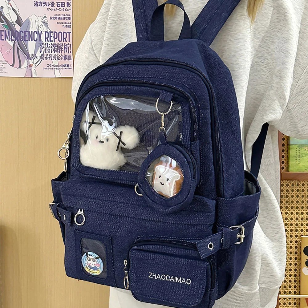
The second option, Ita Bag Japan Minimal Backpack with Clear Display, has a neat, squared-off window that’s especially well suited to a minimal layout with centered clustering and negative space around the edges.
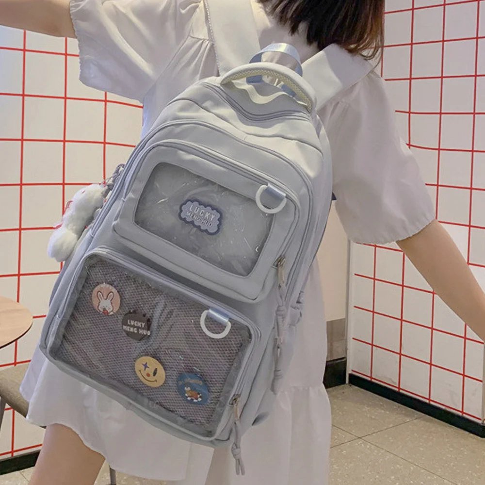
Insert Boards: Matching Both Tone and Structure
An insert board needs to bear weight, but it also needs to work in harmony with the display window’s color tone. Here are two directions to consider:
Mint Green Floral A4 Ita Bag Insert has a soft green tone that naturally matches Animal Crossing’s grassy palette. The board has decent rigidity, holds up well under heavier metal badges, and resists warping over long-term hanging — a great fit for a forest-ecology layout like Case Three, with its plant-based backing and natural elements.
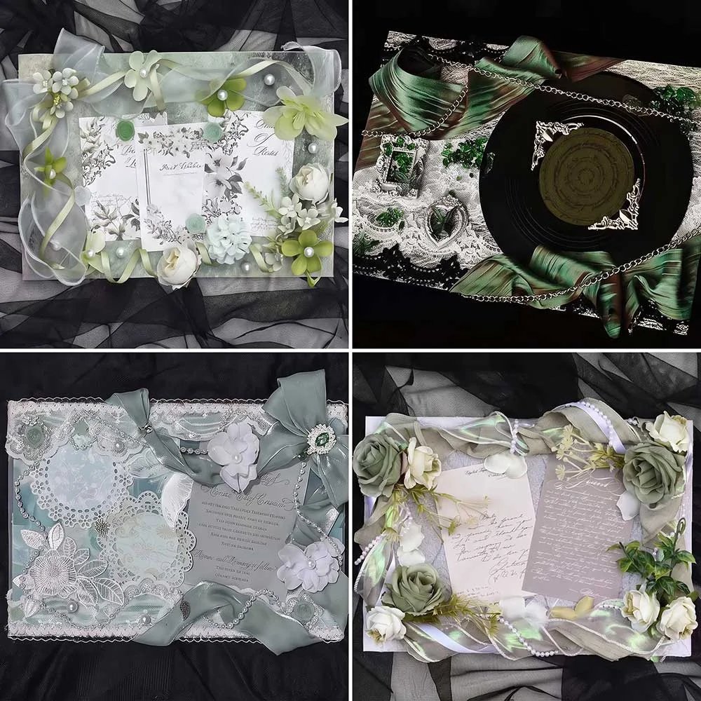
DIY Cuttable Ita Bag Insert — if your bag has an irregularly shaped window, this insert can be trimmed to match the window’s contour, maximizing the fit for an unusual space and letting your badges sit more tightly and neatly.
Accessory Details: Making Your Display More Complete and Durable
Kawaii Mini LED Fairy Lights echo the earlier tip about leaving room for lighting — route the wire along roughly a 1cm gap at the edge of the insert board to hide it, and once lit, it adds a warm glow that’s perfect for scenes like a campsite or night fishing, especially a starry-sky camping vibe.
Clear Badge Protector Cover with Ball Chain — paired with a ball chain for a more secure fit, it effectively protects metal enamel pins from surface oxidation or scratching over time from everyday friction, making it a must-have, low-cost protective accessory for an ita bag you carry out regularly.
IV. Summary
A great Animal Crossing ita bag is, at its core, a real-world miniature of your personal gaming memories. Whether it’s a single-character showcase devoted to a villager like Whitney, or a full island panorama blending Isabelle, fossils, and fruit, a clearly reasoned color scheme, a layered spatial composition, and a sturdy, durable bag base are the surefire keys to building the perfect ita bag.
We hope the analysis and examples above spark some inspiration for your next ita bag layout. Why not head over to Pinitabag and pick out an ita bag that speaks to you — and stitch the laughter and memories from your Animal Crossing world into a corner of real life!
FAQ
Are there any strict rules for color schemes when making an Animal Crossing-themed ita bag?
There are no strict rules, but it’s recommended to lock in 1-2 main colors plus 1 accent color to avoid the palette feeling too scattered. For example, you could go with a natural island look built around grass green and water-mist blue, or center the palette around a specific character’s signature colors. This helps the overall visual feel more unified and orderly.
How should a single-character themed ita bag be arranged so it doesn’t look monotonous?
The key is the “central clustering + negative space” technique. Arrange the character’s merch in an evenly spaced cluster around the center, leaving appropriate breathing room around the edges rather than filling the panel completely. At the same time, strictly stick to that character’s signature color tones so the backing and the merch coordinate with each other — even with a smaller number of pieces, this can still look refined and elevated.
How should I choose an insert panel that balances good looks with durability?
There are two main things to consider: whether the color tone coordinates with what’s displayed in the window, and whether the panel material is sturdy enough to support the weight of metal enamel pins. If your bag has an irregularly shaped display window, it’s best to choose a DIY cuttable insert panel, which can be trimmed to fit the irregular window shape more precisely.
What should I keep in mind if I want to add ambient lighting to my ita bag?
You can use mini LED fairy lights, running the wiring hidden along roughly a 1cm gap at the edge of the insert panel to avoid the wires being visibly exposed. Once lit, they add a warm glow that works well for scenes like camping or night fishing — a nice touch for layouts going for an atmospheric feel.
Get Inspired on Instagram
Looking for inspiration for your next ita bag? Follow us on Instagram for more ita bag decoration ideas, styling inspiration, and creative ways to showcase your favorite pins, charms, and collectibles. We regularly share different styling ideas to help you discover new ways to decorate and personalize your ita bag.