5 Layout Ideas for Beginner Ita Bags
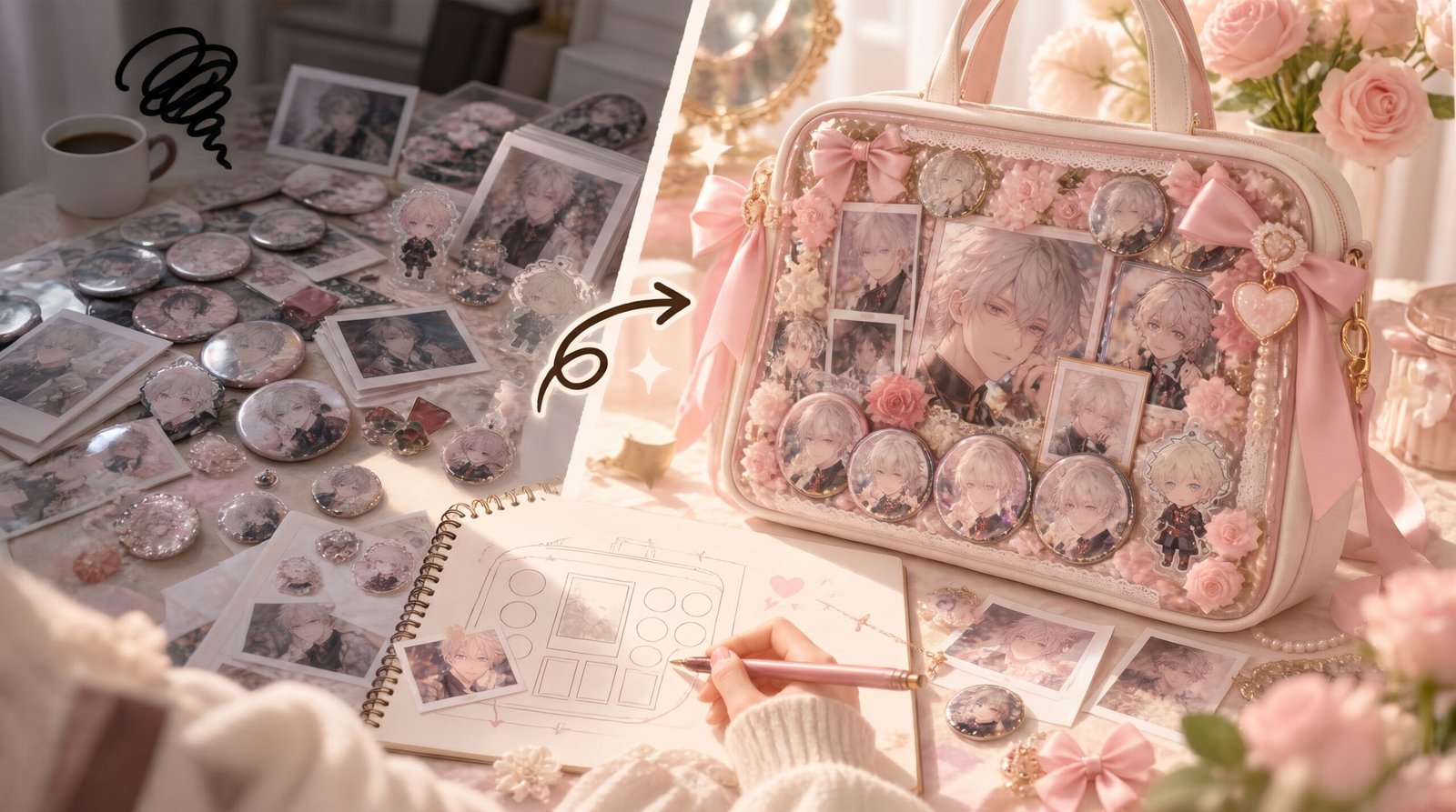
Table of Contents
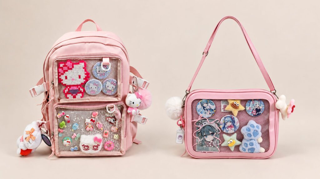
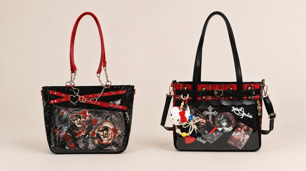
For beginners new to ita bags, the biggest headache is often not failing to get the merch they love, but not knowing how to display everything elegantly once all the badges, acrylic standees, and Polaroids are piled on the table. Many people blindly pack all their merch onto the Insert, and the result is not only crowded and messy, but also hides the beauty of the character.
An ita bag is, at its heart, a visual feast, and layout is the soul of that feast. Today, Pinitabag will break down the spatial composition principles of ita bag layouts, walk through 5 layout ideas in detail, and, with real player cases from the ita bag community, teach you how to build a perfect ita bag from scratch.
How Can Beginners Build a Sense of Composition?
Before you start fixing merch onto the Insert, you first need to build a mental picture of the ita bag’s window space. An ita bag is not a flat canvas but a display stage with depth, color, and visual focal points. Mastering the following three composition principles will maximize your layout efficiency.
1. Lock In the Focal Point
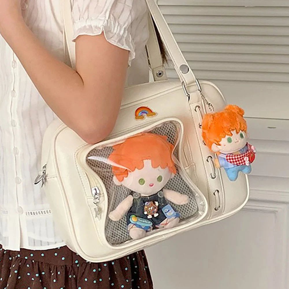
By visual habit, when the eye lands on a transparent window, it is usually drawn first to the central area. When preparing your merch, first pick out 1 to 2 of the most impactful hero pieces, such as a large acrylic standee, a high-saturation shikishi board, or a particular badge. Once this center spot is set, the rest of the merch can be arranged around it, so the composition never loses its center of gravity.
2. Build Depth
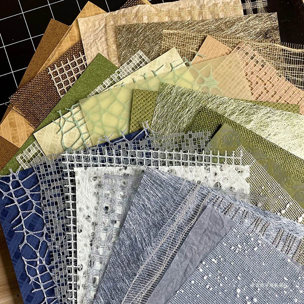
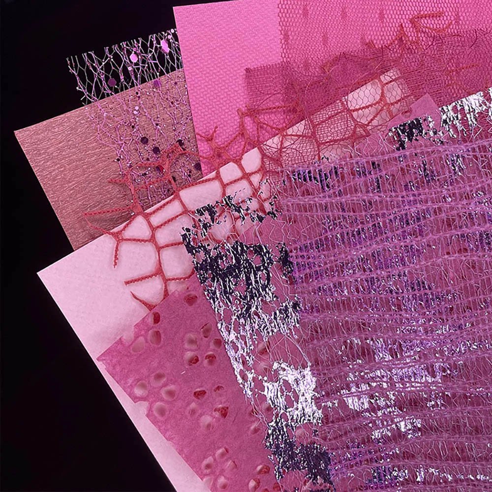
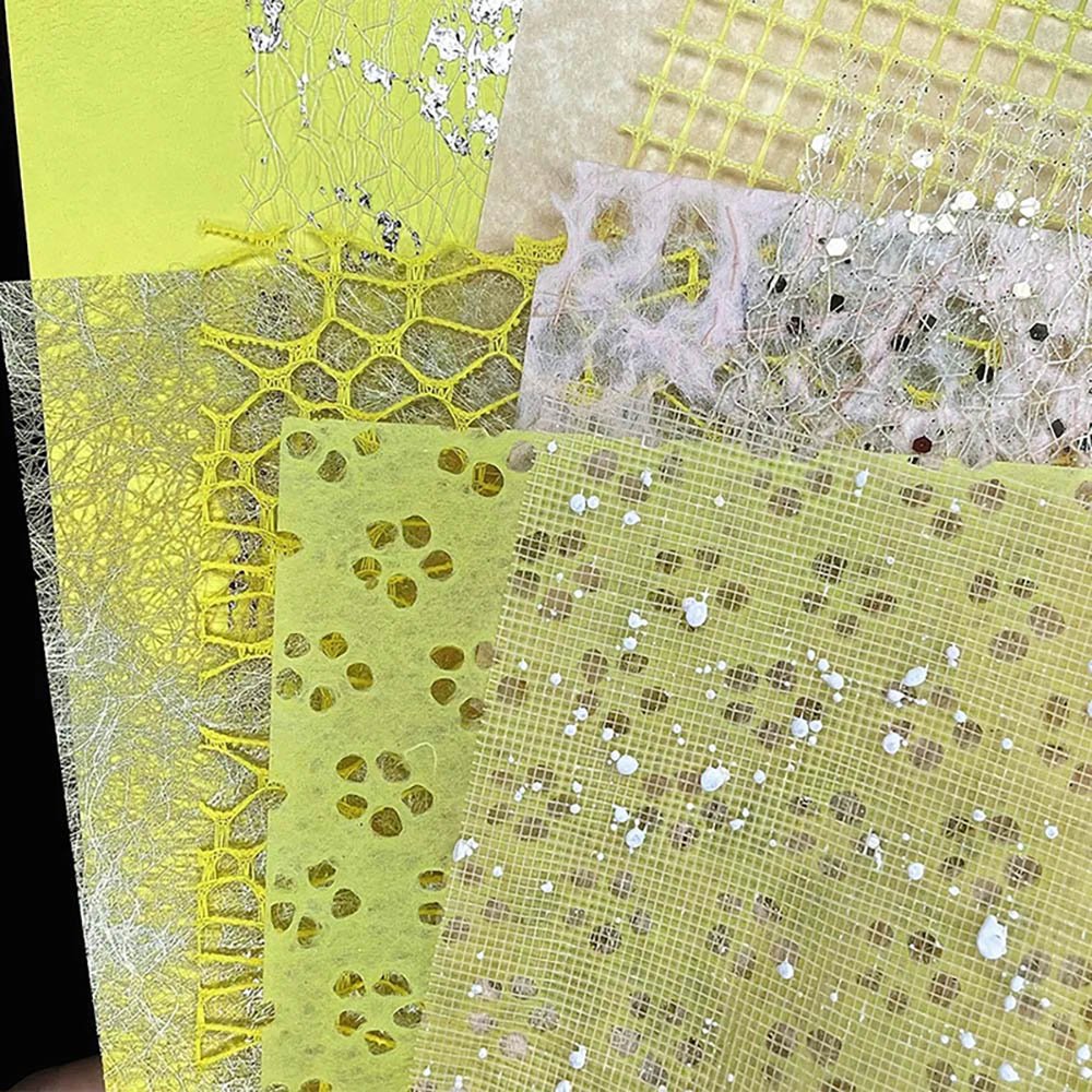
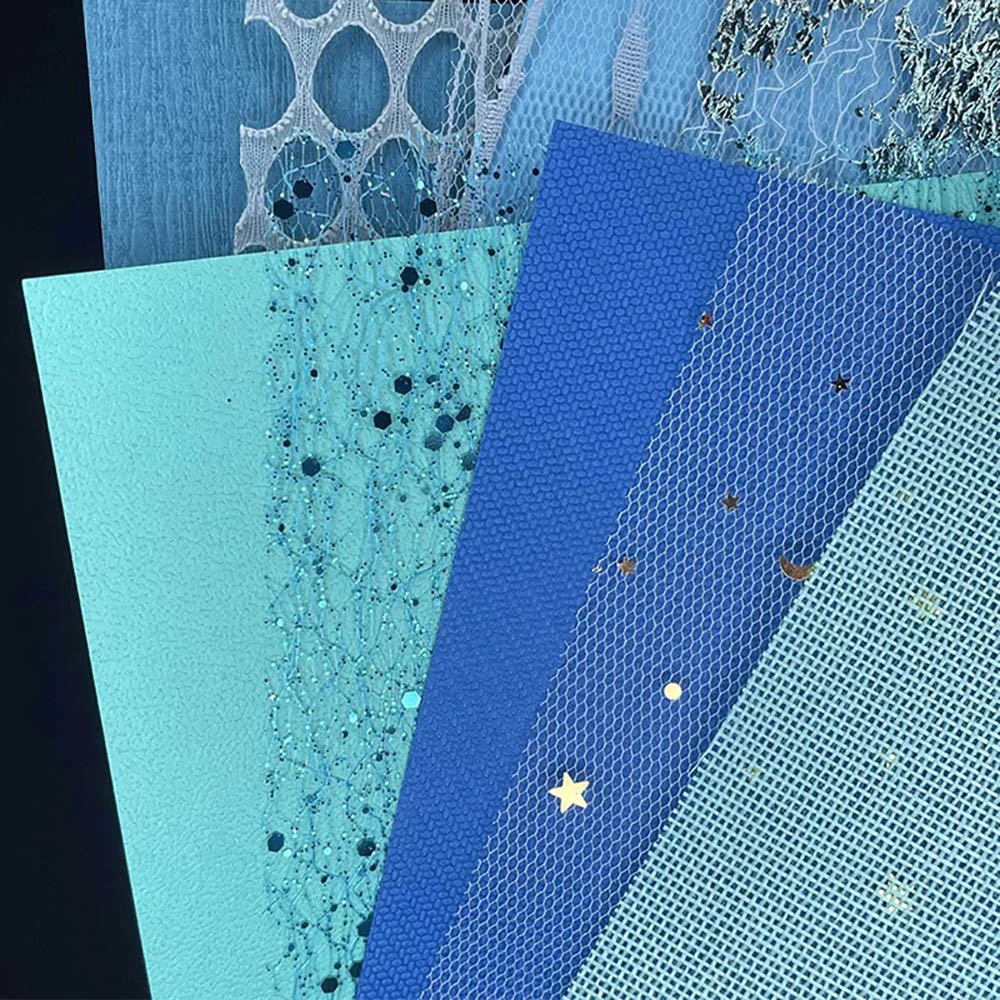
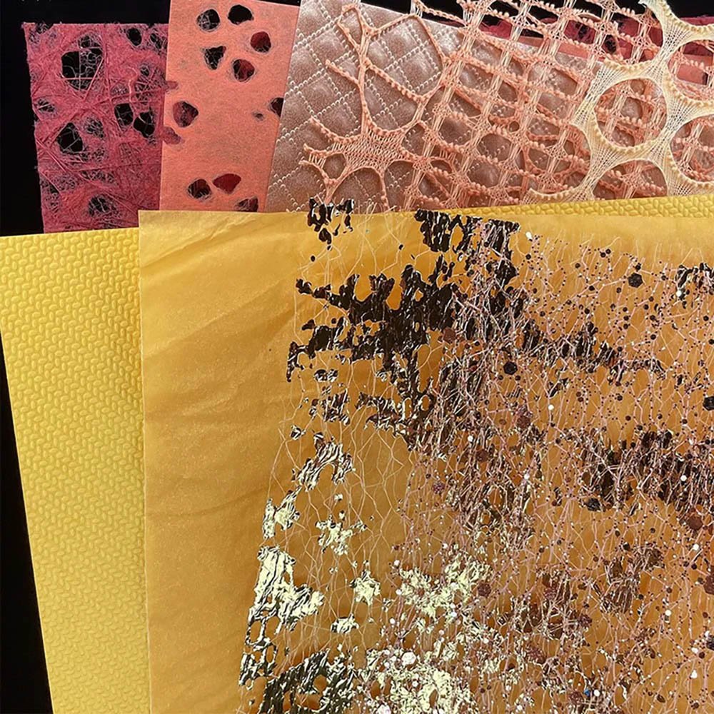
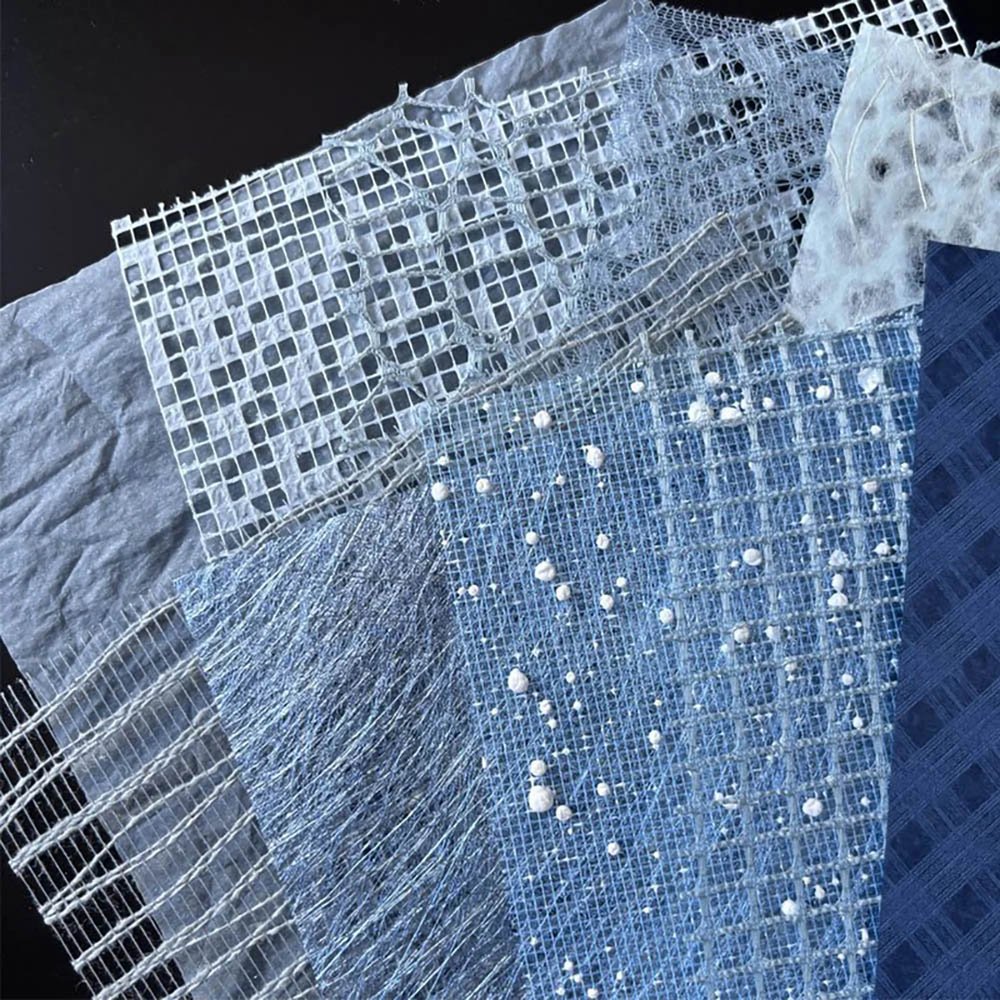
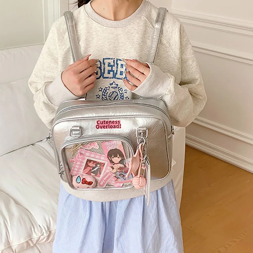
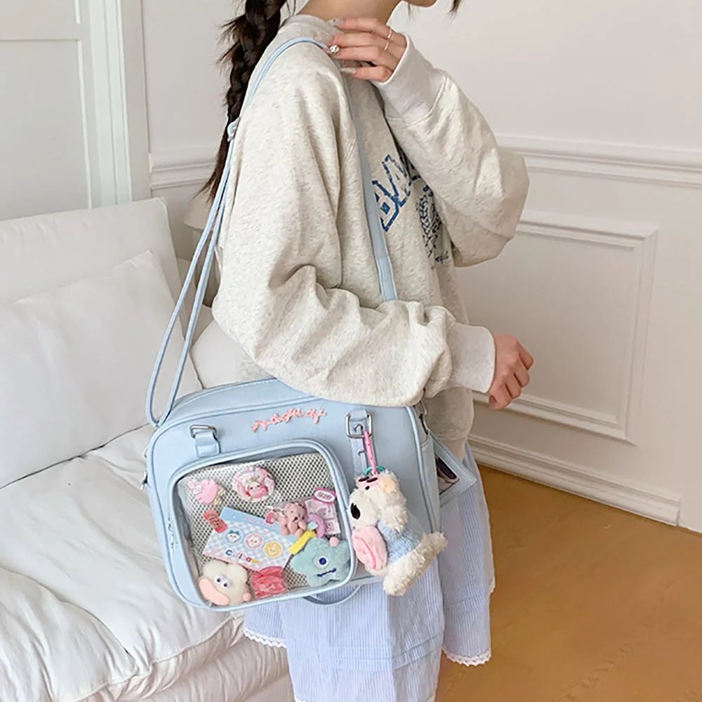
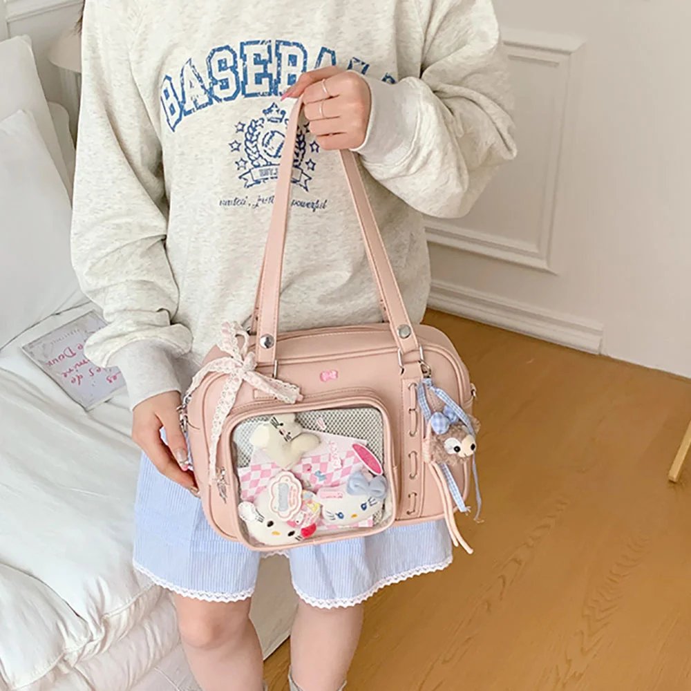
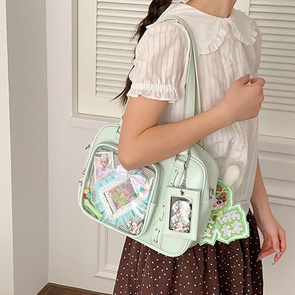
The display window of an ita bag has real thickness inside. A well-finished ita bag usually has three progressive layers of space. The background layer usually holds the base fabric, mesh or background paper, and sets the overall color tone; the main layer, also the most essential one, uses the Insert to display badges, postcards, and other merch; the foreground layer holds acrylic standees, plus hanging chains, lace trim, decorative string lights, and pearl decorations placed right up against the transparent display window. Making good use of depth breaks up the dull flatness.
3. Restrain the Main Color Palette
Merch comes in all kinds of materials, which easily looks messy. When laying out as a beginner, it is recommended to distill 1 to 2 representative colors of the character. Then the choice of base fabric and the pairing of supporting decorations should all revolve around this main color tone, unifying merch of different materials into one coordinated visual system.
5 Must-Learn Ita Bag Layout Ideas for Beginners
Idea 1: Matrix Wall
Best for: Badges of the same size or cards of the same specification.
Layout logic: Arrange in a neat horizontal and vertical grid. To avoid gaps that expose the base board, use a fish-scale overlap, with upper pieces covering lower ones and right pieces covering left ones, so the pins and the base board are completely hidden.
Visual effect: This is the most classic pinning formation, with great impact and a commanding presence, showing your full love for the character.
Idea 2: Center-Stage Radial
Best for: Large standees, large badges, limited-edition shikishi boards + multiple badges of different sizes.
Layout logic: Place the most eye-catching large pieces at the center of the Insert, with smaller badges and charms surrounding them and spreading outward in a radial pattern.
Visual effect: Clear primary and secondary elements with strong layering; ideal for beginners who own a wide variety of merch but only a few of each item.
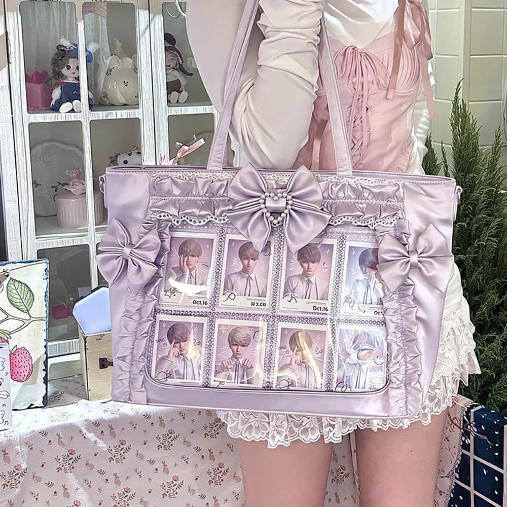
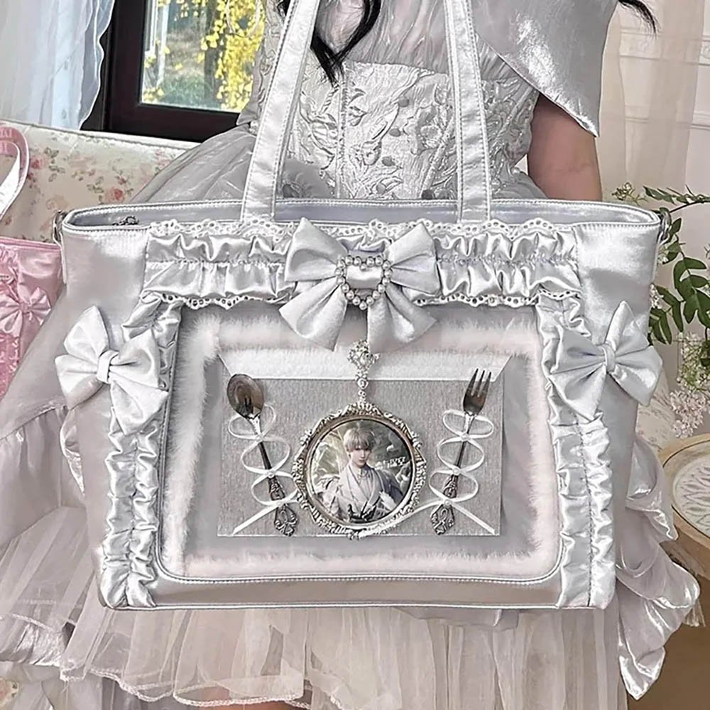
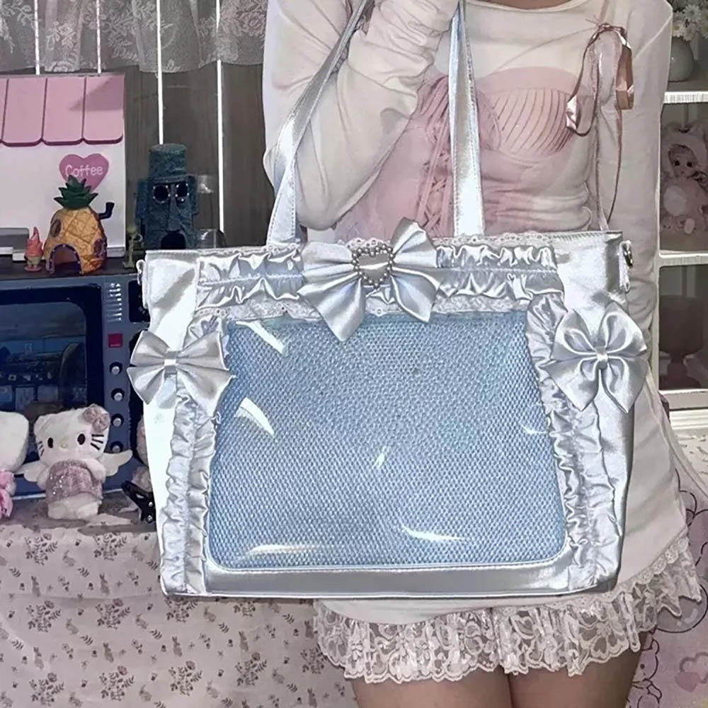
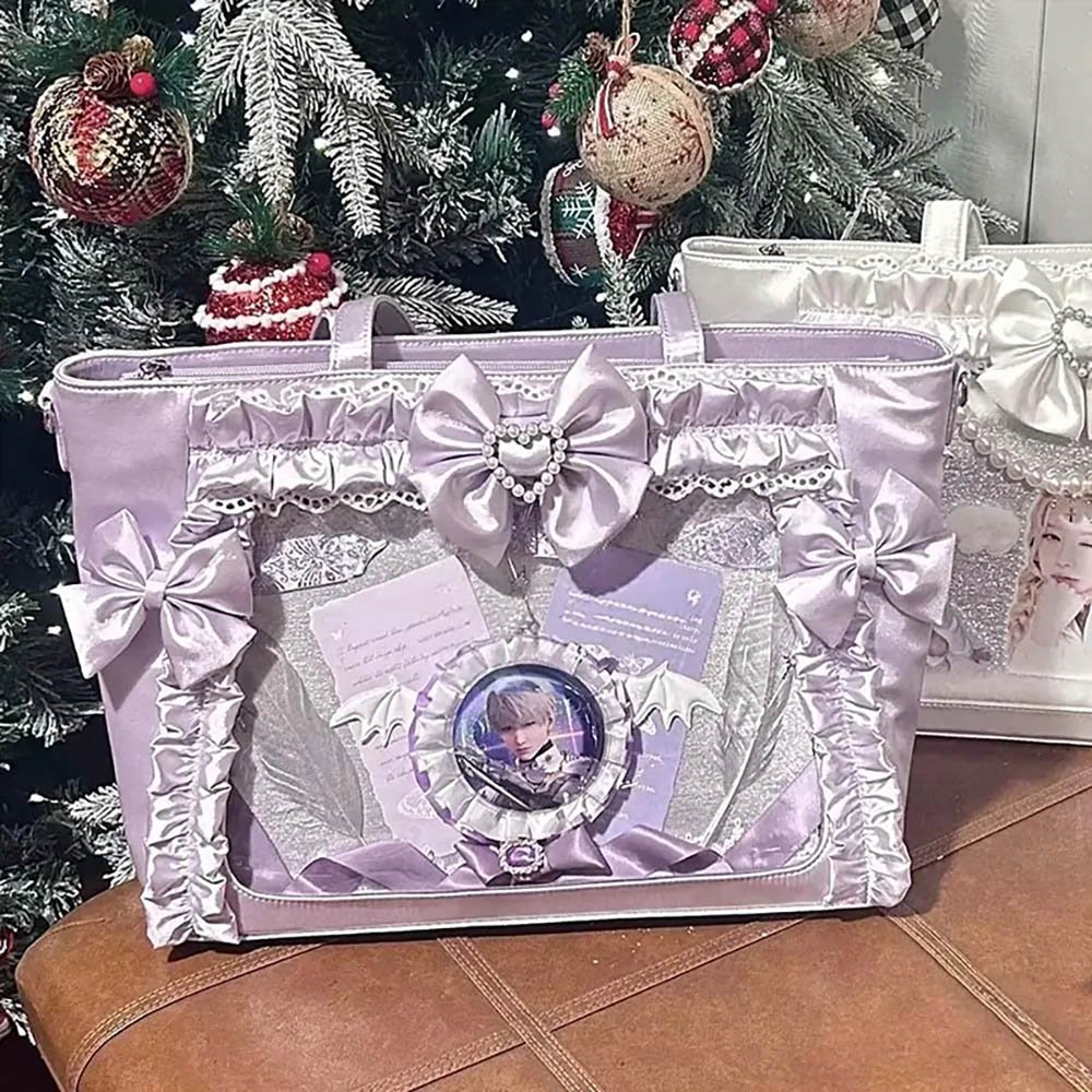
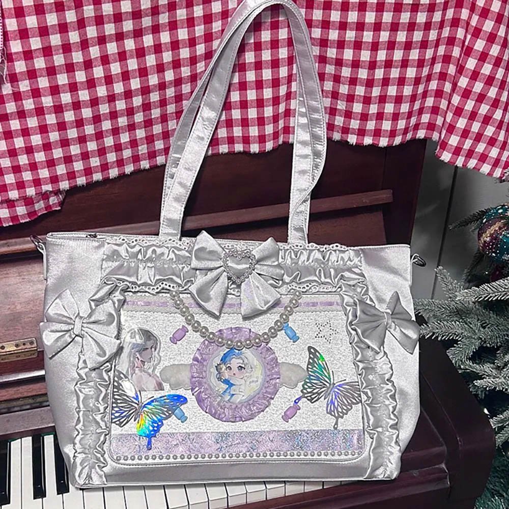
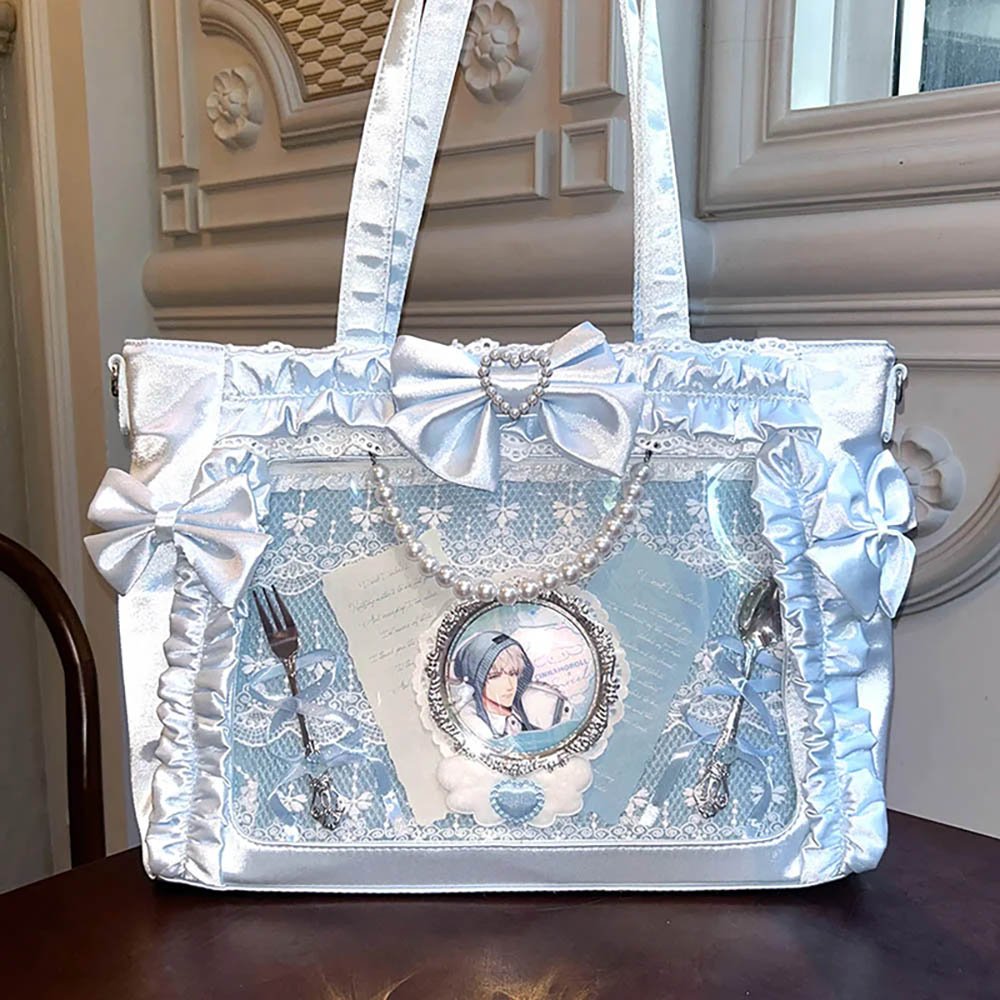
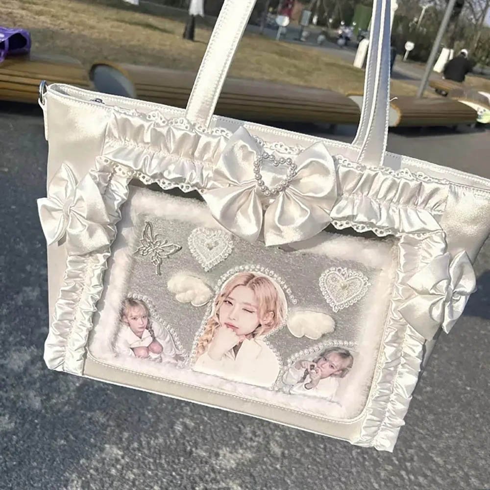
Idea 3: Central-Axis Symmetry
Best for: Two-character couple pairings, two-character contrasts, or two sets of merch of the same specification.
Layout logic: Use the center line of the Insert as the axis, and place merch of similar size and quantity symmetrically on both sides.
Visual effect: The composition is steady with a very strong sense of order, giving a tidy look that is exceptionally comfortable to the eye.
Idea 4: Diagonal Flow
Best for: Card art with story connections, gradient-colored merch, or standees with different poses and movements.
Layout logic: Break away from the stiff, strictly horizontal-and-vertical look by placing the main merch at a slant along the diagonal from upper left to lower right, and filling the blank areas on both sides with small decorations or little slogans.
Visual effect: Lively and full of flowing movement, with great narrative tension.
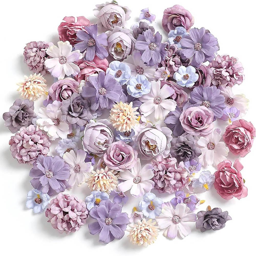
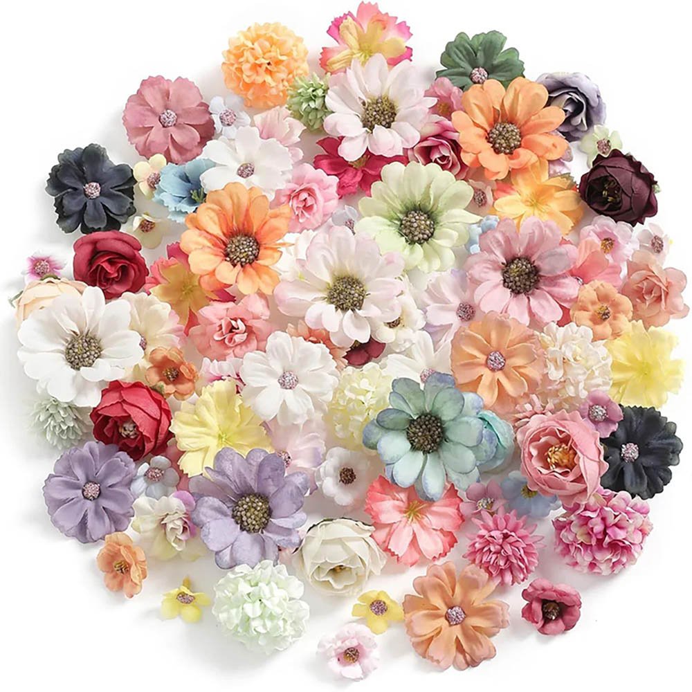
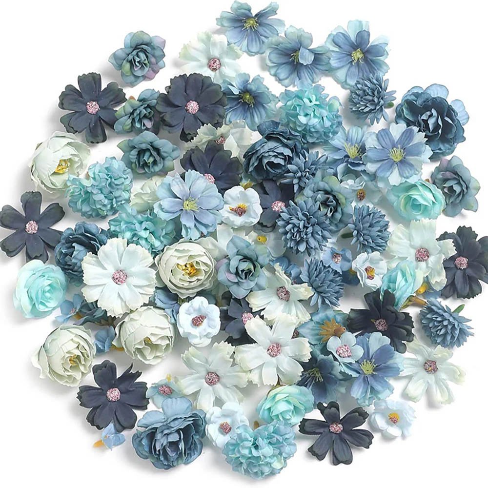
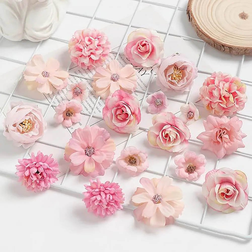
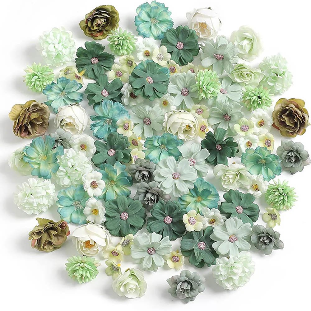
Idea 5: Framed Enclosure
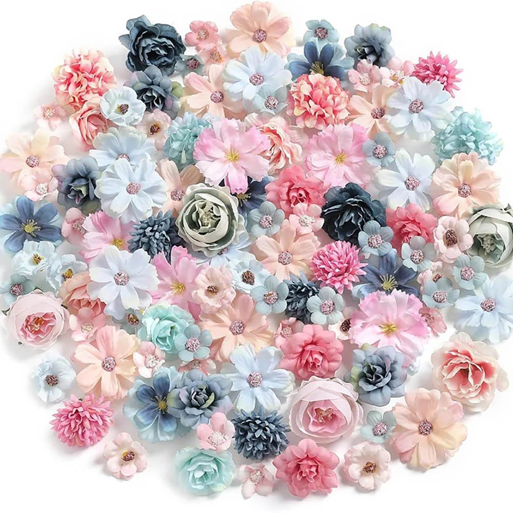
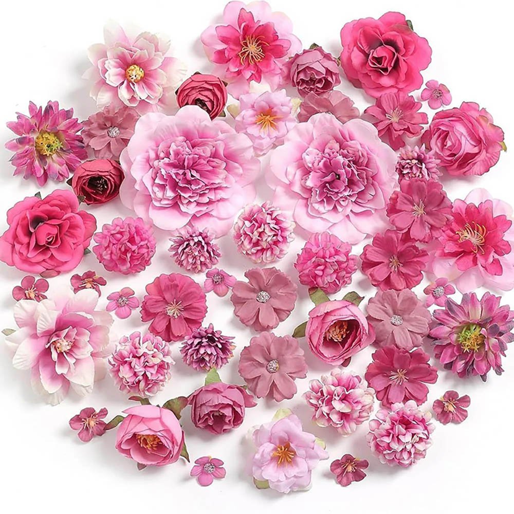
Best for: A small amount of exquisite merch + ita flowers, lace, petals, and the like.
Layout logic: Use lace trim, ribbon garlands, or petals to form a picture frame around the edges of the Insert, leaving space in the middle to display the core merch and avoiding overcrowding.
Visual effect: Vintage and gorgeous, with an enveloping feel; extremely well suited to ita bags for classical, court-style, or cute characters.
Different layout ideas call for different things, and the window shape and structure of the ita bag itself also affect how hard the final result is to pull off. For example, with the Matrix Wall, rectangular or large square windows make alignment easier; with the Framed Enclosure, if the ita bag’s window already has an elegant border design or multiple dividers, it naturally builds the frame boundary for your layout.
Breakdown and Analysis of Player Cases
Players in the ita bag community show a wide range of creativity in their layouts. By analyzing two real cases, we can more intuitively understand how these ideas are applied when actually putting a bag together.
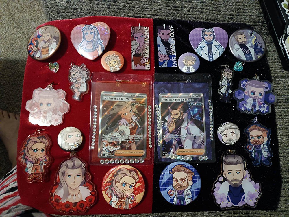
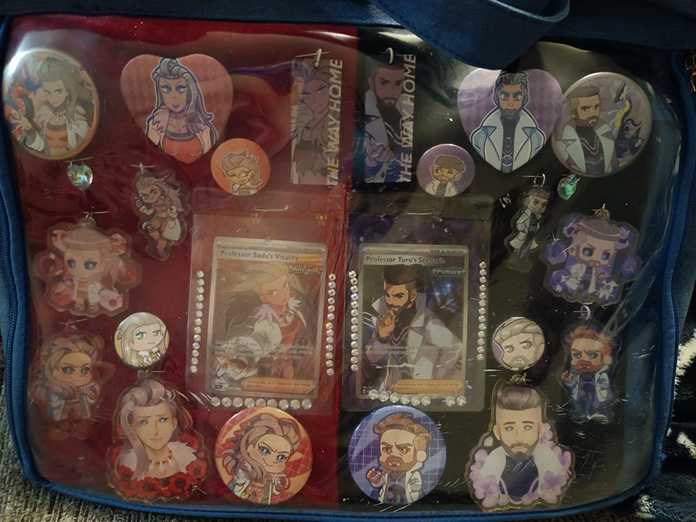
Case 1: Pokémon Scarlet & Violet AI Professors Split-Screen Symmetrical Layout
In this player’s shared ita bag featuring AI Sada and AI Turo from Pokémon SV, the player perfectly combines central-axis symmetry with a clash of colors.
Split-screen base board design: The player sewed the base from shiny red and purple velvet, splitting the Insert in half down the middle and naturally creating a visual divide between the ancient and future color tones.
Symmetrical mirrored distribution: Official badges and cards are arranged symmetrically in the corners of each side, creating a very strong sense of visual balance.
Takeaway: For ita bags featuring duos or characters from opposing factions, there is no need to force the merch together. Using a half-and-half split-screen background fabric together with a symmetrical layout lets you tell a character story with ease.
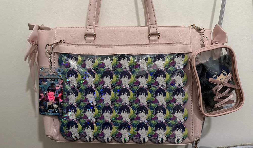
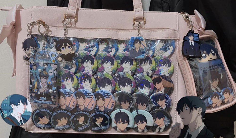
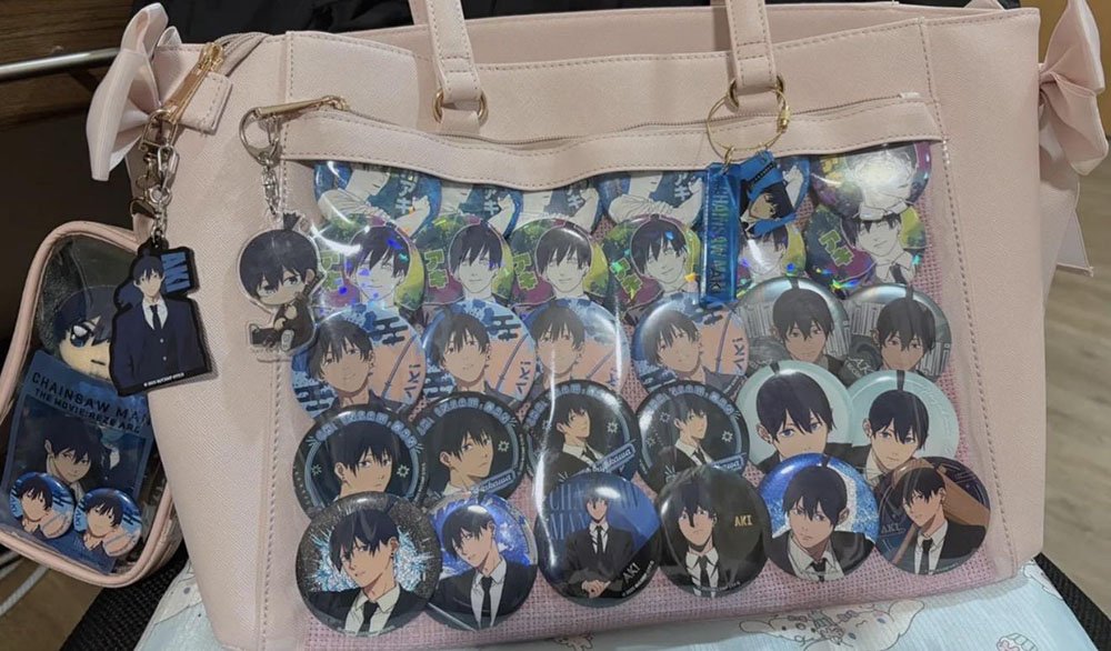
Case 2: Chainsaw Man Aki Hayakawa High-Density Matrix Wall Layout
In this Chainsaw Man ita bag of Aki Hayakawa shown by this player, the pure, ultimate aesthetic of the Matrix Wall is on full display.
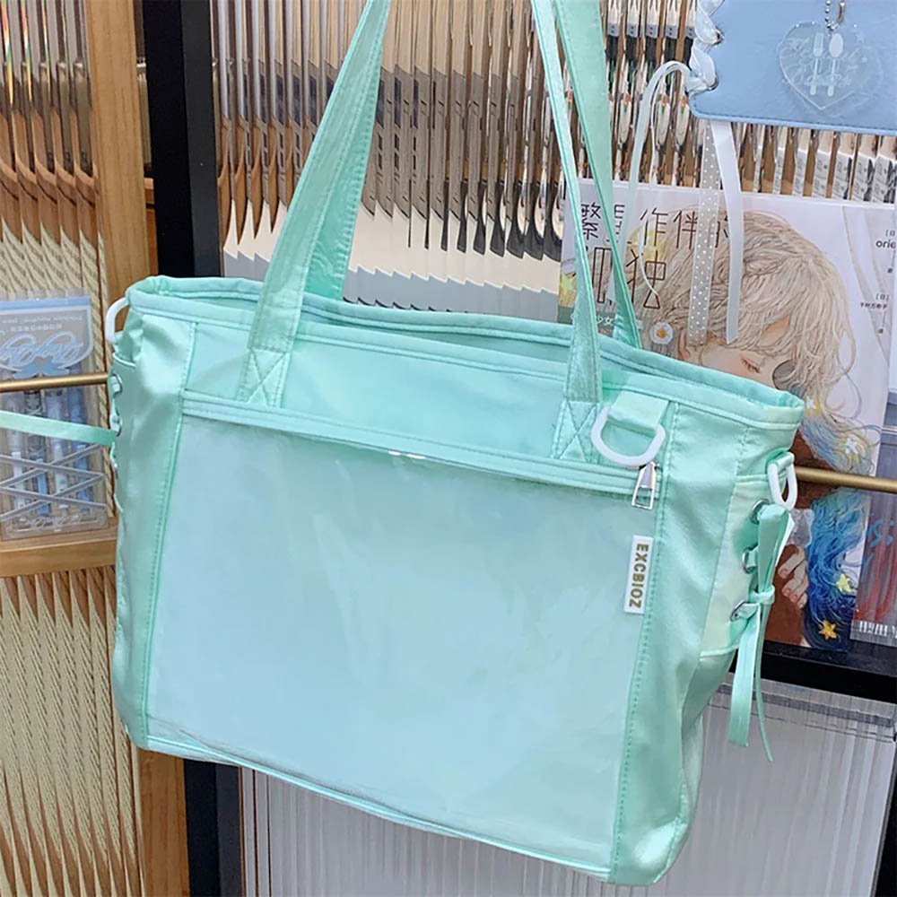
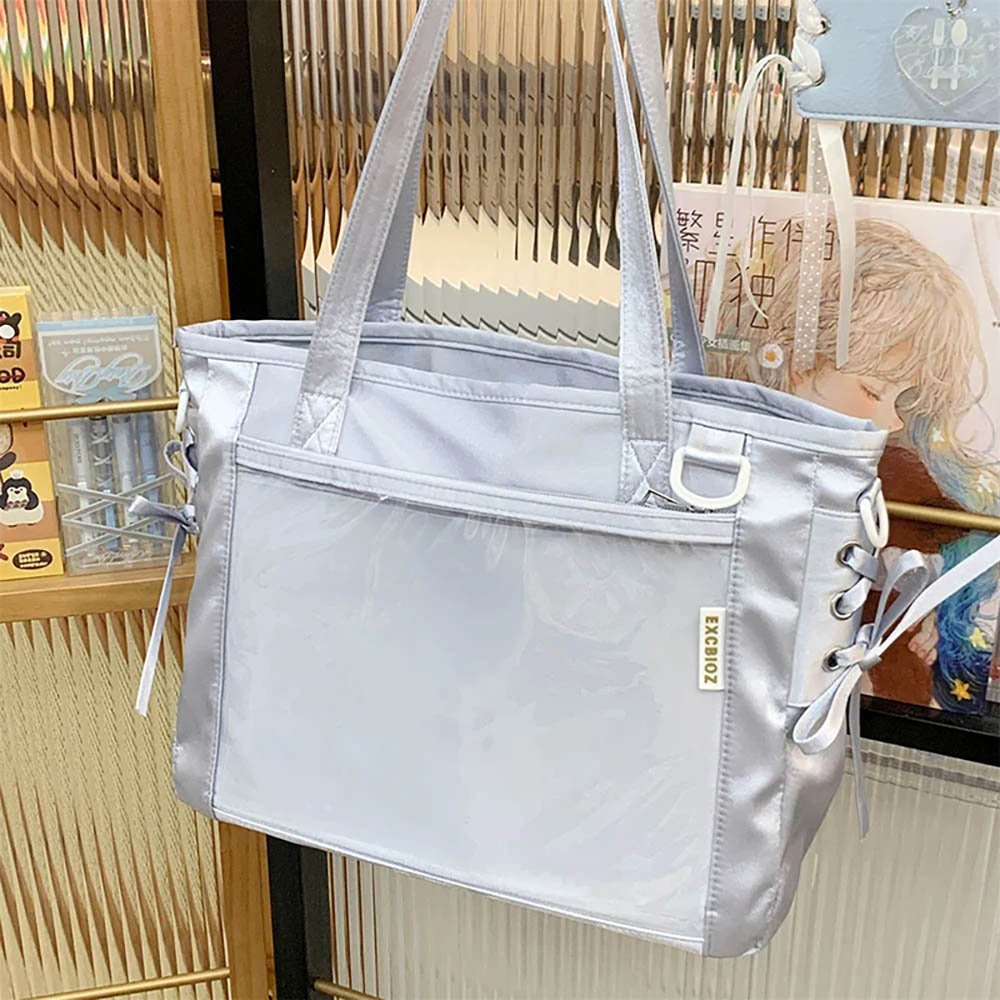
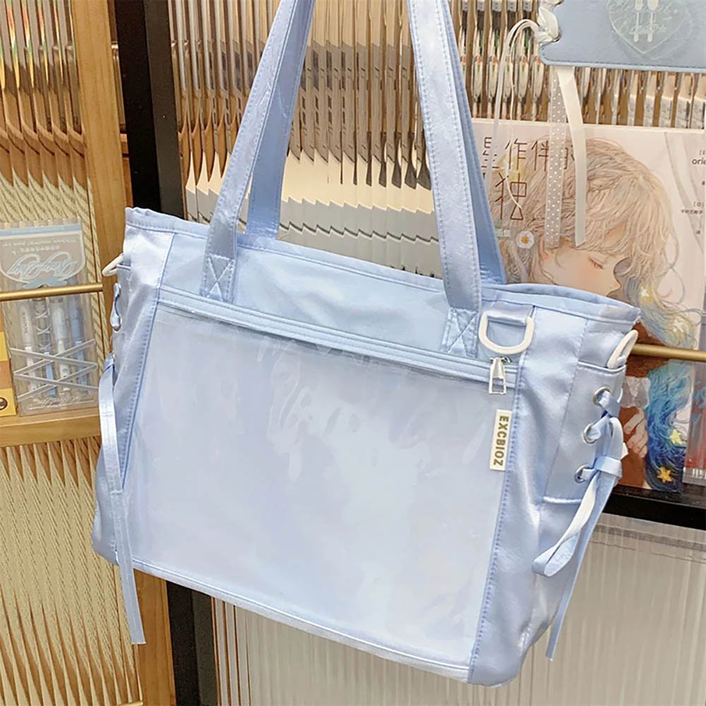
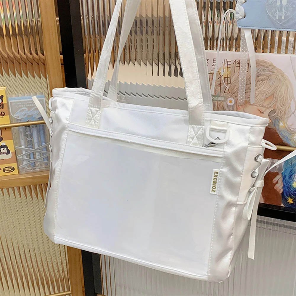
High-density grid array: In the main window, the player used 5 rows and 7 columns of completely identical badges, covering the Insert in perfectly straight lines.
Fish-scale overlap: Badges overlap tightly, with upper ones over lower ones and right ones over left ones, hiding the Insert background and all fixing pins, for a seamless visual impact like metal armor.
Primary and secondary space division: The player kept the transparent main window strictly for a pure matrix of the same image, while hanging a card holder on the left of the main bag and a plush doll in the external pouch on the right. This idea of a unified matrix inside and hanging accessories outside preserves the impact of the matrix in the main viewing area while still accommodating a variety of merch.
In practice with high-density matrices or complex mixed layouts, the Insert’s support strength is critical. If the built-in Insert of an ita bag is too soft, it easily sags or deforms once loaded with many badges. So when choosing an ita bag, pick a high-quality ita bag with a rigid, high-density Insert inside and strong structural support, which keeps your layout flat and undistorted even after long periods of carrying it out.
Pitfall Guide and Detail Bonuses
After mastering the ideas and cases, there are a few more details to watch for in practice to improve the overall quality of your ita bag.
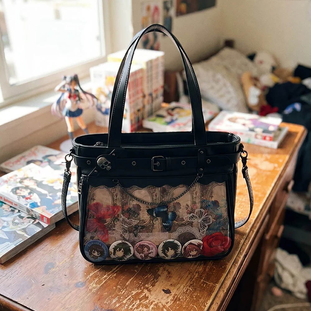
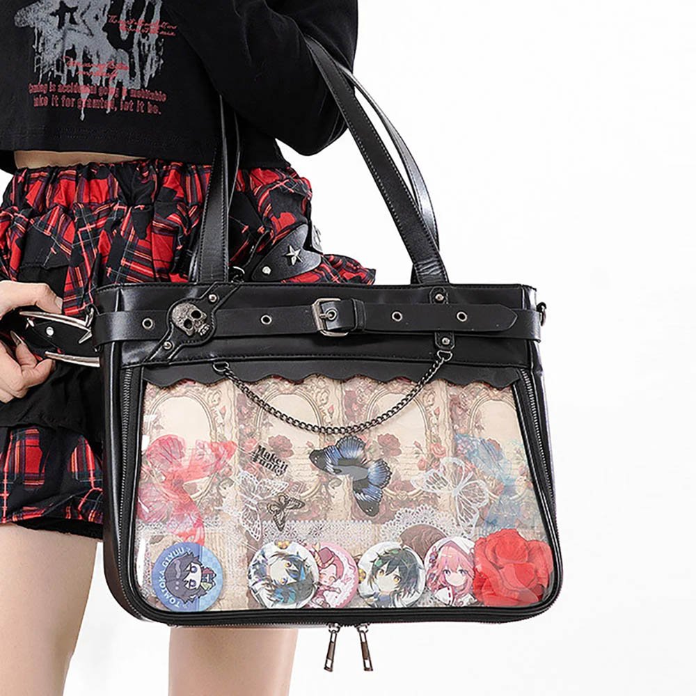
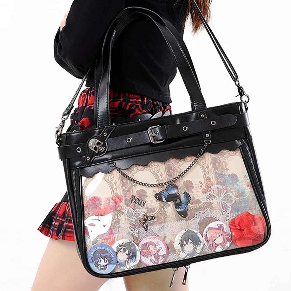
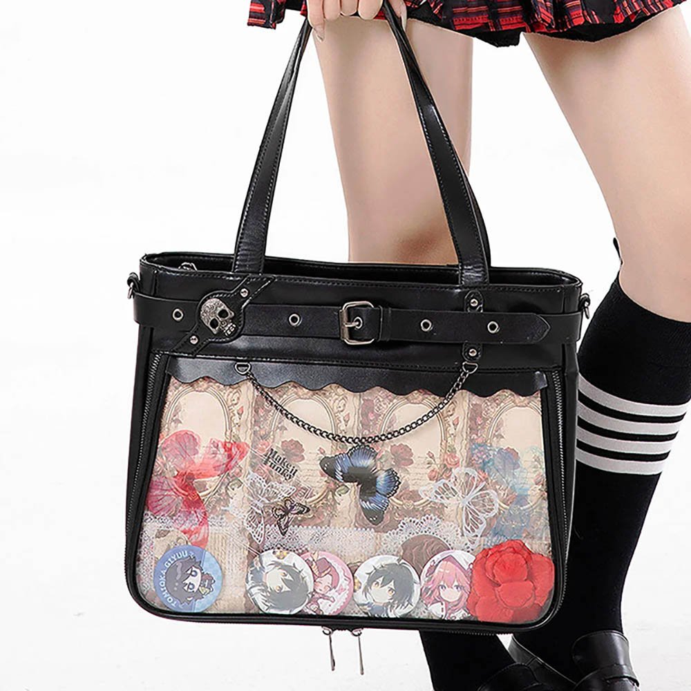
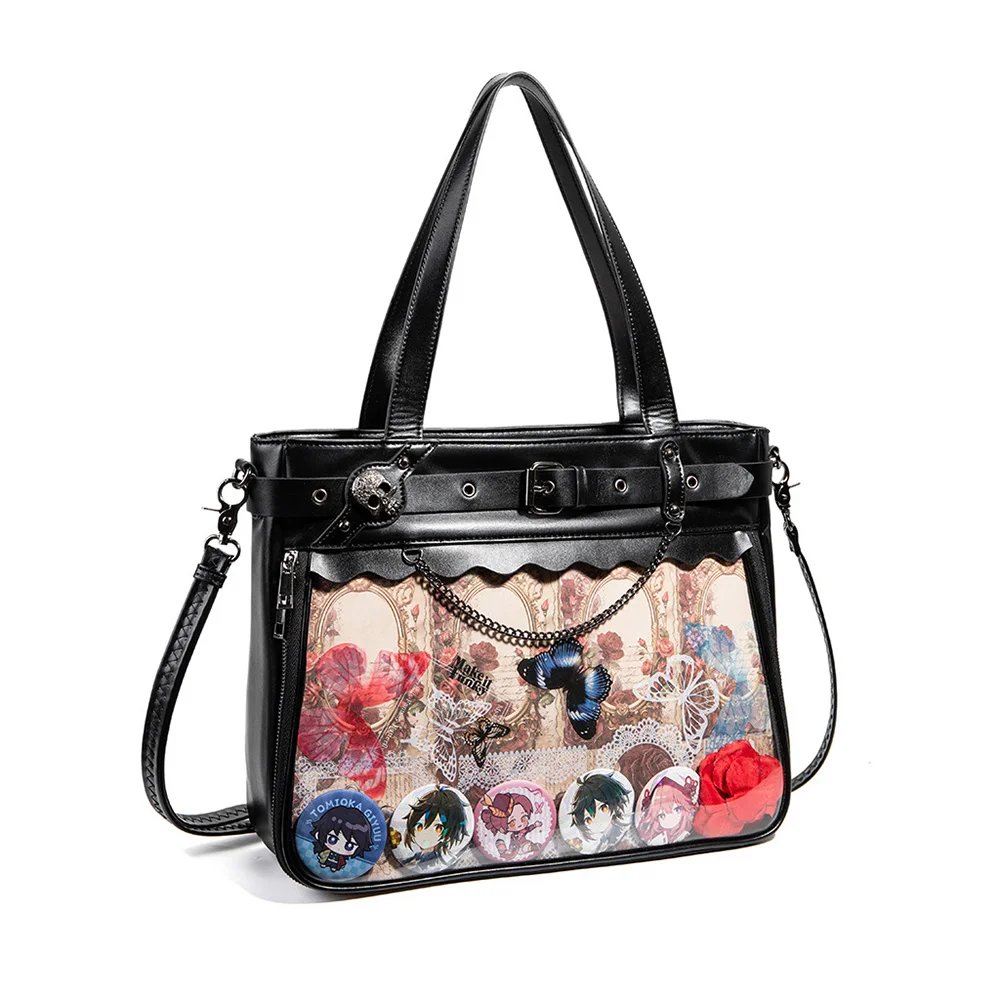
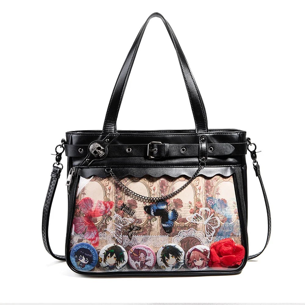
1. Avoid Overcrowding and Leave Room to Breathe
The most common mistake beginners make is cramming all the merch they have collected in at once. Without proper negative space, even the prettiest merch looks messy. Reducing the count by 1~2 pieces and filling gaps with a little gold-glitter background paper or a delicate small mat can actually highlight the refinement of the main pieces.
2. Anti-Drop Security and Mark-Free Fixing
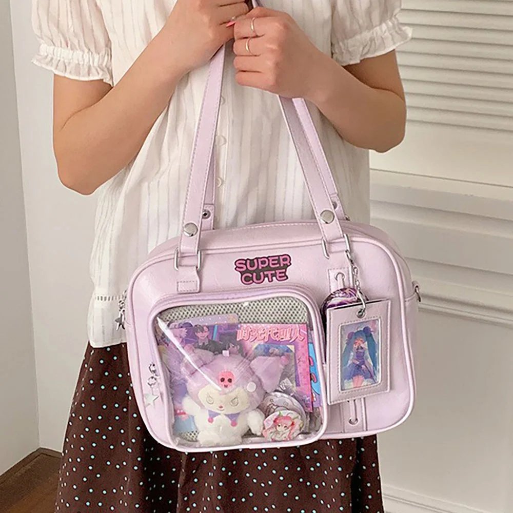
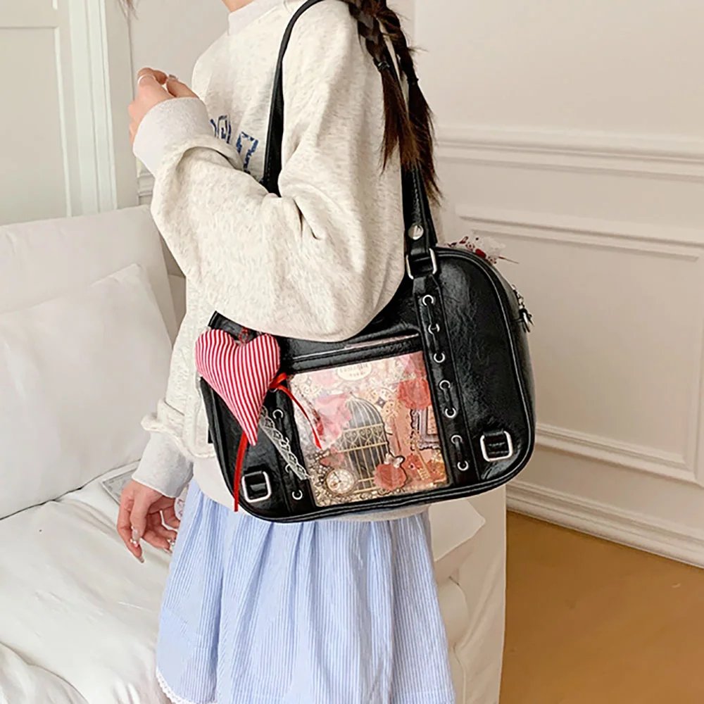
When you take your ita bag out and about, it sways as you walk. If badges are held only by pins, they easily tilt or even fall off. It is recommended to use mark-free tape on the back of the Insert to help secure the badge bases, or to choose an Insert system with dual Velcro fixing, to keep the layout formation stable.
3. Use Layered Padding to Enhance the 3D Effect
When handling standees or back-row badges, you can place foam pads of a certain thickness behind the merch. Raising the back-row pieces slightly creates natural light and shadow and greatly enhances visual depth.
Final Thoughts
The core of ita bag layout is always your love for the character and your own aesthetic understanding. Whether you pursue the ultimate impact of a same-image matrix or a handmade, warm framed mixed-media layout, as long as you master the placement of the visual focal point and the coordination of the overall color palette, you can create a one-of-a-kind display space with the merch in your hands.
FAQ
Where should beginners start when facing a pile of merch for their ita bag?
Before you begin, master three composition principles. First, pick 1~2 large hero pieces as the center spot to establish the visual focal point. Second, build depth with a background layer, a main layer of the Insert, and a foreground layer. Finally, unify the base fabric and supporting decorations around 1~2 representative colors of the character.
What kinds of merch and effects suit each of the 5 ita bag layout ideas?
The Matrix Wall suits badges or cards of the same specification and has extremely strong impact. The Center-Stage Radial suits large standees or shikishi boards paired with badges of various sizes, with clear primary and secondary elements. Central-Axis Symmetry suits couple pairings or two sets of merch, with a very high sense of order. Diagonal Flow suits story-linked card art or gradient-colored merch, full of narrative tension. Framed Enclosure suits a small amount of merch plus lace and petals, for a vintage and gorgeous look.
How do you avoid gaps that expose the base board when making a Matrix Wall layout?
Use a fish-scale overlap, with upper pieces covering lower ones and right pieces covering left ones, to completely hide the pins and the base board, resulting in a tight, seamless look.
What tips help avoid a crowded, messy ita bag layout?
Crowding and mess usually come from a lack of negative space and secure fixing. Reduce the amount of merch appropriately and fill gaps with gold-glitter background paper to leave room to breathe. Use mark-free tape or an Insert with Velcro on the back to keep pieces from swaying and falling off when you’re out and about. Finally, use foam pads to raise back-row merch for a stronger 3D effect.
Get Inspired on Instagram
Looking for inspiration for your next ita bag? Follow us on Instagram for more ita bag decoration ideas, styling inspiration, and creative ways to showcase your favorite pins, charms, and collectibles. We regularly share different styling ideas to help you discover new ways to decorate and personalize your ita bag.