How to Arrange an Ita Bag Beautifully
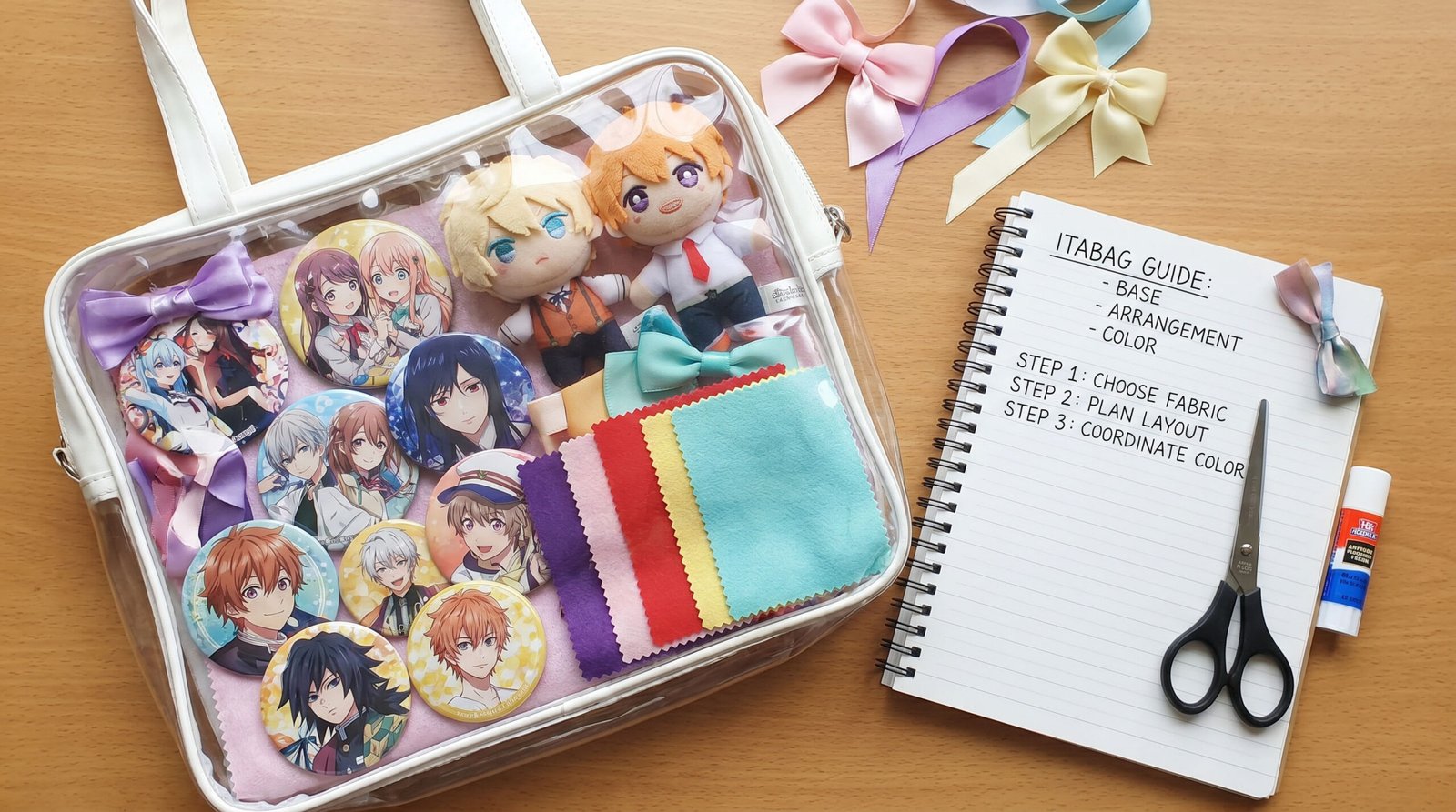
Table of Contents
I. Introduction
- Why do some people create stunning ita bags with the same badges while others end up with a messy look?
- The number of badges isn’t the key to a beautiful ita bag — the three core elements are the base fabric, layout, and color scheme.
- By breaking down these three dimensions, this guide helps you build a reusable methodology for arranging your bag.
Many collectors gather a large number of badges and want to put them all on their ita bag, but the result often falls short of expectations and can even look chaotic. In fact, the visual appeal of an ita bag does not mainly depend on the number or style of badges. The real key lies in the base fabric, layout, and color scheme. So how can you arrange an ita bag to achieve the effect you want? This article will analyze these three aspects and help you develop a thought process for creating stunning ita bags.
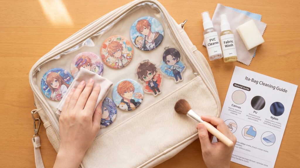
II. Preparation Before Arranging Your Bag
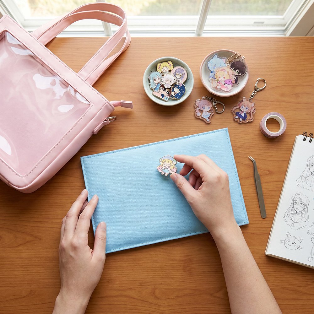
1.Define Your Style: Before arranging your bag, determine the style you want. Common styles include minimalist, luxurious,“kawaii”doll-style, badge-background-focused,daily-commute-friendly,and color-theme-oriented. Different styles have different requirements for base fabric, layout, and color scheme. Only after defining your style can all subsequent decisions have a clear direction.
2.Simulate the Layout: Have a mental preview of the overall layout. Here are two commonly used methods:
- Badge-board Layout: Use the bag’s transparent layer or a display board to simulate the layout.
- Digital Layout: Use your phone or computer to design the composition, allowing continuous adjustments and a preview of the overall effect until it looks as you want.
III. The Base Board: The Overlooked First Step That Determines Success or Failure
1. What Is the Purpose of a Base Board?
A good base board does more than just secure your merchandise. Through the contrast of material and color, it helps the artwork on badges stand out and creates a sense of depth. On the other hand, the wrong background color can cause the merchandise to blend into the background, making the entire display look flat and visually dull.
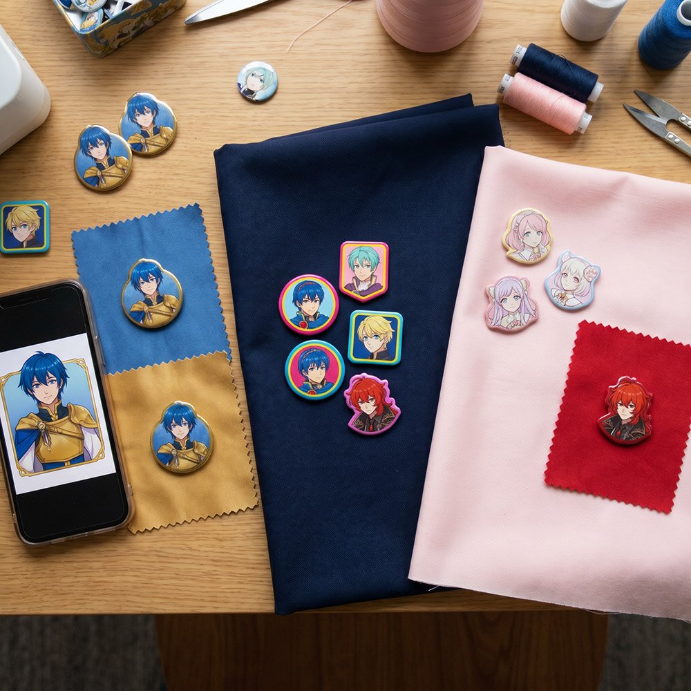
2. How Do You Choose the Color of the Base Fabric?
- Take colors directly from the character artwork: Extract the character’s primary color, secondary color, or scene color as the base fabric color. This naturally creates harmony with the colors of the merchandise.
- Dark-colored base fabrics (black, brown, navy blue): The most versatile option. Dark colors naturally create a sense of visual contraction, maximizing the contrast around colorful badges and making them stand out. They are also highly resistant to visible dirt, making them ideal for daily use.
- Light-colored base fabrics (white, pink, beige): Dreamy, sweet, and elegant. Suitable for otome-style and feminine characters. However, they require a very careful layout. If spacing is not handled well, the overall arrangement can easily appear loose and scattered.
- Common Mistake to Avoid:Avoid large areas of the same color as the character. For example, if the character’s hair and outfit are bright red, do not use a bright red base fabric. Otherwise, the merchandise will blend into the background, the character will visually disappear, and the entire ita bag will look blurred together.
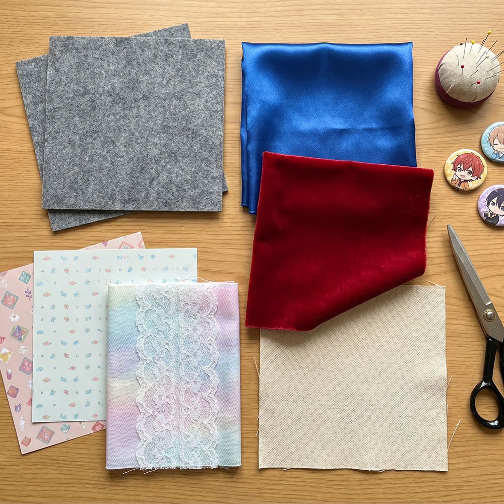
3. How Do You Choose the Material of the Base Fabric?
- Non-Woven Fabric:This material is thick with a slightly fuzzy surface texture. Repeated insertion and removal of badges leaves almost no visible holes, and the fabric is resistant to deformation. It can keep badges and acrylic stands firmly and evenly secured. The downside is that it may become soft and lose structure after long-term use, and its texture can feel somewhat inexpensive. It is suitable for players who use a large number of badges and fill the entire display area.
- Satin Fabric:Satin has a luxurious sheen, a smooth surface that is easy to work with, excellent drape, and a subtle reflective effect. It can significantly enhance the overall texture and premium appearance of an ita bag. However, badge pins leave very noticeable holes once inserted.
- Velvet Fabric:This material can effectively hide badge pinholes and provides excellent grip, preventing badges from slipping due to gravity. However, it easily attracts dust and lint. One advantage is that velvet is available in a wide variety of colors, allowing you to freely choose colors that match different styles.
- Canvas:Canvas is highly versatile, extremely durable, resistant to damage, and breathable. It has a strong texture and produces a premium look in photographs. However, the material is relatively soft and may sag or wrinkle when covered with many badges. It pairs particularly well with Japanese-inspired and school-style themes.
- Lace:Lace must be used together with a solid-colored base fabric and cannot serve as a base fabric on its own. It is mainly used to decorate the background or edges of the display area. It adds visual layers and decorative details to the background, creating a more luxurious overall appearance.
- Background Paper / Decorative Paper:This option allows for personalized customization and can recreate almost any scene or theme. However, paper is vulnerable to water damage. If water enters the display window, the paper can become blurred, warped, or develop bubbles. In addition, paper has no elasticity, so badges can only be attached using hot glue, double-sided tape, or by forcing pins through the material.
IV. Layout: How to Arrange Badges Neatly and Beautifully
1. Core Principle of Layout
Start by identifying the main character, then arrange the others around it. Choose your favorite badge or the largest one as a “visual anchor”, placing it at the center or at the golden ratio point. Arrange the supporting badges and accessories around it. Pre-arrange everything before securing them. Lay out all badges first, take a photo to confirm positions are accurate and not tilted, then start the final placement.
2. Detailed Arrangement Methods
- Symmetrical Arrangement: Place the main item at the center, with other badges distributed symmetrically on either side or top and bottom. This creates a neat and orderly visual effect, making it easy for beginners to achieve.
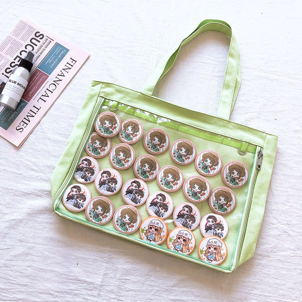
- Full-Coverage Arrangement: Arrange badges densely like a formation, leaving only minimal spacing between them. This fills the display window completely, maximizes the number of badges shown, and creates strong visual impact. Ideal for players with a very large badge collection.
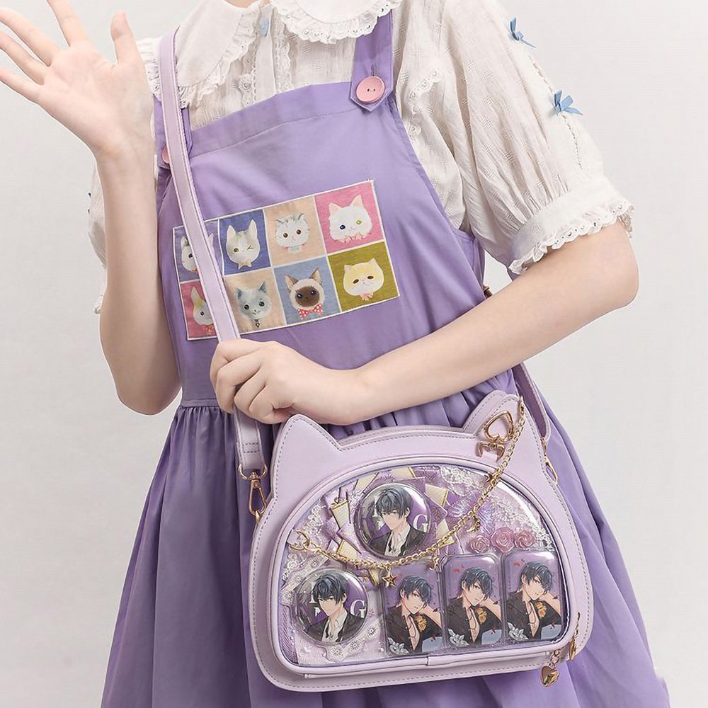
- Radial Focus Arrangement: The visual center is a single standout item, with surrounding badges or accessories radiating outward in a circular or V-shaped pattern. This creates depth and a clear visual focus without looking cluttered. Suitable for those who want to highlight a favorite badge.
- Scene Recreation Arrangement: Break traditional layout rules. Directly reference the original anime or official poster composition. Treat acrylic stands as characters, badges as background elements, and add miniature fences, artificial flowers, or branches to turn the display board into a tiny diorama stage, creating a storytelling and immersive layout. Suitable for advanced enthusiasts with strong DIY skills who want to express atmosphere and narrative.
3. Filling Techniques When Badge Count Is Low
Insufficient badges is a common problem for many ita bag enthusiasts. Many highly praised bags do not rely on dense coverage but instead use strategic filling and empty space to enhance overall completeness.
- Concentrate a few badges in the center and radiate outward. If there aren’t enough badges, increase spacing or arrange them in a diamond/offset pattern to cover a larger area.
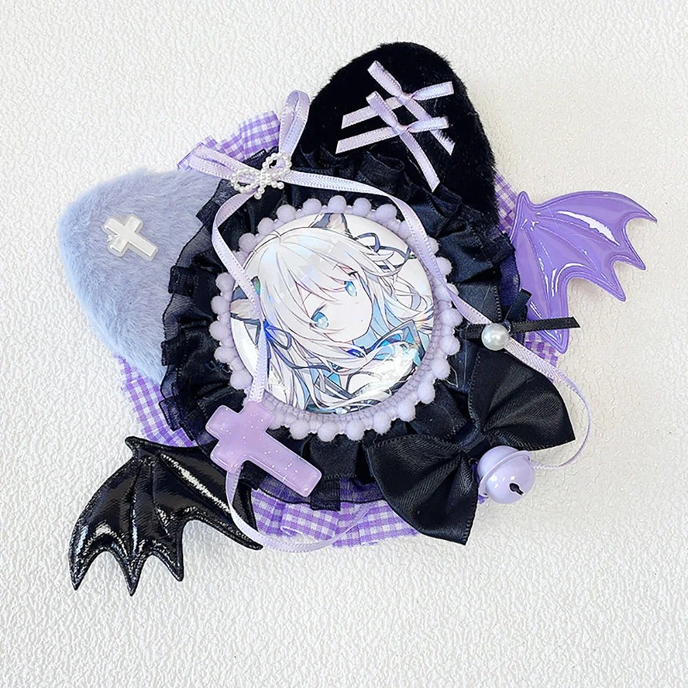
- Use large-sized merchandise as a visual centerpiece to occupy space and reduce the number of badges needed. Add lace or satin badge mounts, or wrap ribbons around them to increase the visual footprint of individual items.
- Fill gaps with everyday accessories. Flowers, pom-poms, ribbons, and tulle not only fill empty spaces but also enhance the overall visual richness.
4. Creating Depth: Combining Flat and 3D Elements
Excellent ita bag designs are not limited to flat arrangements. Use layers and spatial elements to achieve a more three-dimensional display effect:
- Bottom layer: Flat elements (background paper, washi tape, lace)
- Middle layer: Semi-3D elements (badges, keychains)
- Top layer: Fully 3D elements (acrylic stands, plushies)
V. Color Scheme: Making the Whole Look Cohesive
A good ita bag requires not only thoughtful layout but also harmonious color coordination. If layout shapes the structure, color defines the atmosphere and visual impact.
1. First Rule of Color: Start from the Character’s Palette
- Extract the character’s official colors, typically including a primary color, a secondary color, and an accent color.
- Classic formula: 60% primary color (base fabric or large background), 30% secondary color (major accessories for balance), 10% accent color (small contrasting details).
2. What if Badge Colors Don’t Match? — “Color Matching Method”
Many fans who collect badges from multiple works encounter this problem: one character is red, another is green. What to do?
Blur the character distinction and focus on color. Instead of sorting by series, sort by color palette. Collect all badges with light blue, white, or silver tones and arrange them on a single cool-toned bag. The result will look cohesive and surprisingly harmonious across different works.
3. Coordinate Accessories with Badge Colors
When choosing accessories, consider not only their style but also their color’s relation to the character’s main palette. Avoid random selection. Every accessory should have a reason to exist within the chosen color scheme.
4. The Bag Color Is the “Zero Layer” of the Color Scheme
The bag itself is part of the visual composition!
Dark-colored bags (black, dark red, navy blue, brown): Calm and sophisticated, suitable as a quality frame.
Light-colored bags (white, pink, sky blue, beige): Eye-catching and sweet, but if your badges are dark-toned, placing them on a pink bag can appear extremely jarring. Check your badges before buying the bag.
VI. Real-World Case Studies: Why These Ita Bags Look Amazing
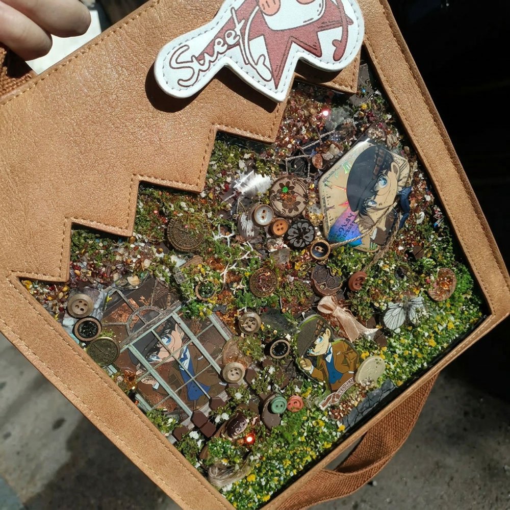
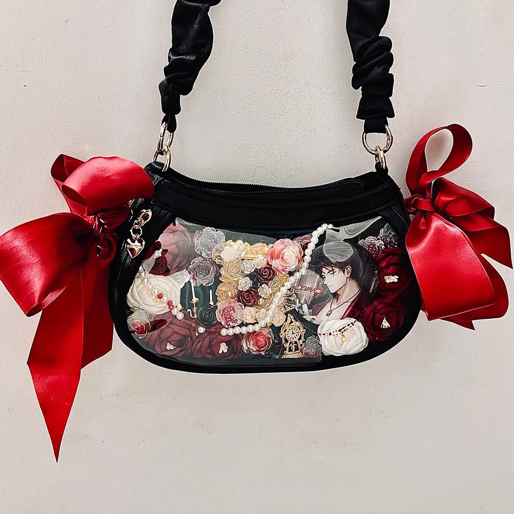
1. Conan — British Style
This bag breaks away from traditional stiffness, creating a miniature 2D stage inside the bag using accessories.
- Vintage base fabric: Bold use of decorative paper with stamped aging effects. This instantly enhances the nostalgic, mysterious, and school-themed vibe of Detective Conan.
- Narrative layout: “Scene-based composition” using miniature Big Ben, clocks, keys, and fences to recreate a tiny scene within a limited display space. Badges remain the absolute centerpiece.
- Color and material harmony: Strict adherence to British color schemes. Dried flowers and buttons are used as accents, creating a refined, high-end look.
2. Perfect Card Scene Recreation
This bag is a classic extension of the official aesthetic. Color is taken from the character card, referencing the official artwork layout to create a luxurious and sophisticated look.
- Multi-layer base fabric solves key problems: Three layers of silk solve transparency and softness issues. The dark green is extracted from the official card, creating a strong, steady background with the silk providing high-end sheen.
- Official card layout reproduction: Layered “outside-in” paste method based on the official visual composition. Outer circle uses fabric flowers to frame, guiding the viewer’s eye to the main central badge. Strong visual flow creates a sense of prestige.
- Classic contrasting colors: High-saturation red and green contrast, with green background and red badges, catching the eye without looking garish.
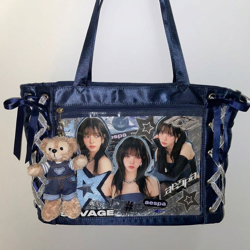
3. Modern Cool-Toned “Material Clash”
This bag shows a unique material layering aesthetic, using multiple fabrics and elements to create rich depth and visual impact.
- Three-layer base reaction: Bottom PVC provides support, middle silver foil adds optical effects, top layer of blue denim enhances texture depth. Together, they form a modern, street-style look.
- Centralized radial layout: Idol photos or large cards placed at the center, with accessories radiating outward, creating a clean and commuter-friendly style.
- Cool-toned aesthetic: Blue and silver perfectly harmonized to create a restrained, elegant, and intelligent visual impression.
VII. Conclusion
The base fabric sets the tone, the layout determines the structure, and the color scheme defines the soul. These three elements complement each other and are all indispensable.
There is no absolute standard for arranging an ita bag, and no hierarchy of value. As long as you put thought into the base fabric, use your brain for the layout, and exercise restraint in color choice, your bag will undoubtedly look stunning. Moreover, an ita bag is a work of art that can always evolve. As your collection of badges grows, your bag grows with it.
Which character’s bag are you currently preparing? What challenges have driven you crazy during the arranging process? Feel free to share and discuss in the comments!
FAQ
Why Do I Have So Much Merchandise, Yet My Ita Bag Still Doesn’t Look Good?
Having more merchandise does not automatically create a better visual effect. Many beginners tend to put every item they like into one ita bag, which often results in a lack of focus and a cluttered appearance. A good-looking ita bag depends more on the following factors: a suitable backing fabric, a clear arrangement logic, and a consistent color scheme. Rather than adding more merchandise, it is better to establish a visual focal point first.
What Backing Fabric Is Most Recommended for Beginners?
If this is your first time making an ita bag, non-woven fabric is the most recommended option. It is inexpensive, resistant to deformation, does not show obvious pin holes after inserting pins, and makes it easy to secure badges. These advantages make it the most stable and beginner-friendly choice with the highest margin for error.
What Is the Most Common Mistake That Ruins an Ita Bag?
The three most common situations are: cramming all merchandise into the bag, using a backing fabric that is the same color as the character and causes the subject to disappear, and using more than three main colors in the design. As long as you avoid these three issues, the overall appearance of your ita bag will usually turn out well.
Why Does My Ita Bag Always Look Messy?
This is usually caused by one or more of the following reasons: an unclear visual focal point, too many accessories, overly chaotic colors, large differences in element sizes, or inconsistent spacing. If you encounter these problems, try reducing the number of elements first and then redesigning the layout.