The Complete Guide to Sweet-Style Ita Bag Layout and Styling
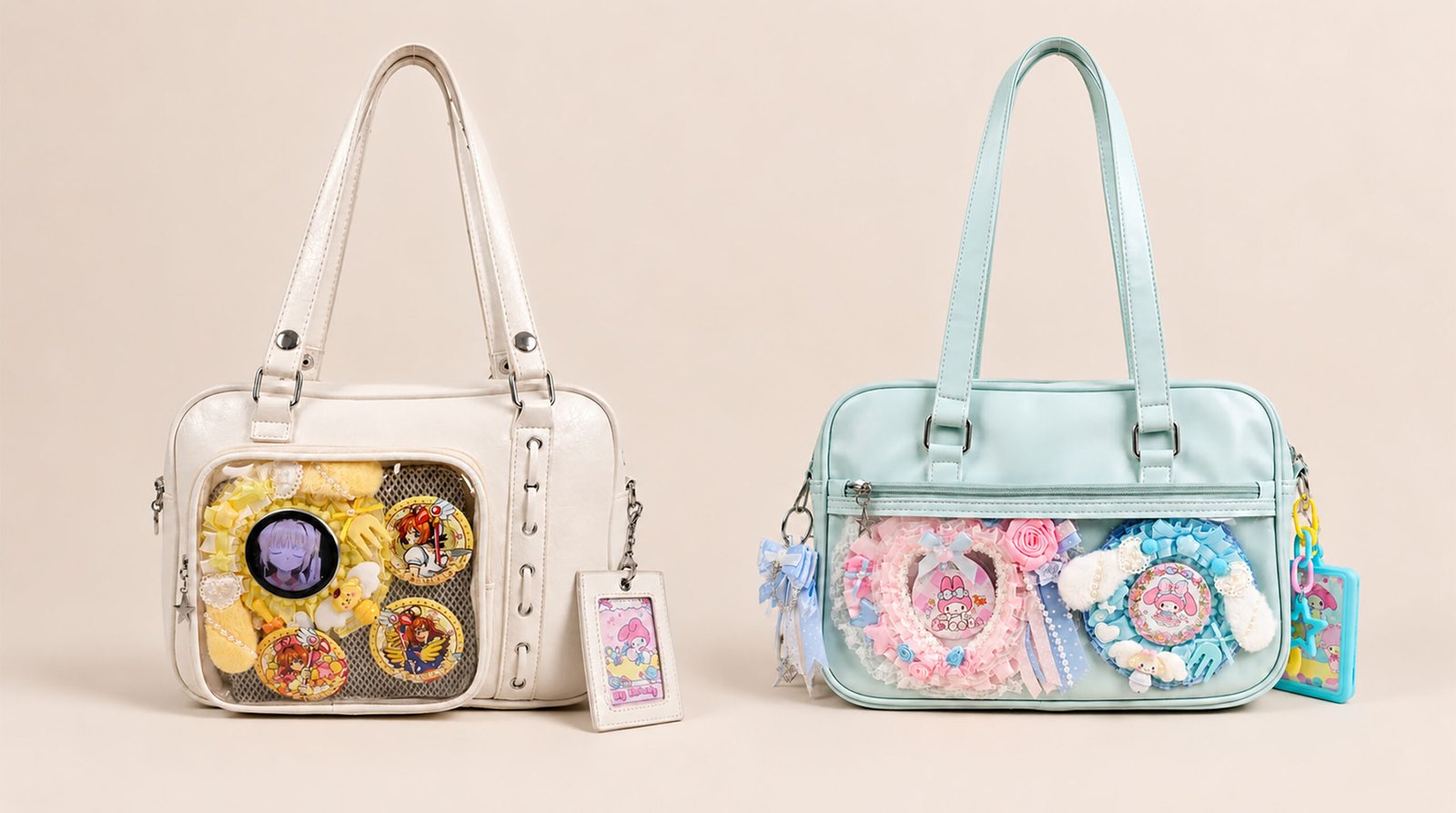
Table of Contents
At Pinitabag, we’ve always believed an ita bag is far more than a bag with a clear window — it’s a portable display case for your love of your favorite characters, and a unique piece of art that’s an indispensable part of your everyday outfit. Every week in our studio we explore new ita board layouts, cream glue handmade bases, lace borders, and color pairings, hoping to bring a steady stream of handmade inspiration to even more ita bag fans.
Today, we’re thrilled to release our latest craft video! Unlike our past DIY tutorials that simply walk through the collage-and-assembly process step by step, this video focuses on the overall styling aesthetics of an ita bag: how to coordinate your ita board layout, choose and use badge rosettes, pick matching charms, and make the color scheme of the ita board blend perfectly with the bag’s material and silhouette.
Whether you’re just getting into the hobby and about to put together your very first ita bag, or you’re getting ready to create an elaborate, heavily decked-out display board for your next convention, let’s break down two sweet-style styling cases together and, drawing on the experience of community fans, share a set of layout and styling rules you can use right away.
Styling Case Breakdowns
To make an ita bag that feels cohesive rather than messy, you first need to learn to break down the color and structure of great examples. The two looks we’re showing today both lean sweet, skillfully using a soft ice-cream pastel palette, multiple material textures, and a clear visual focal point.
The Two-Layer Aesthetic Logic of Ita Bag Styling: Bag shell and base color — determines the overall color scheme and silhouette; clear window and ita board — determine the theme, symmetry, and visual focal point; badge rosettes and charms — add three-dimensional depth and edge framing.
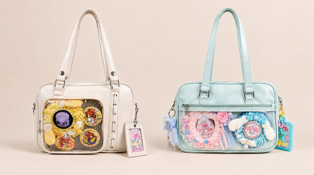
Case A: Sky-Blue Dreamland, My Melody Theme
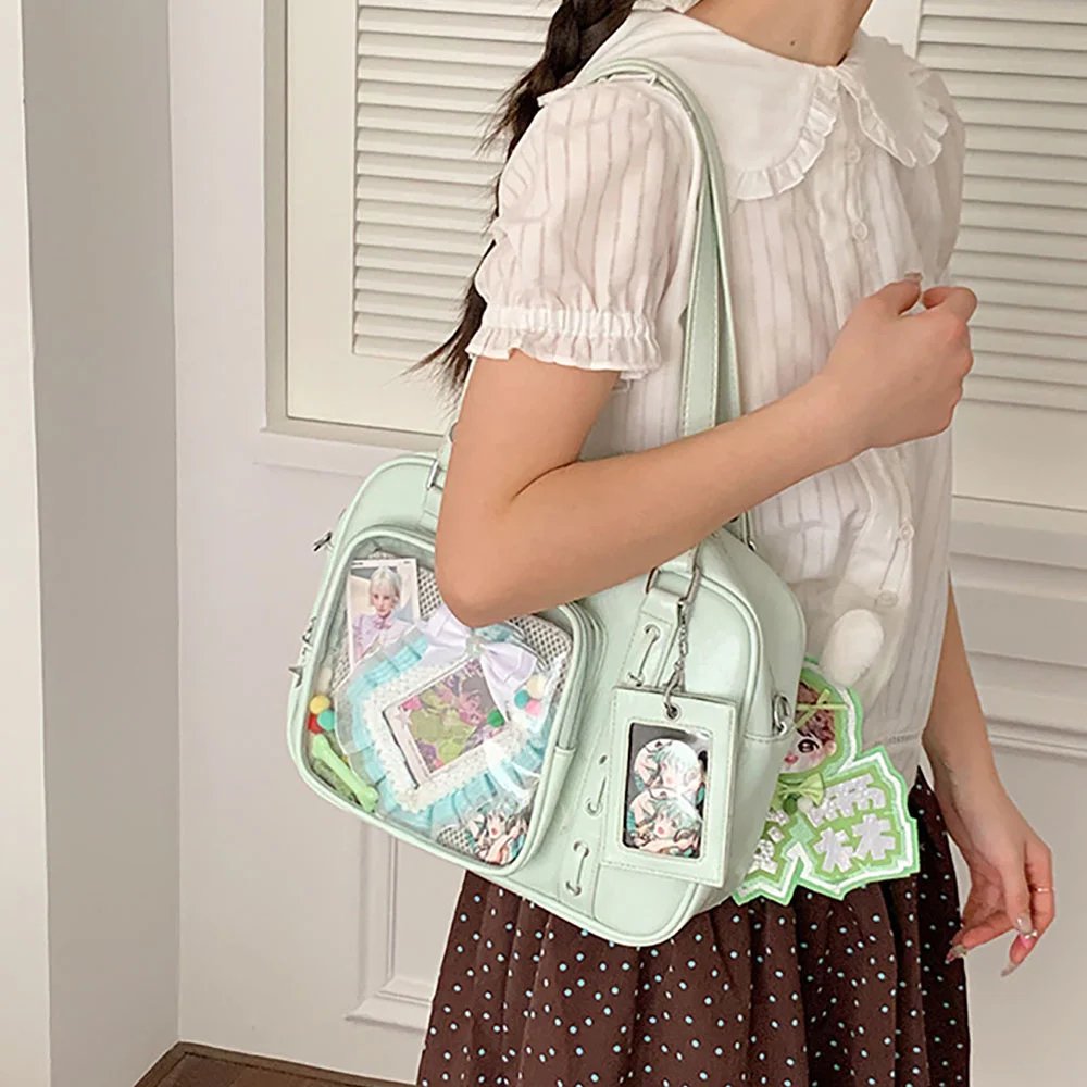
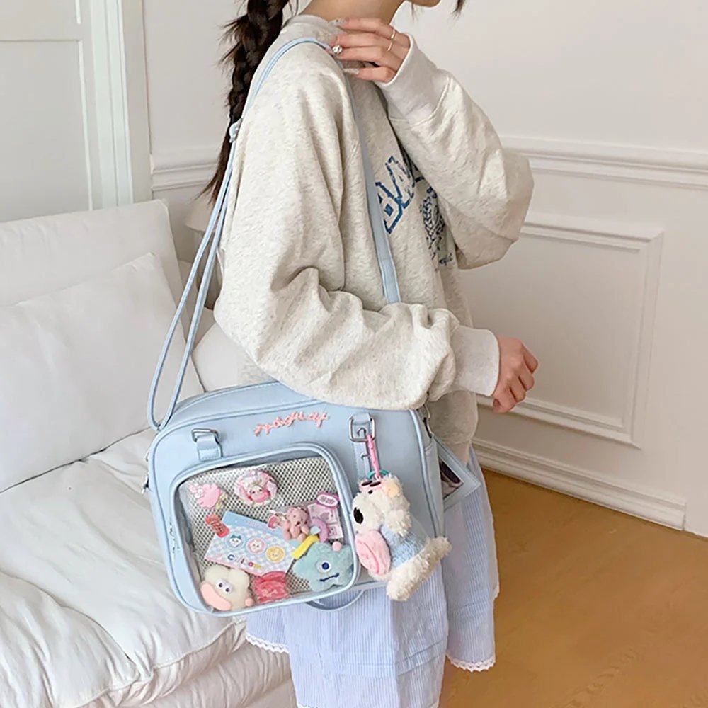
The first look is built around our sky-blue lace ribbon bow Japanese-style JK-style ita bag. Sky blue is a very fresh, highly forgiving color that perfectly sets off the ethereal sweetness of soft pink, white lace, and accessories.
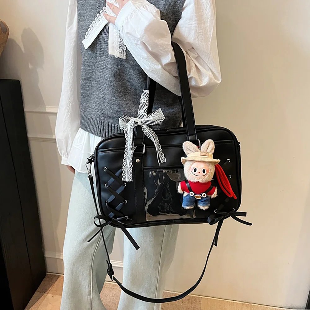
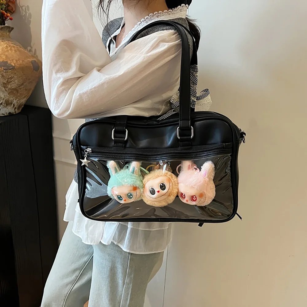
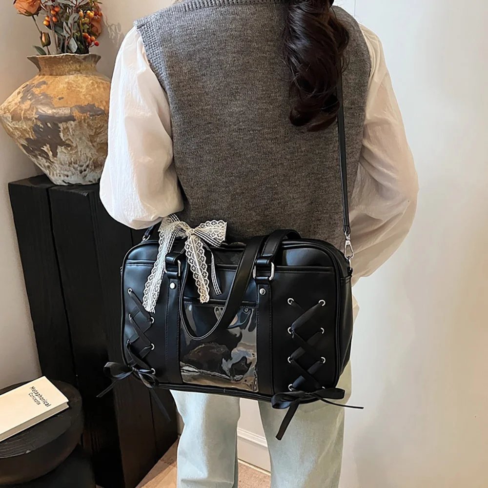
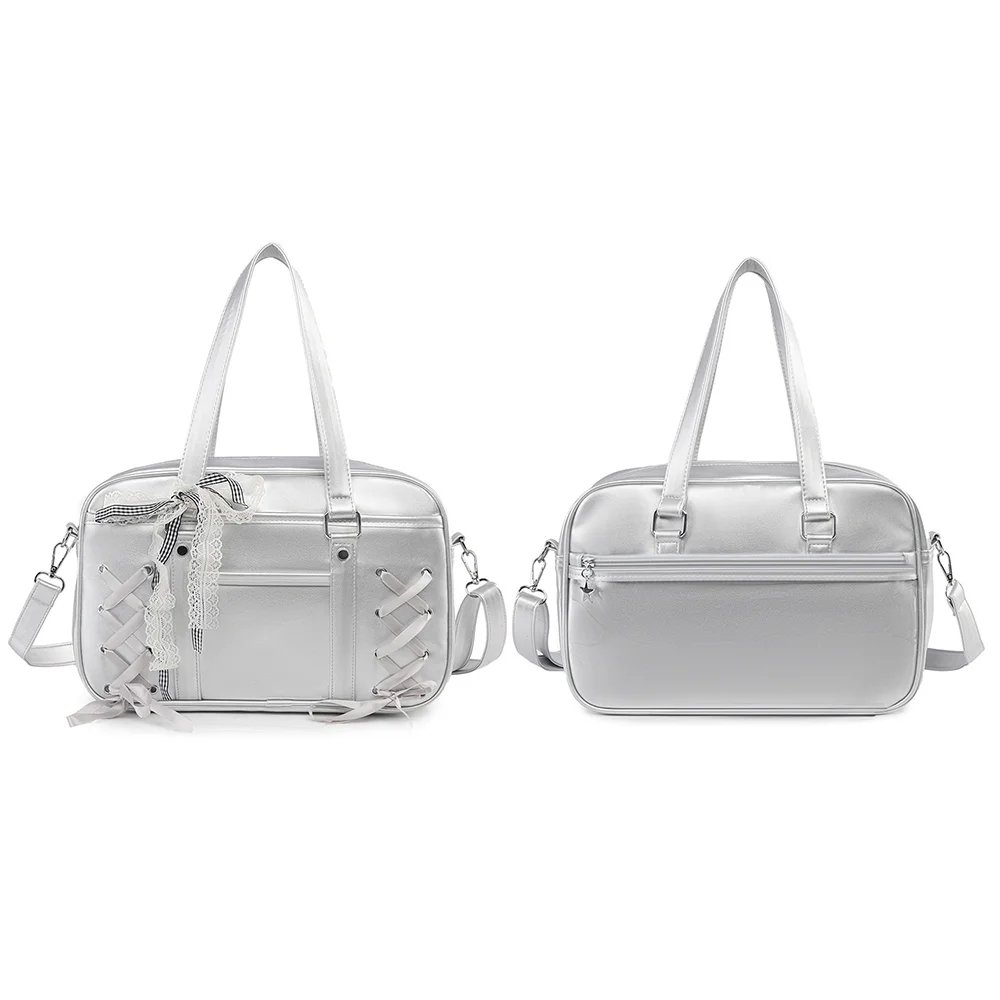
Core Design and Layout Mechanics
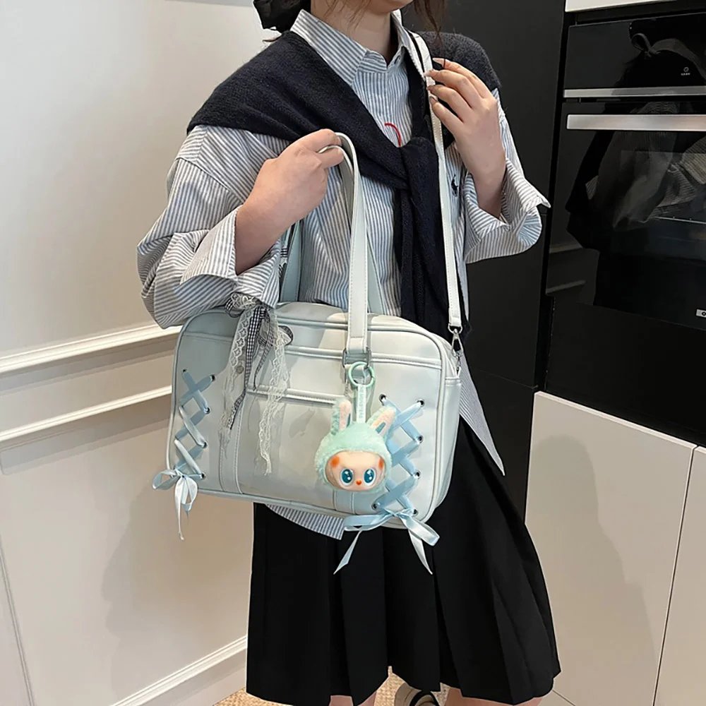
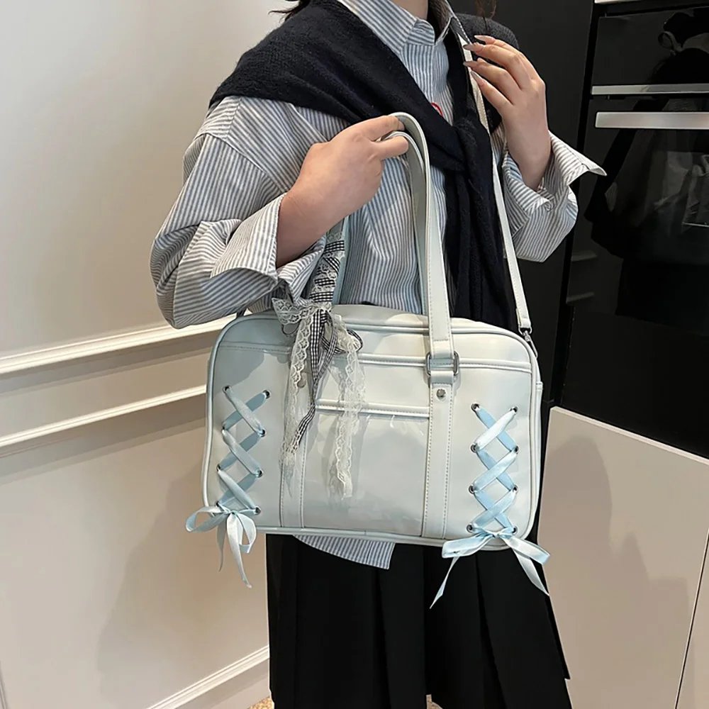
Bag body and silhouette: the bag has a clean, sharp-cut silhouette. A cleverly designed woven blue satin ribbon bow on the back adds a strong Japanese girly feel to the side and back views. The adjustable crossbody strap lets it switch freely between everyday shoulder/hand carry and relaxed crossbody wear.
Color pairing: the overall design inside the window centers on Sanrio character My Melody. The pink and blue badge rosettes split left and right stand out sharply, creating an extremely classic pink-and-blue dreamy feel.
Three-dimensional use of badge rosettes: to keep the badges from looking flat, handmade multi-layer lace-trim badge rosettes are used. Ruched ribbon, delicate lace edging, tiny fabric roses, and plush texture wrap around the badges, creating 1–2 cm (about half an inch) of physical thickness inside the clear window and instantly eliminating any empty feel.
External charms and extended details: to create a link between the inside and outside of the ita bag, a same-color-family blue bow charm is hung from the metal ring on the side of the bag, paired with a matching My Melody card holder and photocards, extending the whole look from the inside window to the outside of the bag.
Case B: Cream-White Magical Sakura, Cardcaptor Sakura Theme
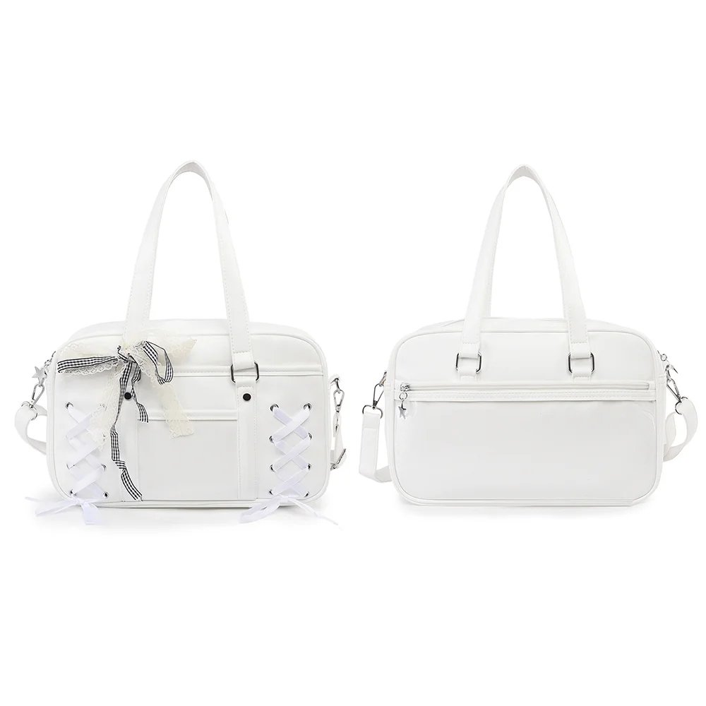
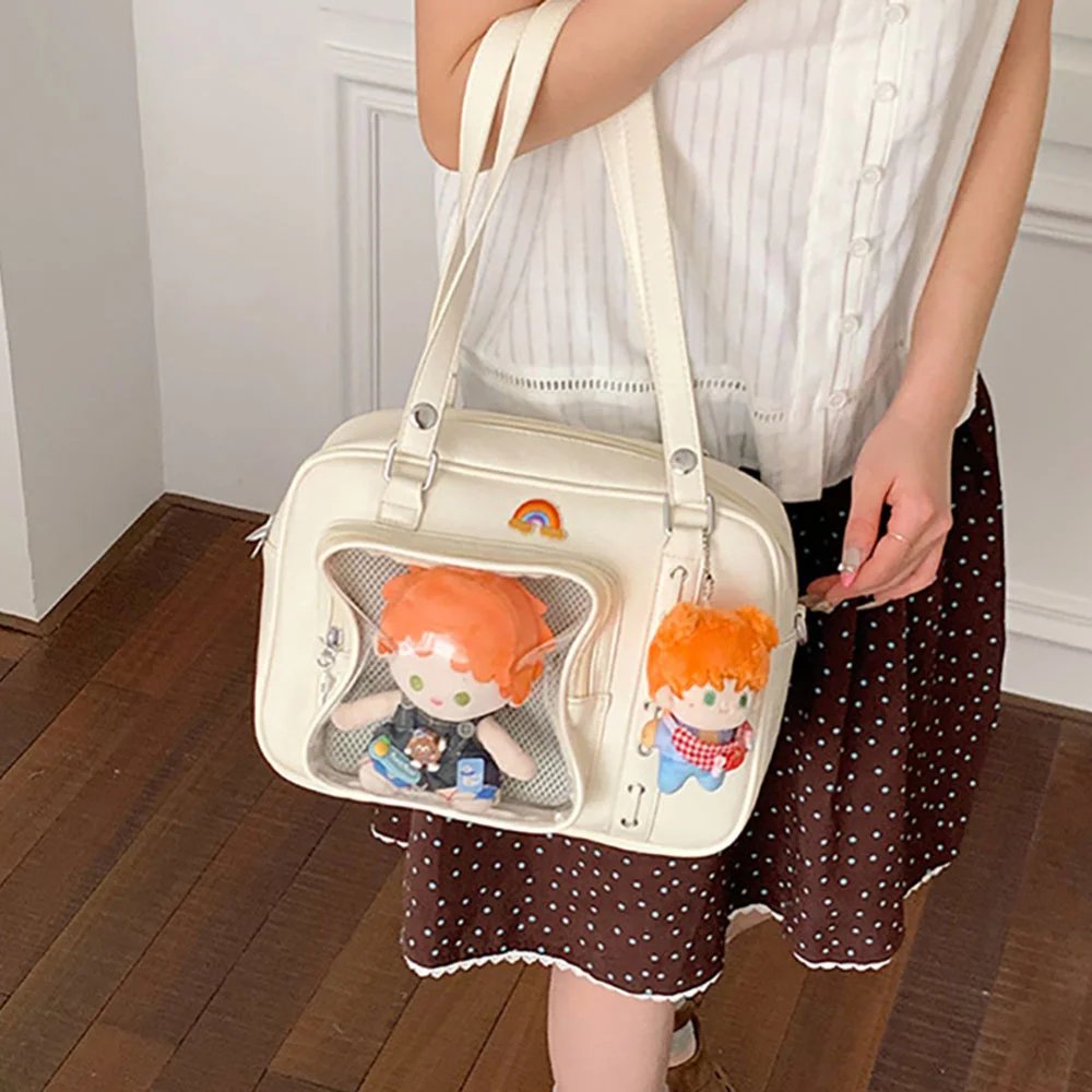
The second look features our cream-white handheld crossbody ita bag, a great fit for fans who want a gentle, versatile base color that can handle any character’s signature colors.
Core Design and Layout Mechanics
Material and soft texture: the soft cream-white PU leather feels more retro and soothing than a stark pure white, and it’s also waterproof and easy to clean. The drawstring-and-eyelet detail on the side adds a touch of embellishment without stealing focus from the clear window.
Ita board theme: this ita board shifts the color story to a warm bright yellow and soft pink palette, perfectly capturing the classic magic-circle look of Cardcaptor Sakura.
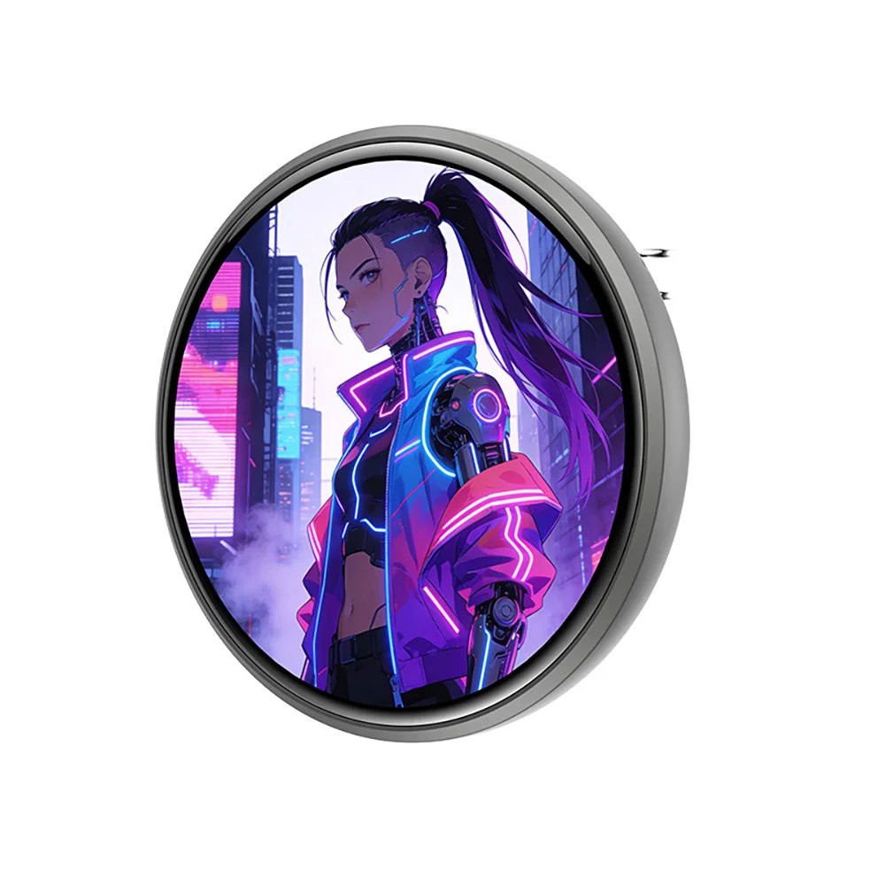
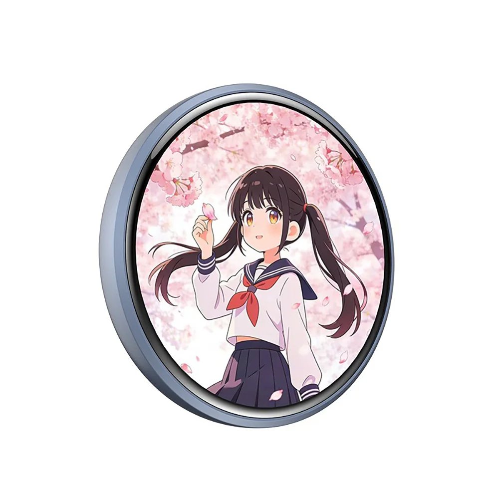
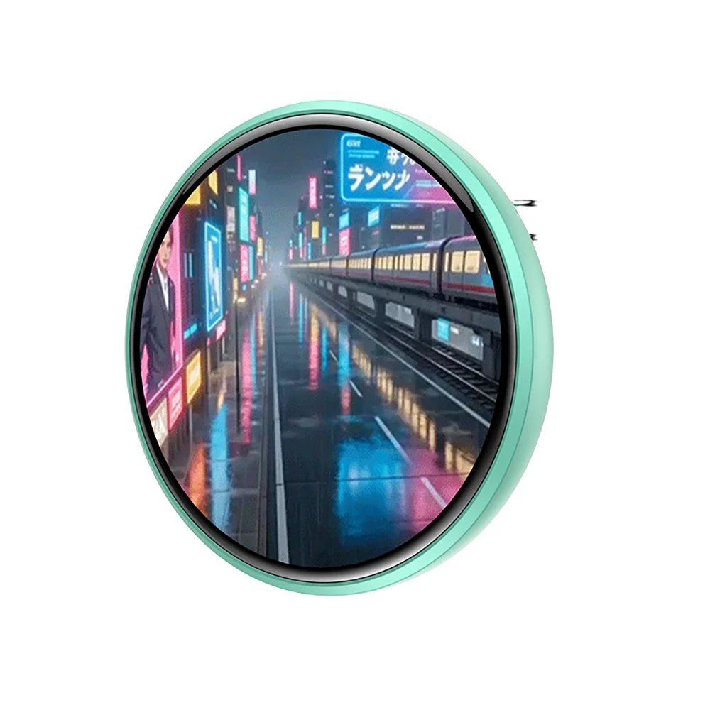
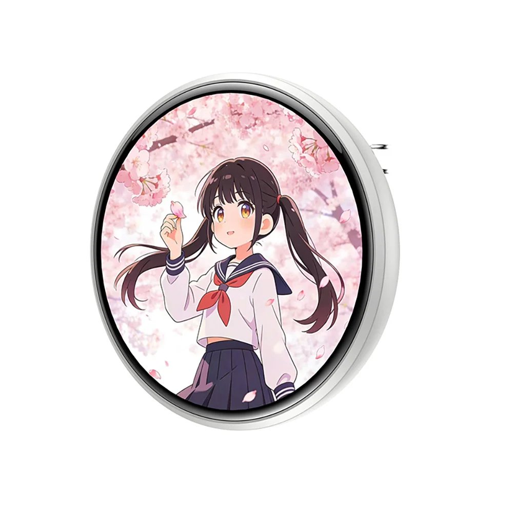
Tech meets handcraft: the biggest innovation of this board is using a touch-screen electronic badge as the core visual center. The electronic badge’s screen loops animated clips of Sakura Kinomoto, surrounded by yellow pom-poms and plush decorative arrangements, cleverly blending dynamic tech with warm handmade charm.
Visual balance and ring layout: when using a very eye-catching animated focal point like an electronic badge, the static badges around it are arranged in a semicircular ring, with matching yellow-toned backings wrapping the electronic badge in the center, so the eye is first drawn to the moving image and then naturally extends out to the beautiful badges around it.
Three Golden Rules for Matching Ita Boards to Bags
Drawing on our own crafting experience and observations of community fans, if you want your ita bag to stand out, you can follow the three rules below.
Rule 1: The Golden Color Ratio
The easiest trap for beginners arranging an ita bag is cramming in all the badges at once, making the colors far too chaotic; a pleasing ita bag usually follows the ratio below:
60% main color: the color of the bag itself.
30% supporting color: the colors of the ita board base and badge rosettes.
10% accent color: small accessories and trims.
When the bag’s main color echoes one of the supporting trims inside the ita board, the whole bag gets a very strong sense of visual unity.
Rule 2: Layered Textures That Break the Flat Surface
Simply arranging badges in a grid can make a bag look like a store shelf; using different materials to build layers is what the pros do:
Fabric/felt base board: the bottom layer, covering the board’s mesh grid.
Lace ribbon: the middle layer, creating raised texture.
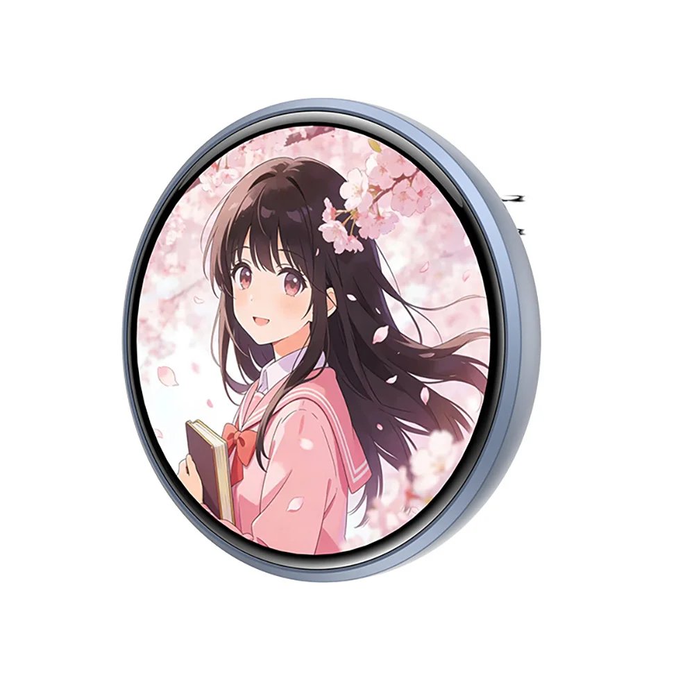
3D badge rosettes: the top layer, raising the core badge 1–2 cm (about half an inch) to create the visual center.
Rule 3: The Picture-Frame Effect of the Clear Window
Think of the ita bag’s clear window as the frame of a painting. Adding a ring of wavy lace, a small pearl chain, or a ring of little flowers around the edge of the ita board works beautifully as a frame, guiding the viewer’s attention naturally to your beloved character.
Community Inspiration and Trend Insights
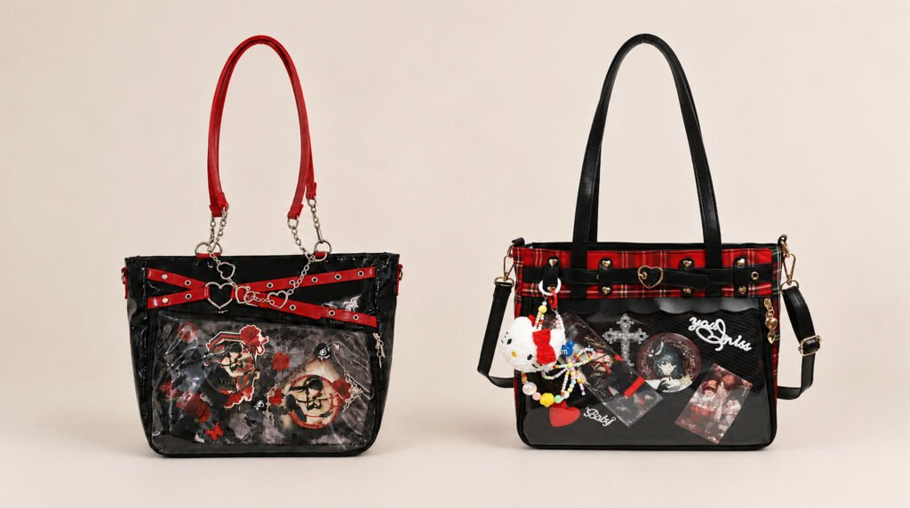
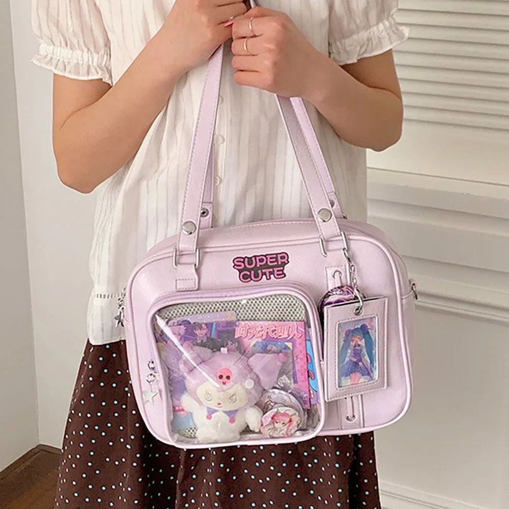
Watching creative trends in the fan community, it’s easy to see that today’s sweet-style ita bags are being given richer ways of expression. From multi-material, single-color-family handmade pieces that take one shade of pink to the extreme, to dark sweet-and-edgy looks that blend lace with black-and-white tones, fans are using different styling logic to show the limitless possibilities of the sweet style.
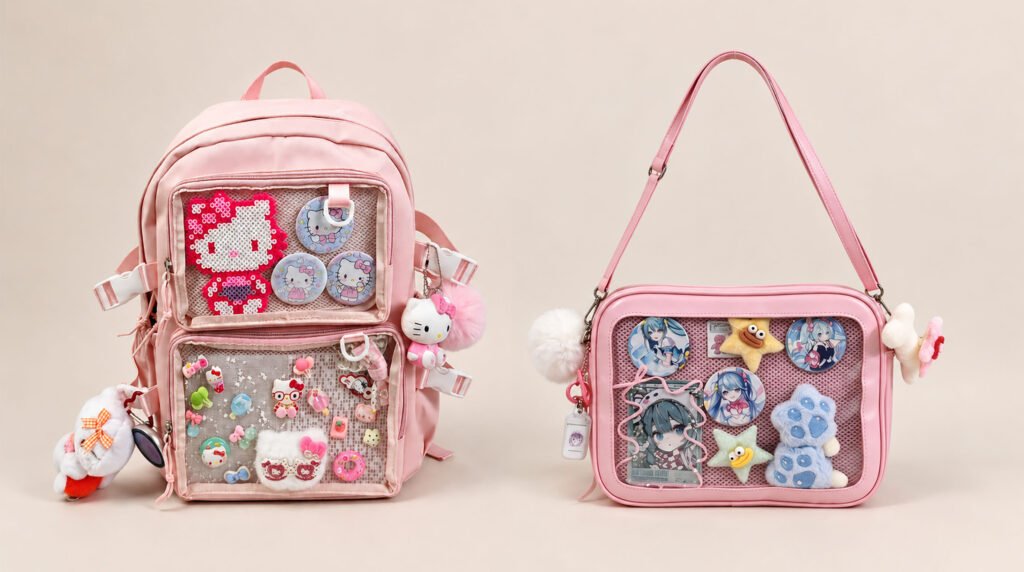
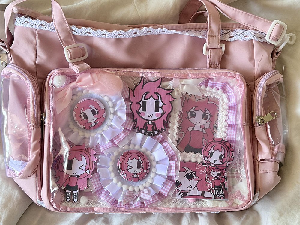
Case 1: Ultimate Pink-and-White Monochrome Aesthetic — Ashley-Themed Ita Bag
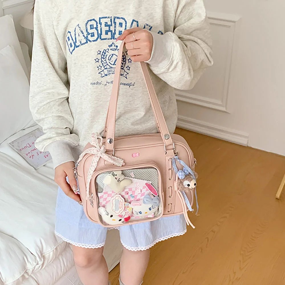
Pink-and-white gingham and layered handmade textures: This fan’s all-pink ita bag is a great example of one color family pushed to the extreme. The whole bag strictly follows the golden color ratio of 6:3:1.
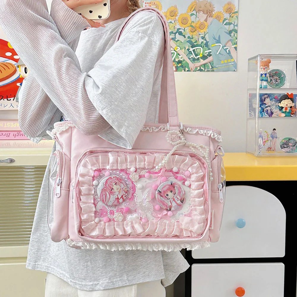
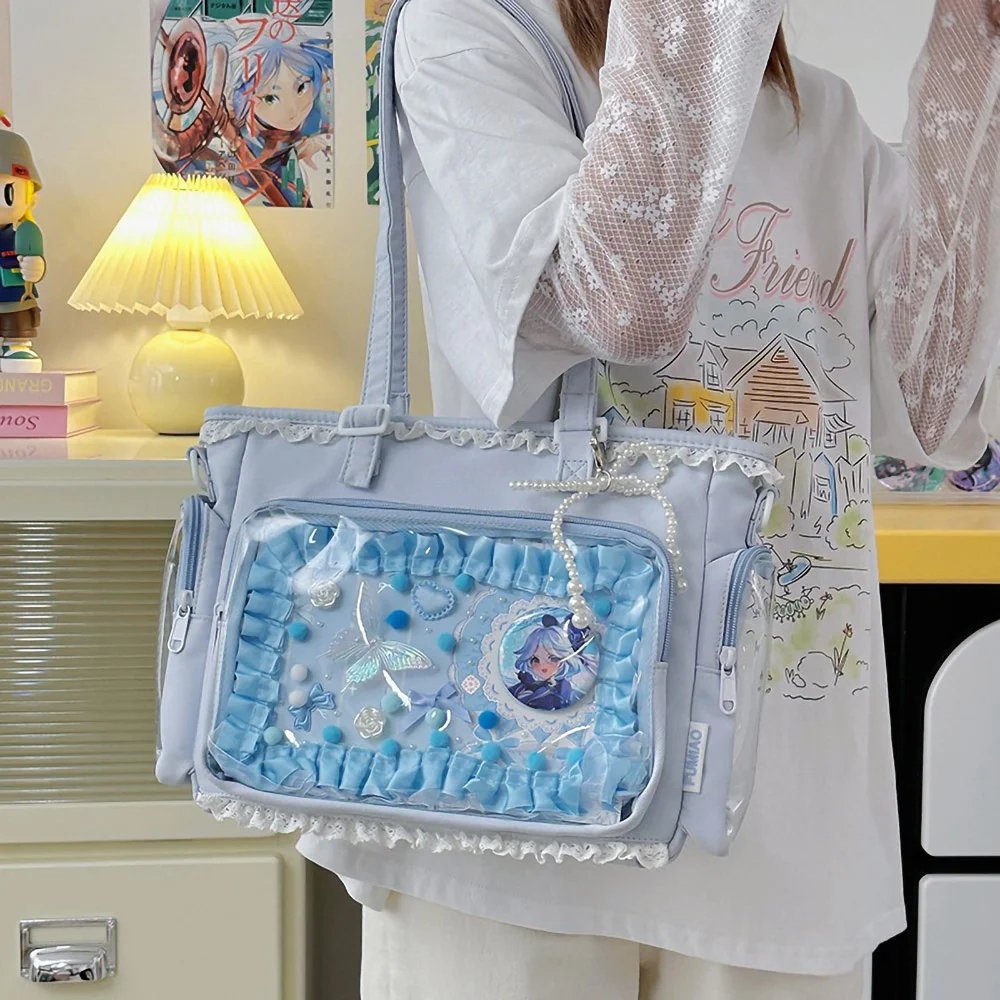
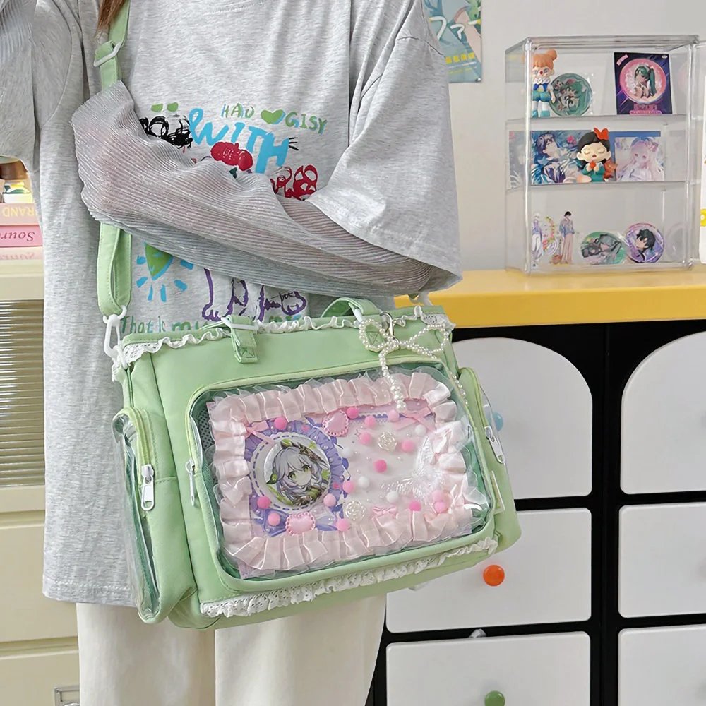
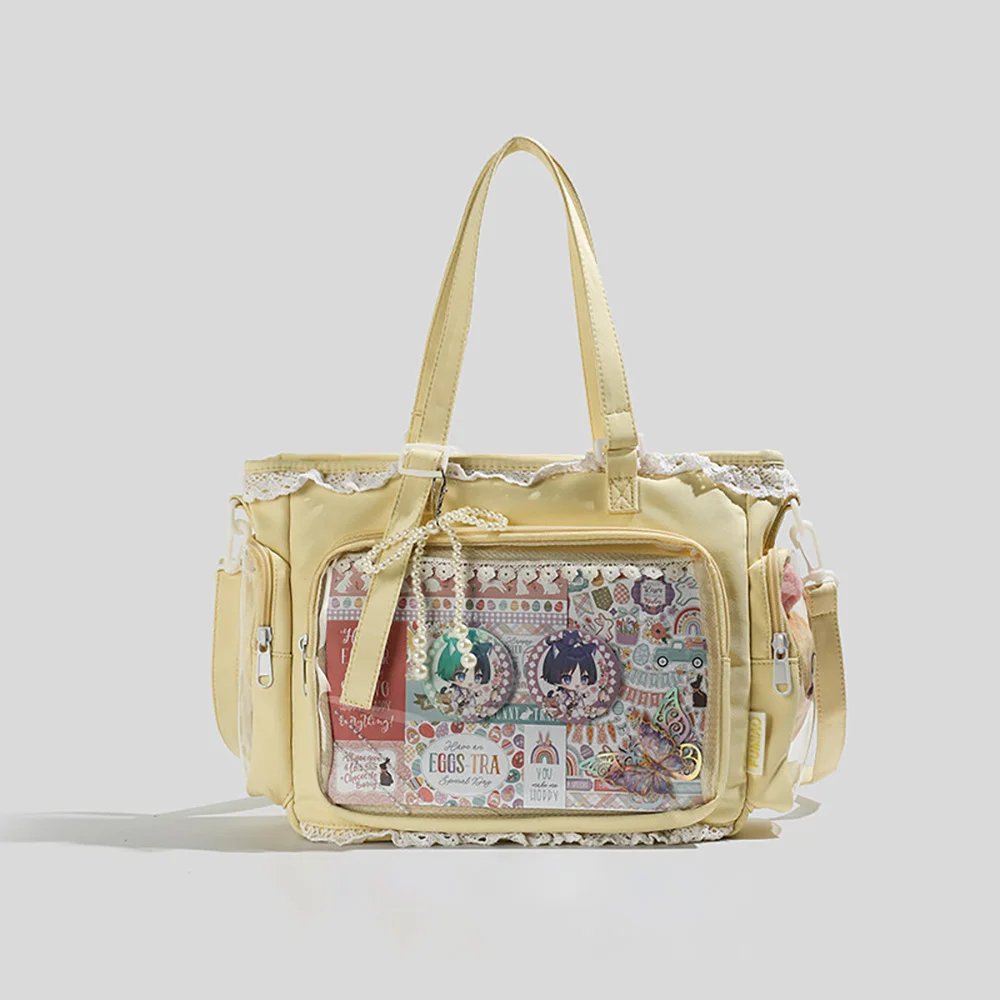
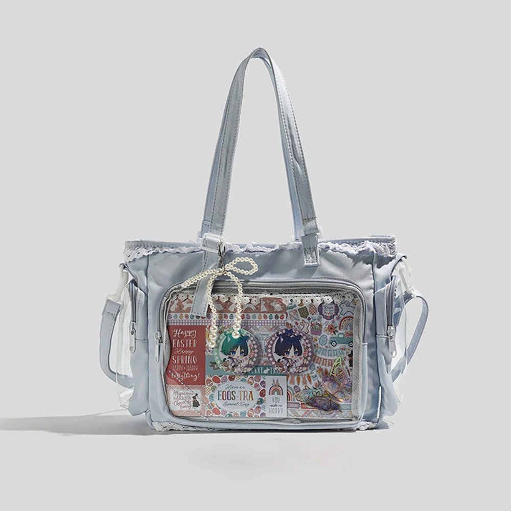
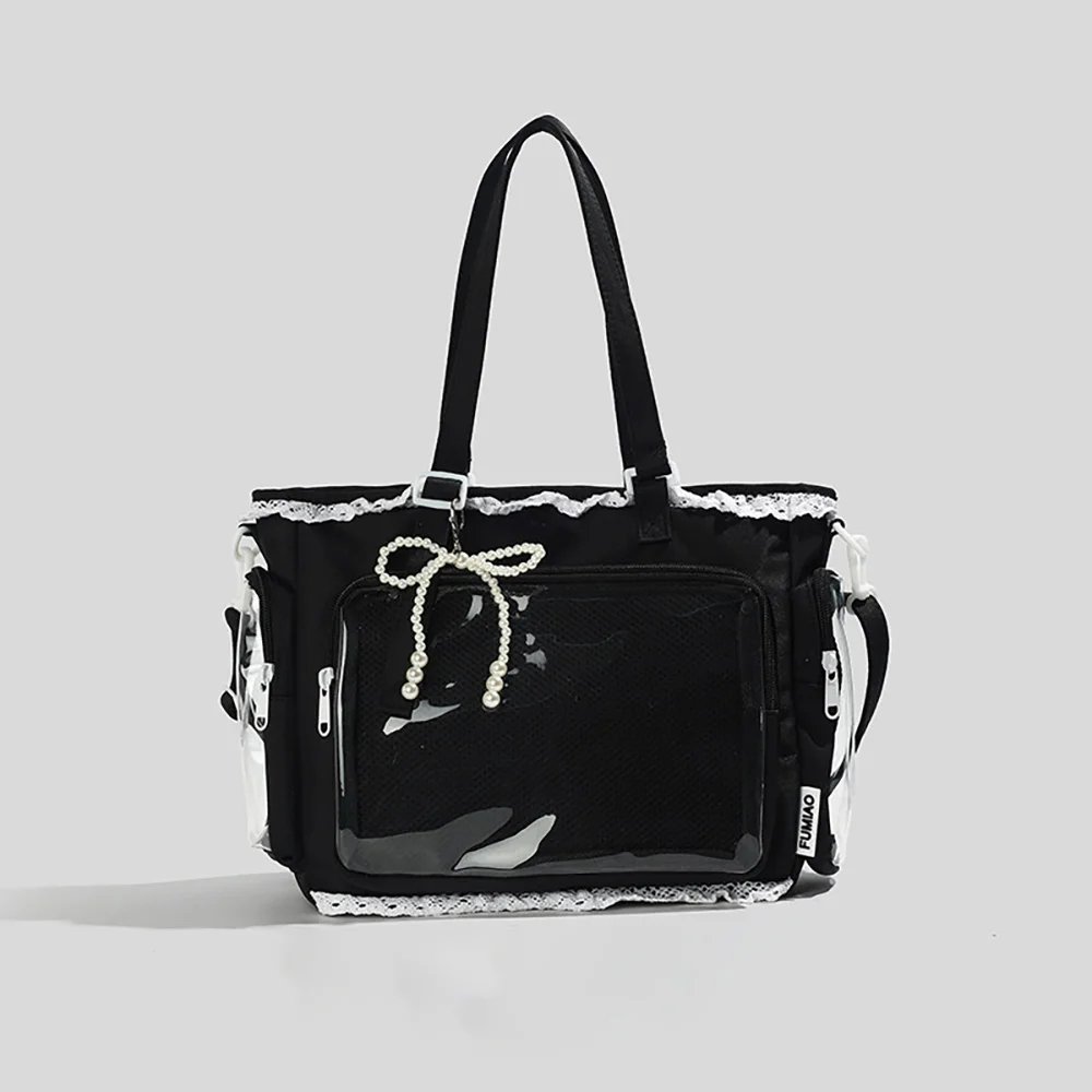
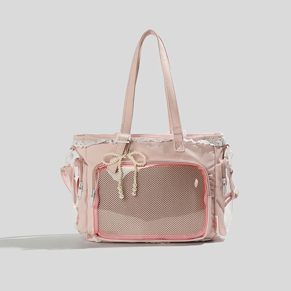
Layered textures that break the flat surface: pink-and-white gingham fabric, white lace trim, polka-dot pom-pom edging, and pink satin ribbon bows are skillfully blended. Even though the character’s merch includes paper crafts and badges in different materials, wrapped in two pink-and-white handmade badge rosettes the overall look stays highly unified, delivering a dreamy yet gentle, sweet handmade feel.
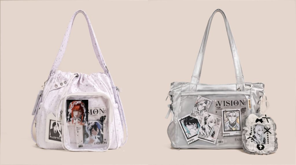
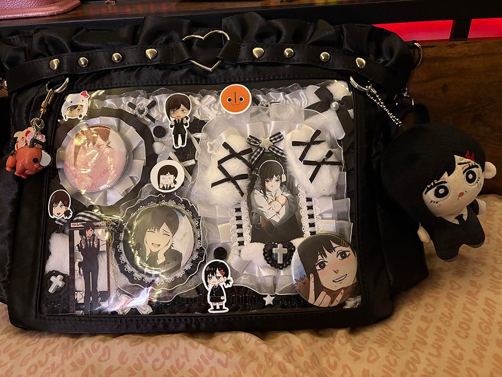
Case 2: Black-and-White Dark Gothic Sweet-and-Cool Style — Kobeni-Themed Ita Bag
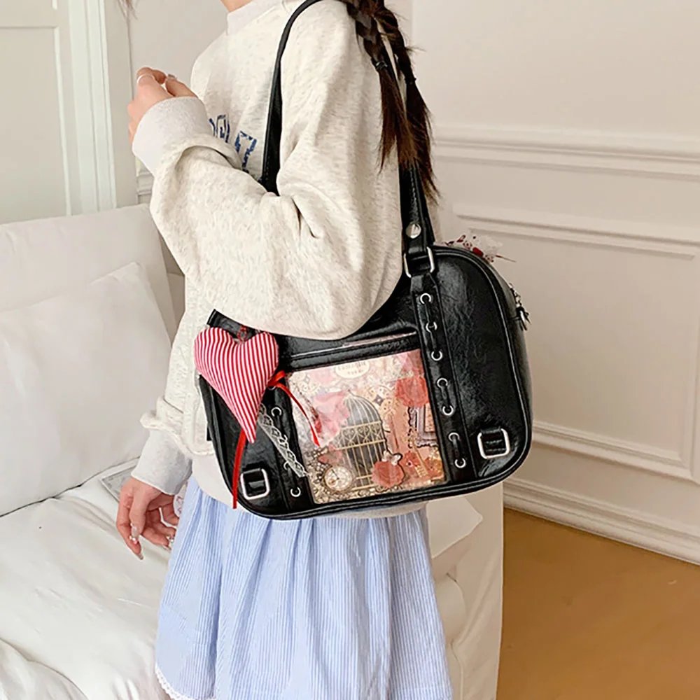
Black-and-white lace meets gothic elements: This fan’s black ita bag perfectly shows the unique charm of the dark gothic sweet-and-cool style. The interior makes heavy use of black satin ribbon, white lace, black-and-white crisscross straps, and cross elements. Black sets the cool, edgy tone that’s signature to Chainsaw Man, while soft lace and straps give it a refined, retro girly feel.
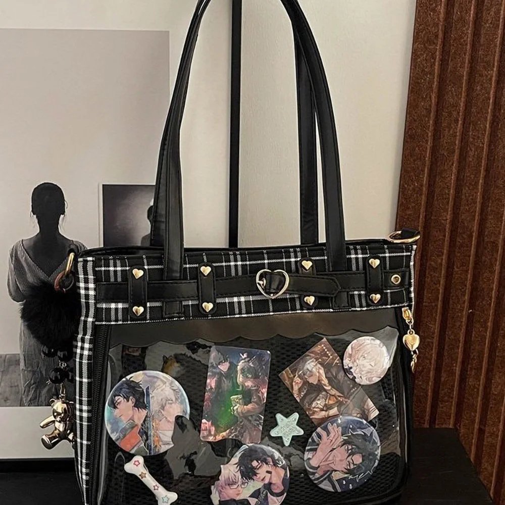
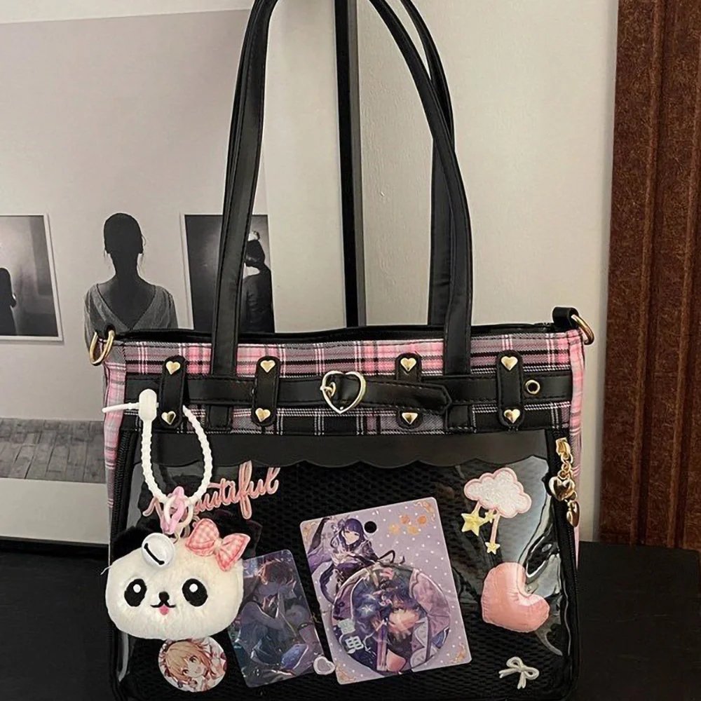
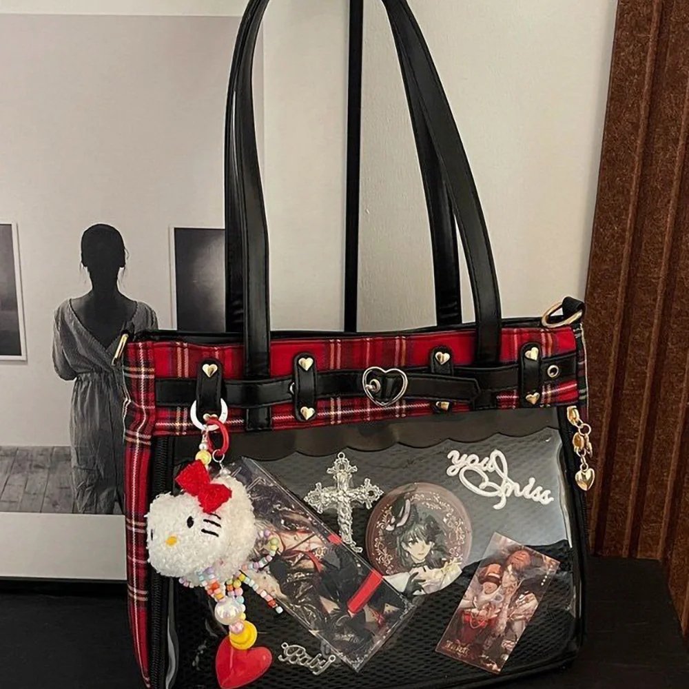
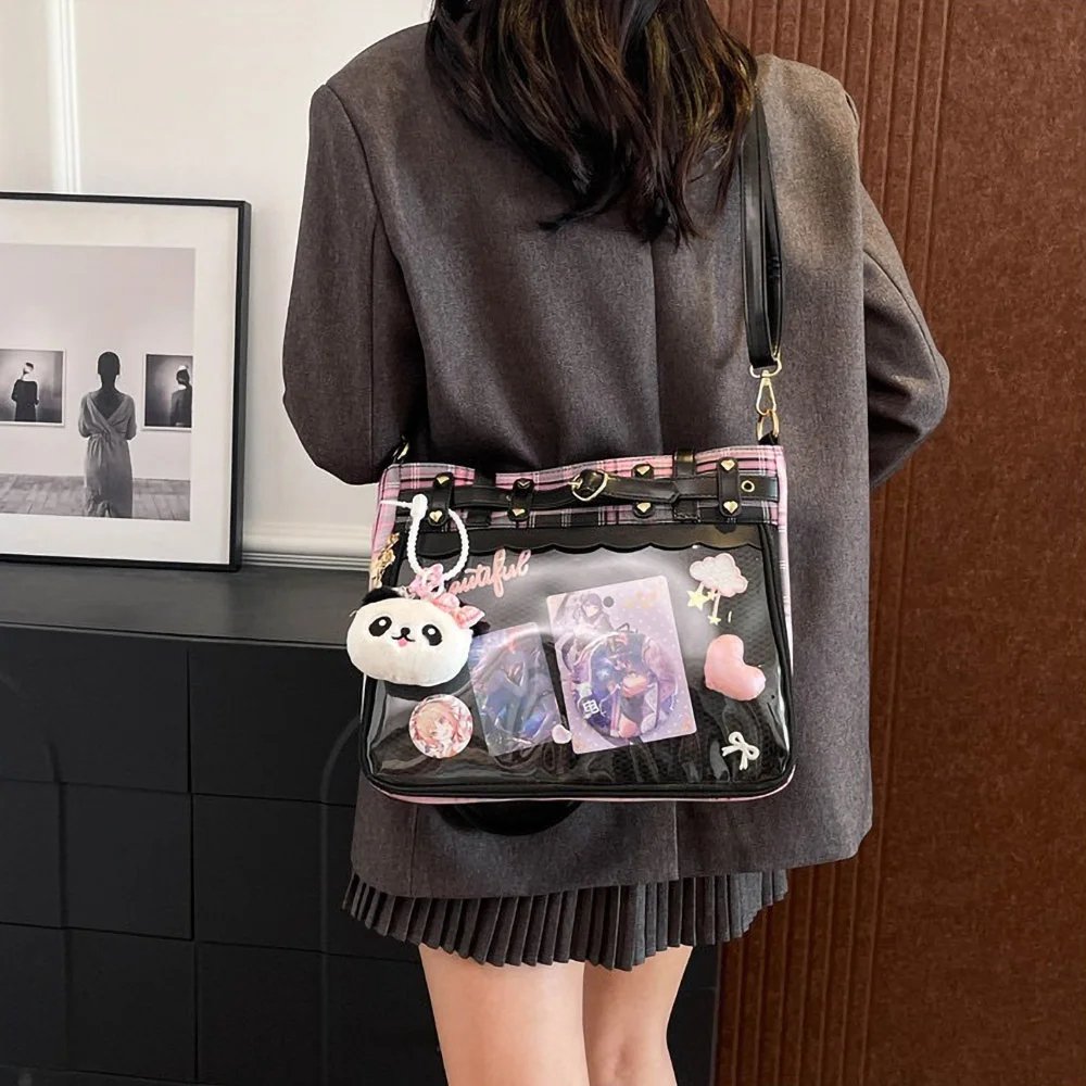
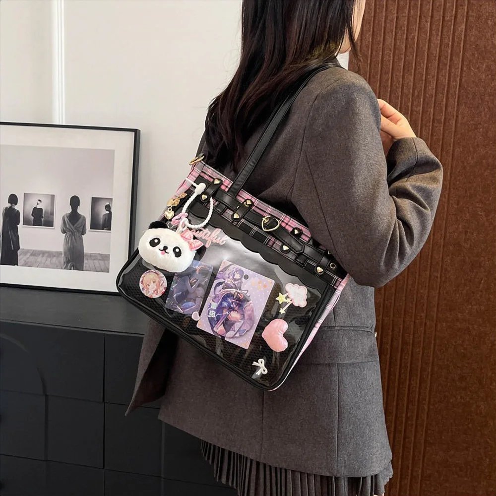
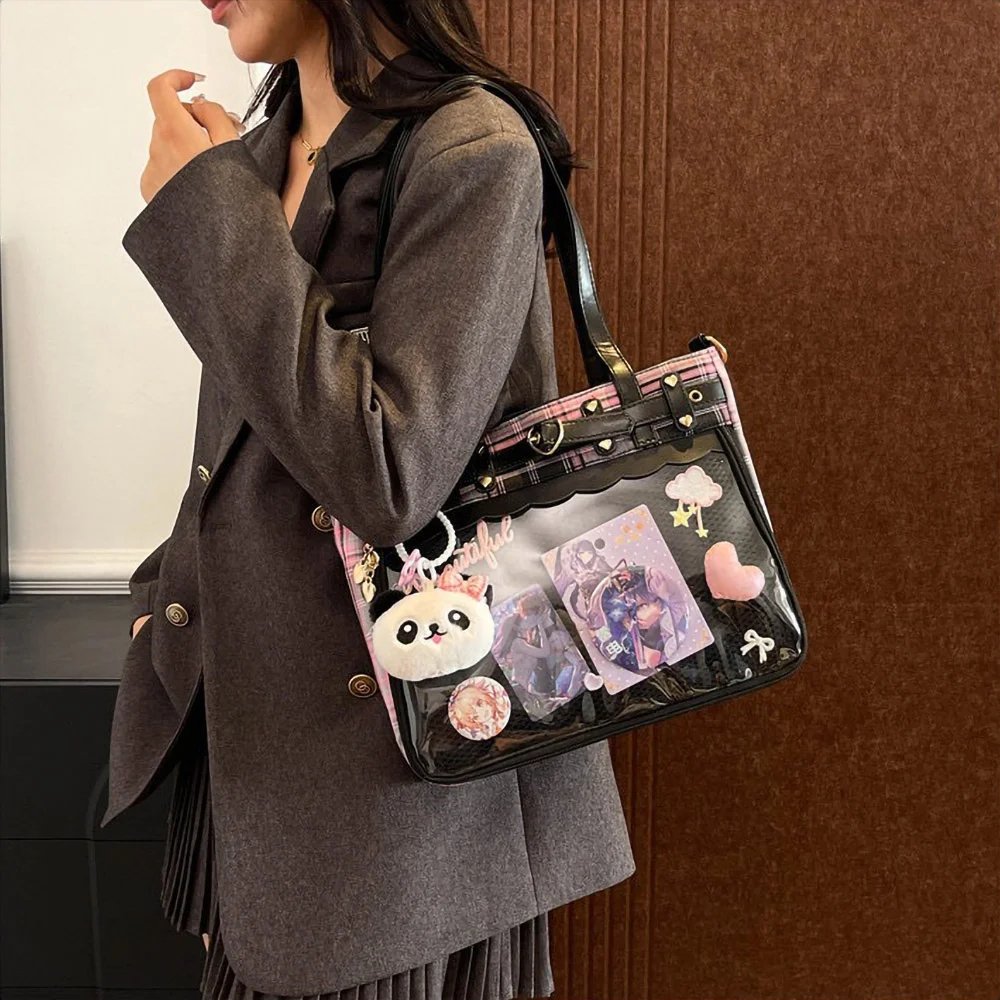
Multi-layer framing and extending space beyond the bag: on the right, a themed badge rosette with black-and-white straps and a cross serves as the visual focal point, with lace pulled around it to form a natural frame. Even more clever, the fan hung a sprawling plush figure on the right side of the bag and a small Pochita charm on the left, smoothly extending the display space from the flat surface inside the bag into three dimensions, full of story and richness.
These two fans’ styling cases prove that whether you want a dreamy, ultimate pink-and-white sweet style or a black-and-white gothic style with a hint of rebellious cool, using badge rosettes to build a 3D center, framing with lace trim, and extending outward with exterior charms are the core secrets to elevating an ita bag from an ordinary display to a refined piece of work.
Conclusion
Every ita bag is a one-of-a-kind expression of its fan’s heart. From building the color scheme and stacking up badge rosettes in layers, to extending charms outside the bag, as long as you master color ratios and the 3D picture-frame rules, you can create a sweet-style ita bag that’s both beautiful and distinctly your own.
What theme will your next ita bag be? Feel free to share your ideas with us and trade creative inspiration with other ita bag fans!
FAQ
How do I choose an ita bag in the right color based on the anime character I like?
Option one is a same-color-family match: simply pick a bag in the character’s signature color. Option two is a versatile neutral, such as a cream-white or black bag. A cream-white bag is like a clean sheet of drawing paper — whether your ita board is bright red, pink, or blue, it sets it off nicely without any color clash.
Badge rosettes are fairly bulky — how can I secure them to the ita board so they don’t fall off?
Most badge rosettes have a pin or clip on the back. After pinning through the mesh ita board, we suggest sticking a small adhesive Velcro patch between the disc on the back of the rosette and the ita board; this effectively keeps the rosette from swinging side to side inside the clear window as you walk.
Will a touch-screen electronic badge be heavy inside an ita bag? Could it warp the ita board?
Electronic badges designed for ita bags are lightweight and well within an ita bag’s load capacity. The key to preventing warping is choosing the right base board: use a mesh board or rigid felt board with some thickness and stiffness as the base, and never hang it directly on thin fabric.
What does the picture-frame effect mean? How do I do it when arranging an ita bag?
The picture-frame effect means treating the clear window of your ita bag as the frame of a painting. In practice, along the edges inside the clear window, follow the edge of the ita board and add a ring of wavy lace, a small pearl chain, or a ring of little flowers. This not only perfectly hides the fixing marks along the board’s edge, but also works like a picture frame to guide the viewer’s eye inward, focusing on your most beloved character.
Get Inspired on Instagram
Looking for inspiration for your next ita bag? Follow us on Instagram for more ita bag decoration ideas, styling inspiration, and creative ways to showcase your favorite pins, charms, and collectibles. We regularly share different styling ideas to help you discover new ways to decorate and personalize your ita bag.